
This page contains our print design drafts, stages and possibilities. To be able to create a visually stimulating outcome we had to refer to existing and past magazine and movie posters. Analysing the existing medias allowed us to incorporate aspects we found interesting. On this page you will find 6 possible drafts, test shots to experiment with lighting and camera angles and 4 drawn drafts.
POSTER MEDIA TEXTS
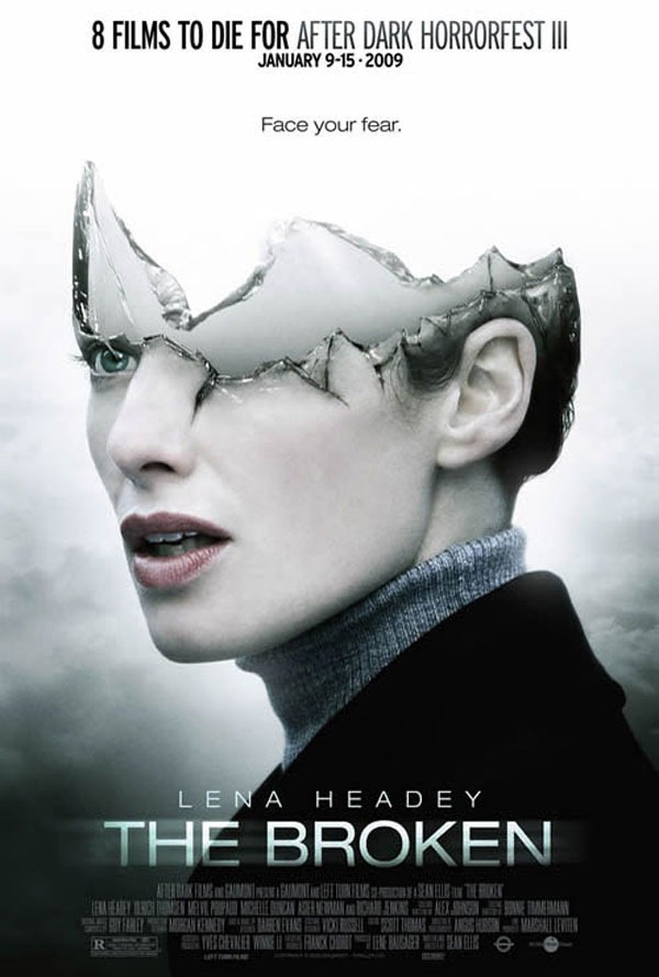
For this movie poster we agreed that the layout of the poster itself is very clean, with the tagline on top and the title bottom central with the main actor's name on top and the film credits below. Furthermore, we found that the image is very striking with not just visual content but a deeper meaning which would leave the audience with many questions; it especially relates to our story line with broken beauty.
|
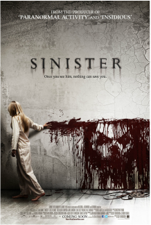
The use of the dull grey colour scheme is what I like in this poster as it attracts more attention to the bright blood which paints out the antagonist's face. This is very effective, as a pose to seeing the protagonist's face we are revealed the antagonist, painted in blood which connotes danger. This subverted aspect is what inspires me about the poster, looking a lot more horror in comparison to the first poster which comes across as supernatural.
|
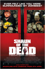
We like the typography. The use of the weapon/ killer's hand incorporated into the lettering enhances the zombie sub genre to this horror film. We also like the contrast in brightness and lighting between the human and the zombies. The dead (zombies) are filtered with faded colours with elements which really illustrates the difference between the living and the dead, conveying the zombie epidemic.
|
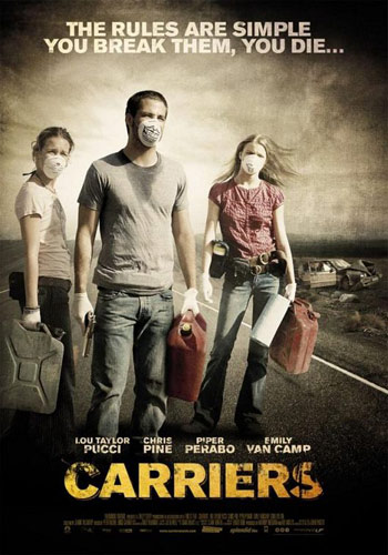
I like the use of the grey filtered image which reflects life as it would be presented in a zombie world, as that is the sub genre. In addition I love the way it doesn't conform to the usual head shot of the victim, but incorporates the 3 friends (victims) together. The fade from the corners into the poster from dark to light is effective as it gives a sense of evil slowly taking over.
|
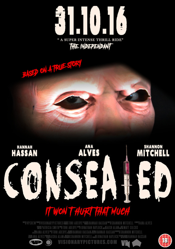
What I admire about this poster is the contrast in colours from the image itself and the main title. I like how unlike the other posters the filter isn't grey, it is black and the faces of both the antagonist and protagonist are illuminated in white to attract attention to their NVC. Another thing which I wish to incorporate in my drawn drafts is the way in which the tag line for the film is short, punchy and concise in it's layout: 3 rows, 3 words. It creates a memorable tagline, visually and verbally.
|
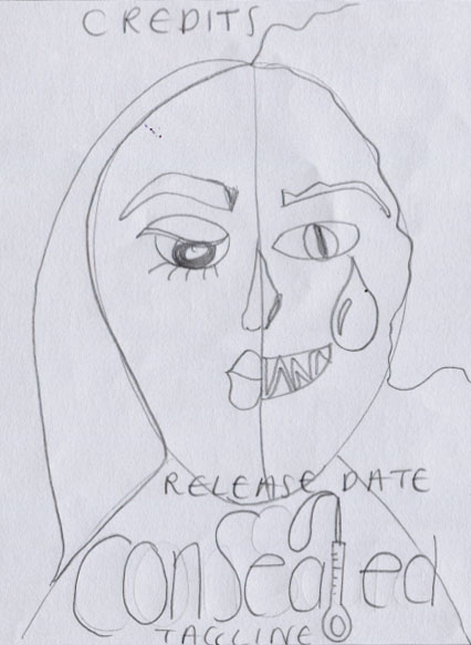
POSTER DRAWN DRAFTS
These are a set of digital drafts which I based on my drawn drafts to narrow down to 4 digital drafts from which I will choose which ever looks visually more engaging as my final design. I created these using photoshop.
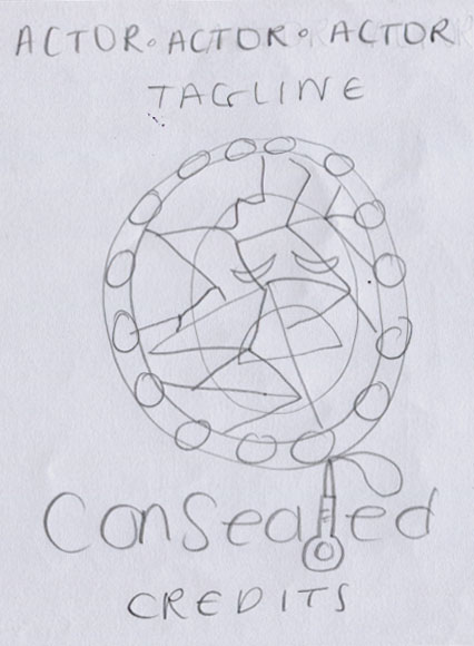
LAYOUT 1: The main image is a play on illusion. The smashed mirror reflects our theme of broken beauty, with the reflection of the girl shattered, inspired by the broken poster. It is a very simplistic, although the layout is plain the image is effective and used as a symbol.
|
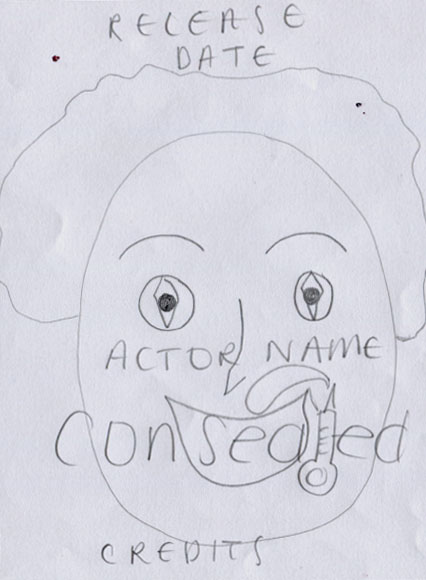
LAYOUT 2: The main image for this poster is the antagonist, a close up shot. The NVC is very disturbing as he is grinning but in a sadistic way. I decided to make this one plain and not include actors names.
|
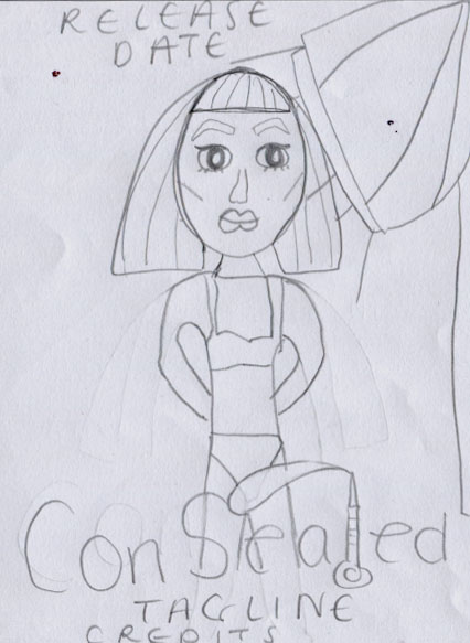
LAYOUT 3: For the front cover I chose to create an image of the protagonist in her beautiful form and after trying to alter her beauty. This symbolizes beauty should be left untouched in natural form, we should not play with God's plan or things can go terribly wrong.
|
LAYOUT 4: This drawn draft includes a long shot of my victim in a photoshoot, the spotlight is on her and the camera flash illuminates her against the dark background, this is for emphasis on the theme of vanity but also effective lighting.
|
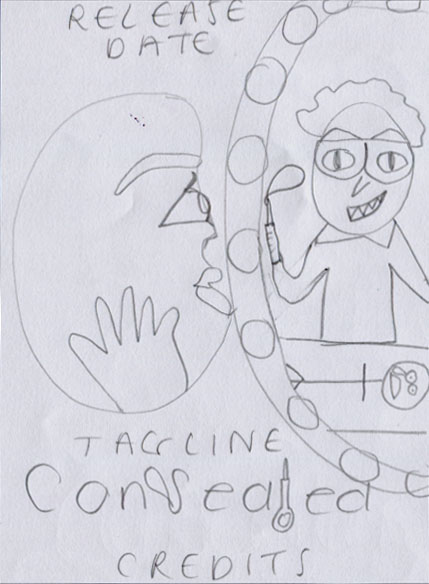
LAYOUT 5: This draft consists of the victim looking at herself in the mirror and seeing her future in the reflection, the antagonist injecting her with a form of narcotic. I do feel this gives away a bit too much for a poster shot however I thought it would also help the viewer to engage with the genre of the film.
|
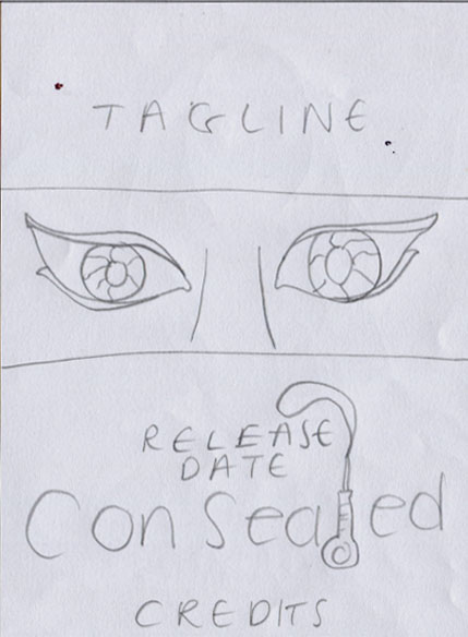
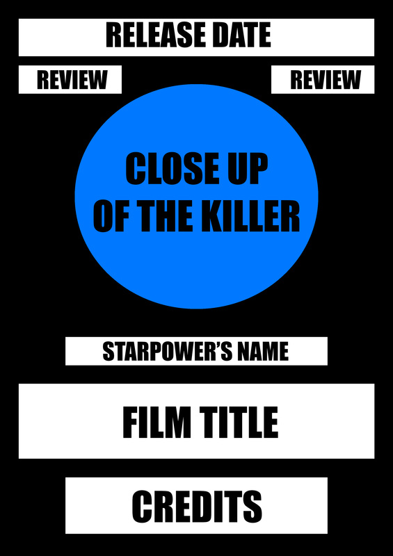
LAYOUT 6: This draft remains very central and bold. The tagline is top central and the film title bottom central with the release date aligned directly above and the credits directly below. This clean structure keeps things simple yet bold. Similarly, the image is a shot of the victims eyes narcotized, it is a powerful image, evoking mystery.
|
POSTER DIGITAL DRAFTS
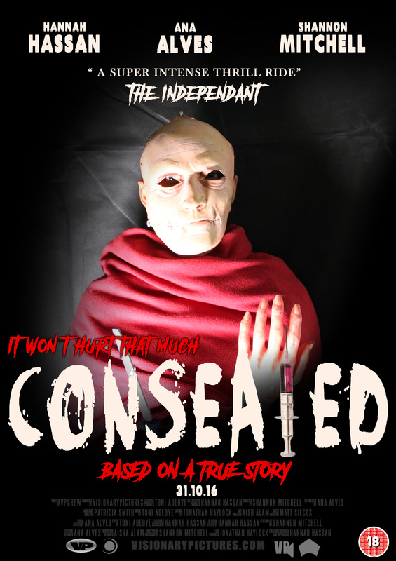
These are my digital drafts put into a more visual perspective using photoshop. I have included typography and experimented with various layouts to decide which of these we should base our final design. I also included my test shots in my poster typography drafts to visualise which shots would suit the layout best, I included a close up, mid shot and extreme close up.
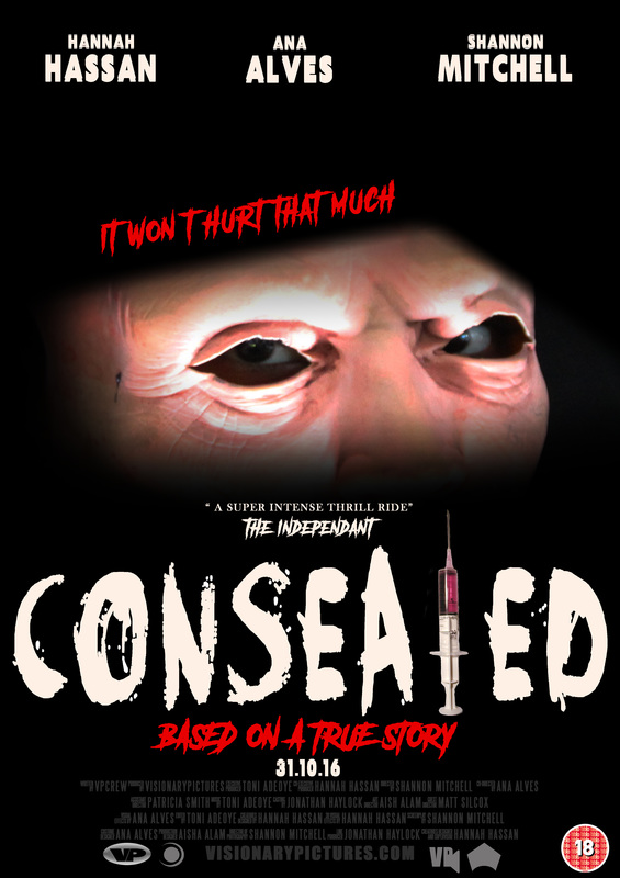
This digital draft is a mid shot of the victim taking the majority of the page. The release date and title will be placed over the victims shoulders to draw attention to the main text. The review will be a quote from a newspaper rather than a 5 star rating.
|
This draft is largely text based rather than image, the close up will most likely be of an element such as the eye to impose a sense of threat. The purpose for this is to connote a theme of secrecy, not revealing too much image wise but letting us know main information about the film for us to go and watch.
|
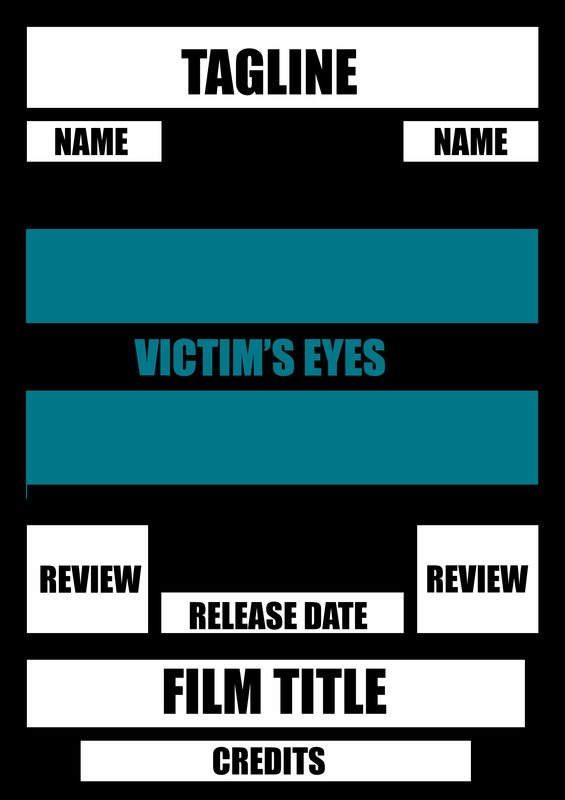
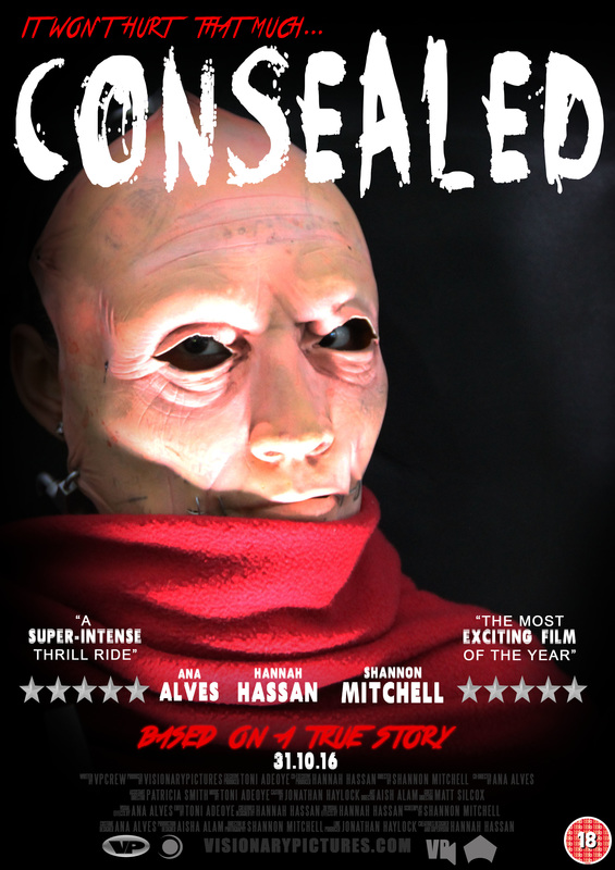
This digital draft is the opposite to the previous in terms of purpose. Rather than acting as a threat, the distressed victims eyes will act as a fright for the viewer revealing part of the effects, still maintaining the theme of secrecy as this is what will keep our viewer most curious.
|
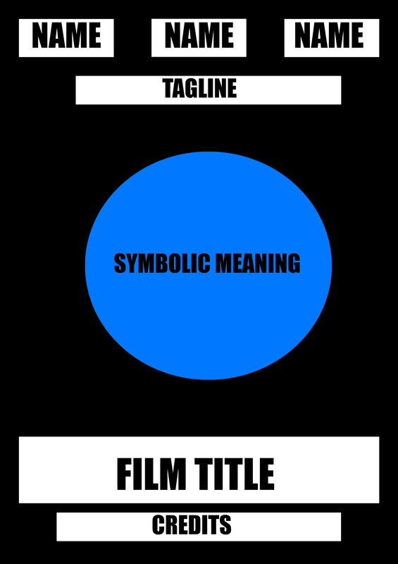
This poster follows the typical layout of any film poster in regards to having the actor/actresses names at the top with the credits directly below the film title. However as a horror poster I would need to tweak this in some respects as most horror posters follow their own layout to reflect the genre of their film.
|
POSTER TYPOGRAPHY DRAFTS
Here I am experimenting with the positioning of typography, size, style and colour. This will help me come to terms with what suits my horror film concept and sub genre more and is more appealing to our audience.
|
|
|
|

|
POSTER FRONT COVER DEVELOPMENT

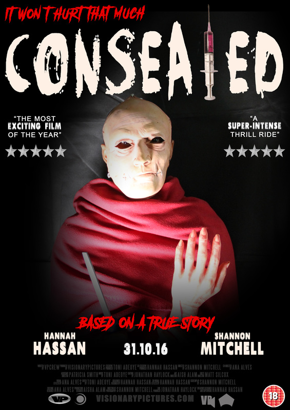
STAGE 1: This is my background which I colour edited using Photoshop Cs6.
|
STAGE 2: Next I placed my image over the background and using the gradient tool in black I blended the image into the background.
|
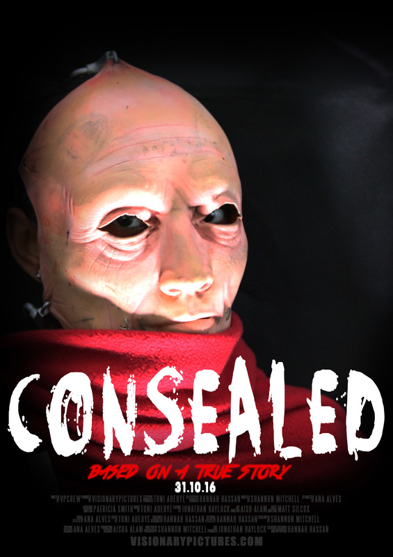
STAGE 3: I then began to type my film credits using the steel tong font. I created my title, dateline and my "based on a true story" by downloading font from dafont.com.
|
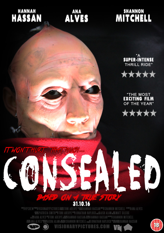
STAGE 4: Lastly, I included my tagline, star power and film reviews. I arranged them in a visually aesthetic manner for the target audience to be attracted. I inspired this structure from existing horror film posters.
|
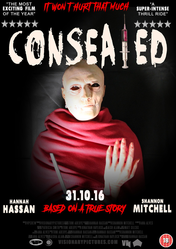
Stages: The first stage is a my photoshop programme with a black background. The second stage is placing my image onto the document and using the gradient tool to create a black back ground which slowly blends into the image for a cleaner touch. I then typed up my film credits using the steel tong font. I also downloaded a splatter inspired font for my film title. Using a different font I typed my tag line. The last stage is adding my film production, distribution and sounds logo with my film certificate. Then I used a standard impact font to type my actors and actresses names along with my film reviews.
MAGAZINE MEDIA TEXTS
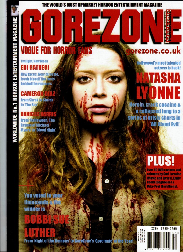
We weren't a big fan of this magazine in particular in comparison to all the others, however I chose to analyse it as there are few elements we wish to incorporate within ours, such as the "PLUS!" box and the writing across the letter E in the title.
|
I love this cover in terms of colour scheme, the green and purple contrast is very sinister. Moreover,the way in which the title and tagline have been placed are very engaging for the reader, as it the boxed main coverline.
|
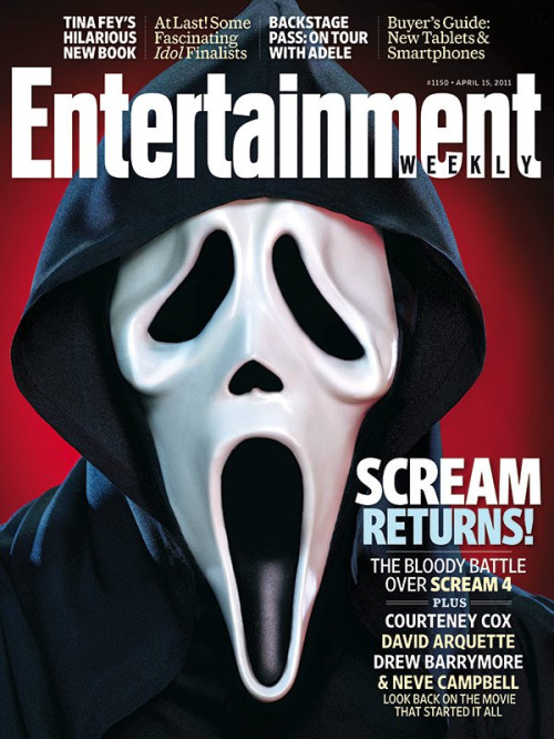
This is one of our favourite layouts. It deviates from the normal layout of any magazine, the coverlines on top of the title and the main coverline in the right hand corner. The font used is very bold and clear and the light blue compliments the navy hood.
|
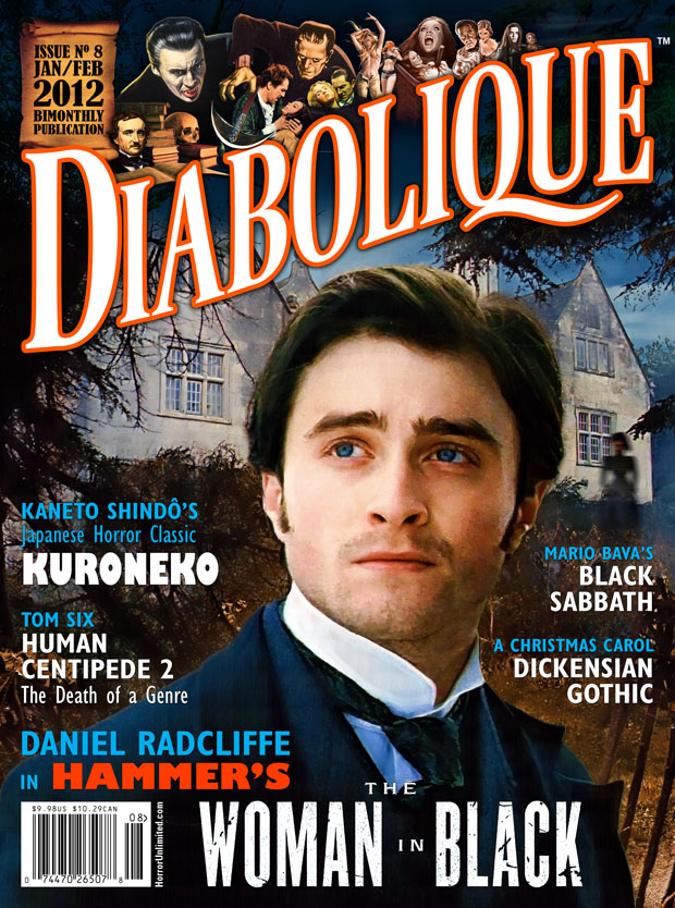
I liked the colour scheme in this magazine as it isn't the typical horror magazine colour scheme-dark reds, blacks, and greens. Also the main image includes the setting as well as the protagonist.
|
I like the font in this magazine, the main title comes down the page quite low, taking up a lot of the cover, I also like the way the tagline is in between the top of the title. It looks very clean, few coverlines, just image based.
|
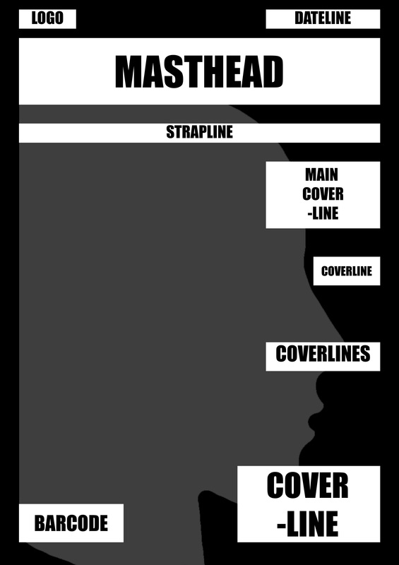
MAGAZINE DRAWN DRAFTS
These are a set of digital drafts which I based on my drawn drafts to narrow down to 4 digital drafts from which I will choose which ever looks visually more engaging as my final design. I created these using Photoshop.
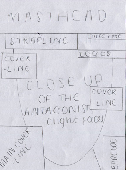
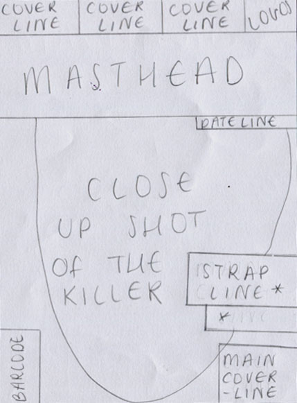
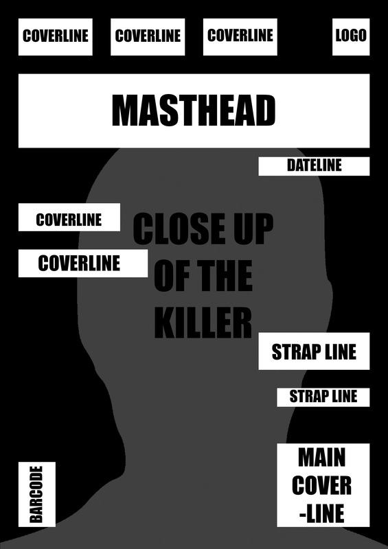
LAYOUT 1: To reflect the mysterious nature of the Antagonist I placed them behind the masthead and strap line, alluding to a hidden killer. A close up shot seemed best for this as through the antagonist's NVC we will be able to almost feel their presence. This relates to the on going fear of the unknown with all horror films.
|
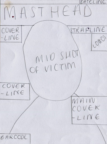
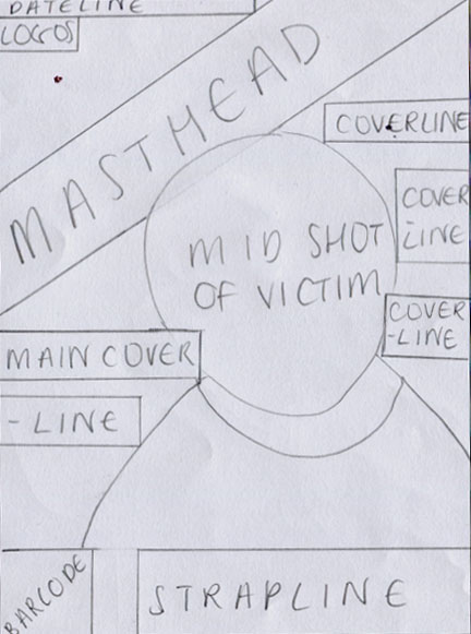
LAYOUT 2: The subject is featured over the masthead and strap line to draw all attention to them. This is the victim, the character central to our story line so it is mandatory we create this focus point by placing them over the text. This is very simplistic, yet clean as I found with the Gorezone poster it was cluttered with too much text.
|
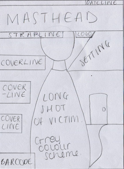
LAYOUT 3: Inspired by the Diabolique magazine cover I decided to incorporate setting to the shot. This works as an establishing shot and enhances the horror genre, placing it behind the victim is key allows the reader to create a clear link between the troublesome events that occur during the film and the setting.
|
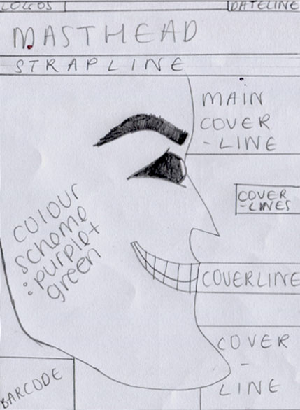
LAYOUT 4: This side profile close up shot, builds on the fear of the unknown and the mystery within antagonist. Yet also, this builds curiosity for the audience, convincing them to watch the film. The masthead and strap line were placed over the subject as it is already taking a great amount of space, it doesn't cover any facial features either.
|
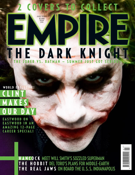
LAYOUT 5: Similar to layout 1, I hid the antagonist behind the masthead. However, this time I altered the layout in terms of typical places to put conventions. This was mostly inspired by the Empire magazine front cover, with the cover lines above the masthead. Although uncommon and different I find it will help our magazine differentiate itself from other students.
|
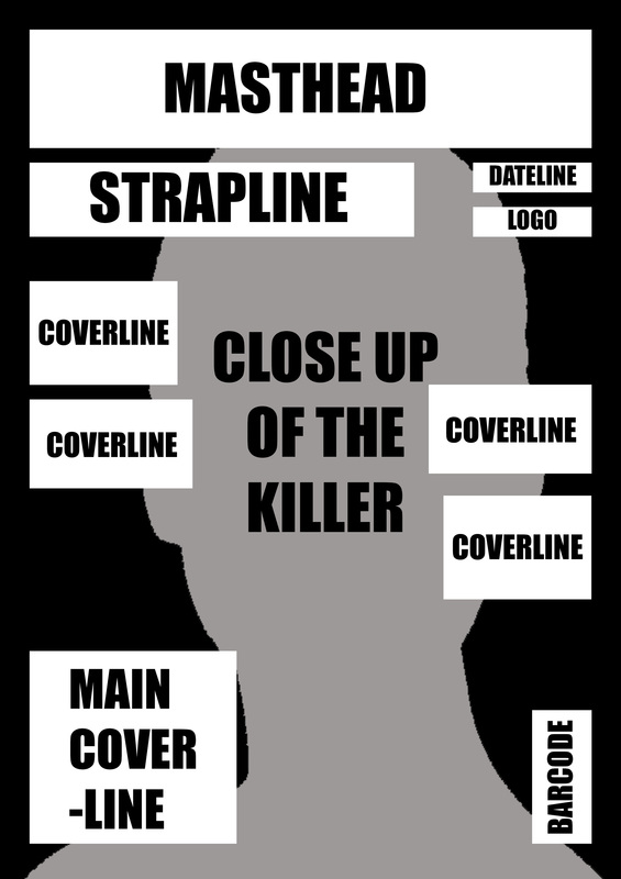
LAYOUT 6: Layout 6 is largely inspired by the Diabolique magazine's masthead positioning. The diagonal masthead differs from the traditional top central convention and depicts a strap-like image. This I believe creates a more focal point despite not being central, it takes its left corner of the magazine in a visually engaging manner. Furthermore the strap line at the bottom is an original function.
|
DIGITAL DRAFTS
These are my digital drafts put into a more visual perspective using Photoshop. I have included typography and experimented with various layouts to decide which of these we should base our final design. I also included my test shots in my poster typography drafts to visualize which shots would suit the layout best, I included a close up, mid shot and extreme close up.
I based this digital draft on the Entertainment magazine layout, with the coverlines on top of the masthead. For a different element I chose to place the strapline above the main coverlines as a pose to under the masthead.
|
This digital draft is arranged in a balanced way, the coverlines and elements are even on each side for an aesthetically attracting look. The dateline and logo are sized against the strapline to enhance this clean look.
|
I included a side profile shot to enhance "the fear of the unknown" which is a main element in the horror genre, as you can see it is all very right hand sided to cover certain facial features for mystery whereas the main part of the face is clear.
|
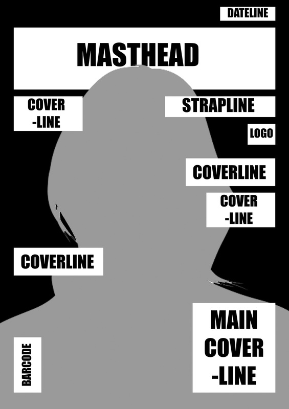
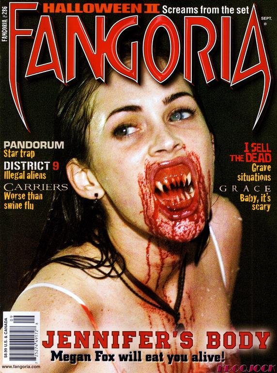
I based this digital draft on the Gorezone magazine, however I did not include as many coverlines as I found it looked too untidy in the Gorezone magazine. The main coverline is placed in the right hand corner as it is the point which attracts more attention.
|
MAGAZINE TYPOGRAPHY DRAFTS
Here I am experimenting with the positioning of typography, size, style and colour. This will help me come to terms with what suits my horror film concept and sub genre more and is more appealing to our audience.
|
|
|
|
|
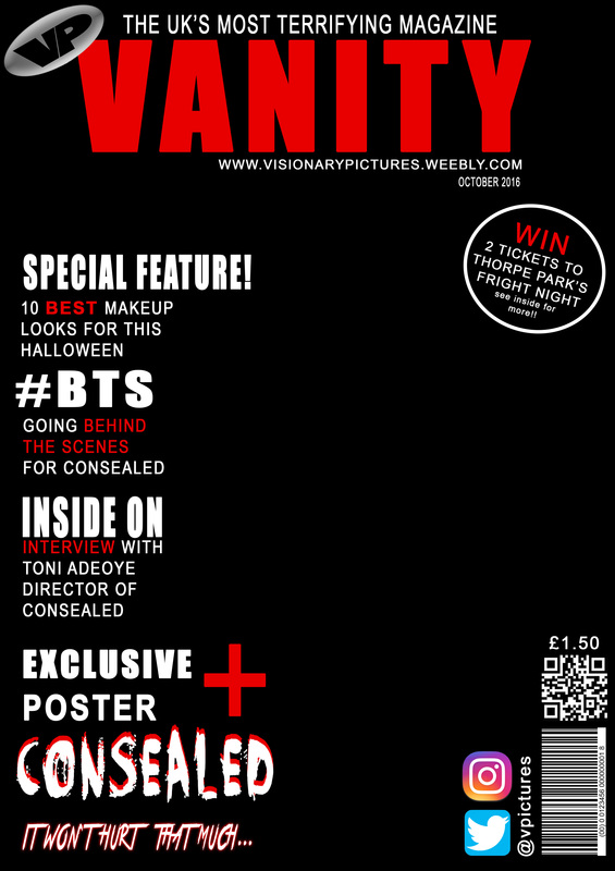
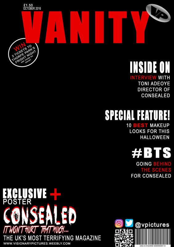
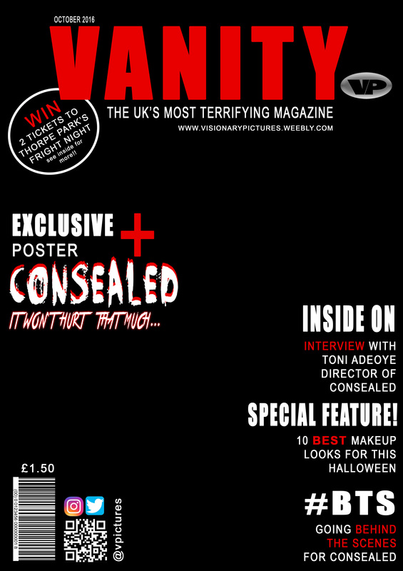
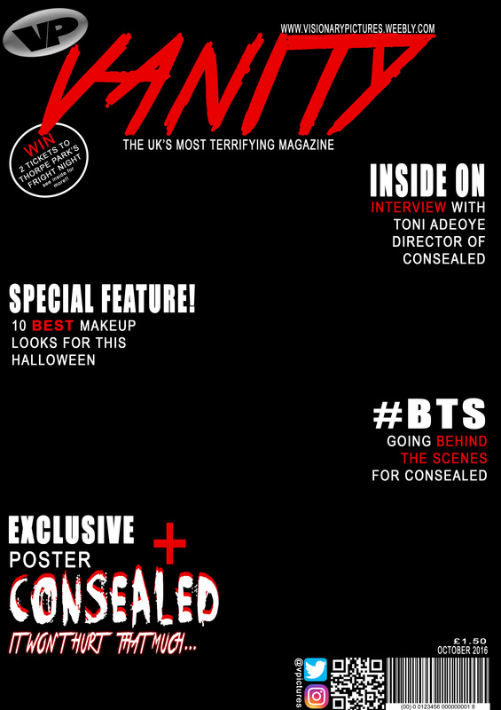
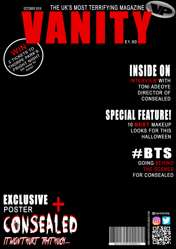
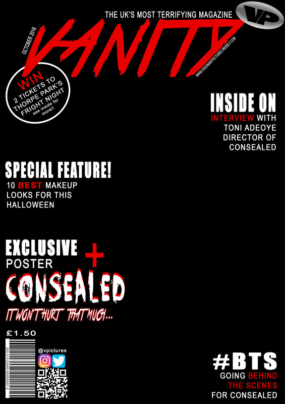
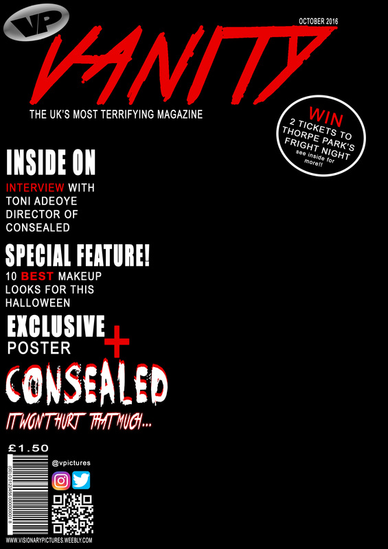
MAGAZINE FRONT COVER DEVELOPMENT

STAGE 1: This is my background which I colour edited on a Photoshop file.
|
STAGE 2: Here I began to form the magazine, creating the title, strapline, website and date of issue.
|
STAGE 3: I then included my QR code, bar code, social media logos, price and twitter @ name to promote the film's hashtag search on social media.
|
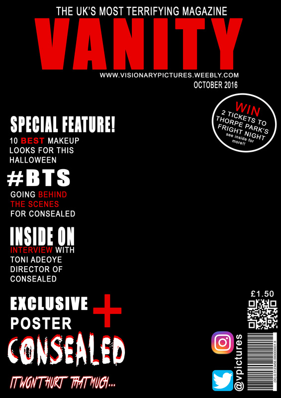
STAGE 4: Lastly, I include all my coverlines, main coverline and hashtag using the iconic font in which readers will recognise my film from.
|
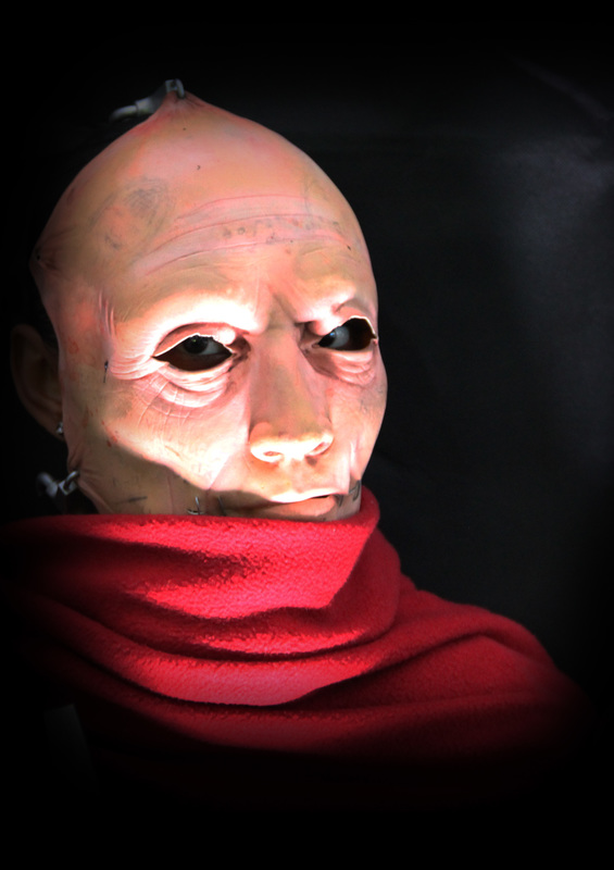
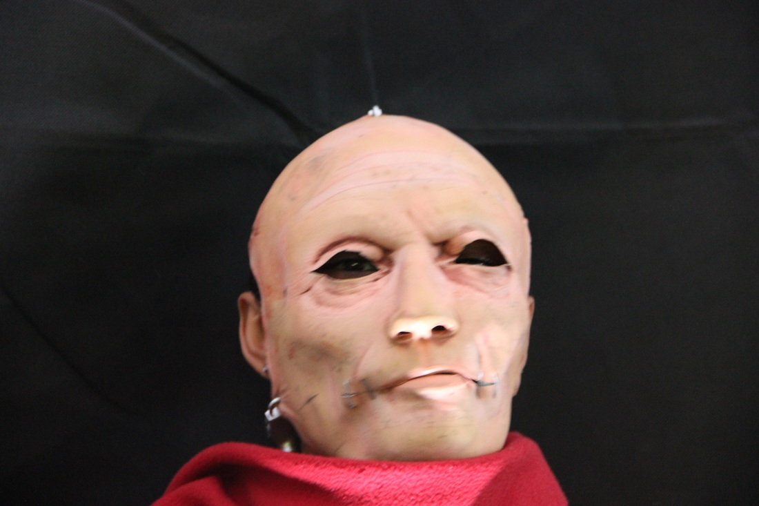
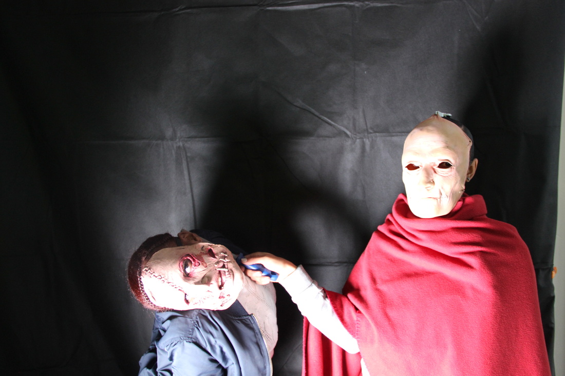
TEST SHOTS
This is a slideshow of our test shots we took in class for our magazine and poster. We experimented with different lighting to see what will work best for our final shots, we also experimented with props for the victim and aggressor to see how effective it looks with masks as a pose to makeup. We will also experiment with makeup as we believe that will look more effective with the lighting as well as realistic. The camera we used was the Canon 600 D.
IMAGES I LIKE:
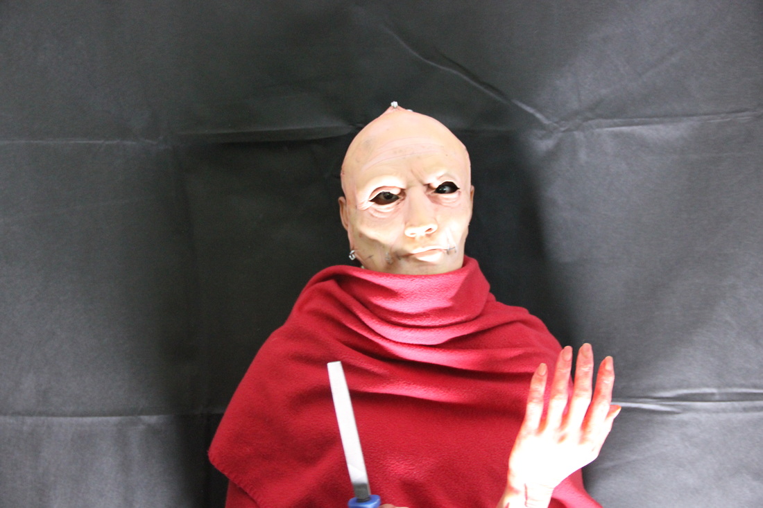
I like the camera shot captured in this image. The mid shot captures all the needed elements, such as the iconic weapons, body parts and the antagonist's body is hidden to create a sense of realism.
|
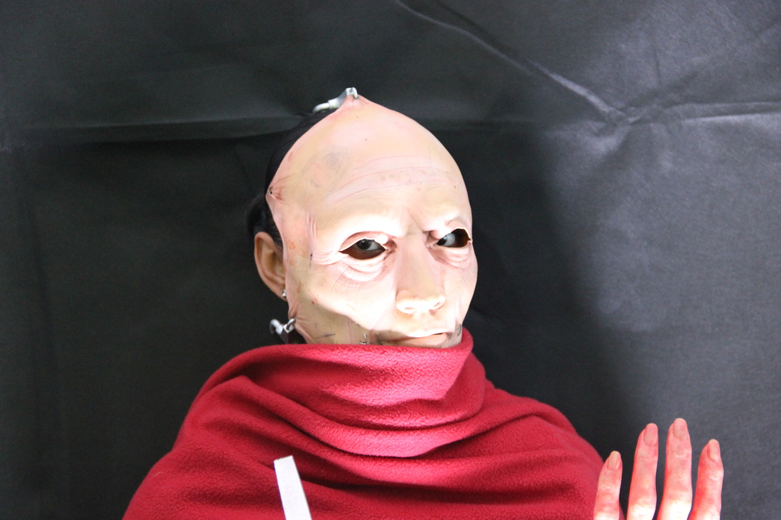
I like the way in which the close up shot is very focused on the antagonist's eye contact with the camera which imposes a threatening effect. The lighting in which the image was captured is also perfect, as it illuminates the face.
|
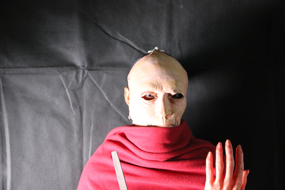
I like the weird lighting in this picture as half of the picture is illuminated and the right side is darker, conveying this concept of the 'dark side' within a horror film. I believe this use of lighting is effective although different.
|
DISLIKED IMAGES
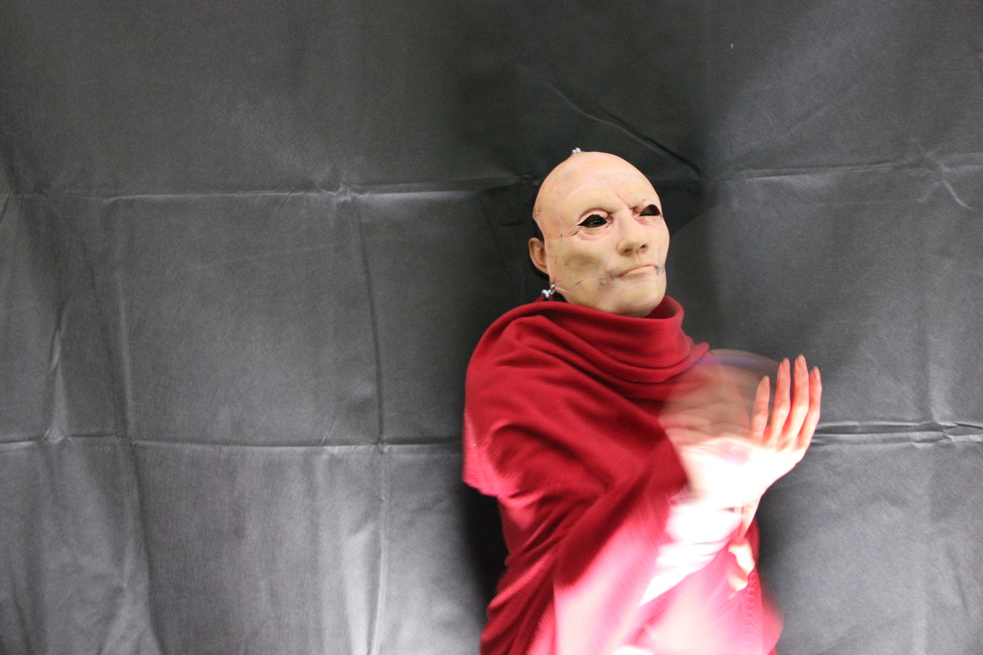
What we did not like about this picture is how unfocused it is on the antagonist's movement. Perhaps using shutter speed would have been better.
|
This image is taken at an awkward angle, slightly tilted. It was meant to be an extreme close up, as a result the eyes aren't very visible which defeats the threatening effect.
|
This picture captures the wrong lighting. As you can see both the protagonist and antagonist's facial features are hardly visible due to the high brightness. Conveying NVC is one of the most important features for us in our image.
|
