
|
|
In What Ways Does Your Media Production Use, Develop Or Challenge Forms Of Conventions Of Real Media Products? |
|
Question 1 of the evaluation is asking us the ways in which our final products compare to the real media products, referring to inspirations we use for existing horror content and how we either developed or altered it in the enablement of achieving high marks, as well as engaging our target audience and meeting their expectations at all times. To maintain high marks where possible, it is useful to refer back to our textual analysis, in which there is a list of conventions that may apply to our sub-genre. Therefore, we'll be able to make clear signification of the continuity accomplished between our sub-genre and our final products.
Conventions are familiar and predictable forms and techniques use by the media to communicate specific ideas. These rules can be developed and changed but have to maintain a recognisable structure for the intended audience. Below demonstrate are existing real media texts which feature conventions alongside our final products in which we have followed these rules and also developed and altered them.
|
|
POSTER CONVENTIONS
|
|
|
|
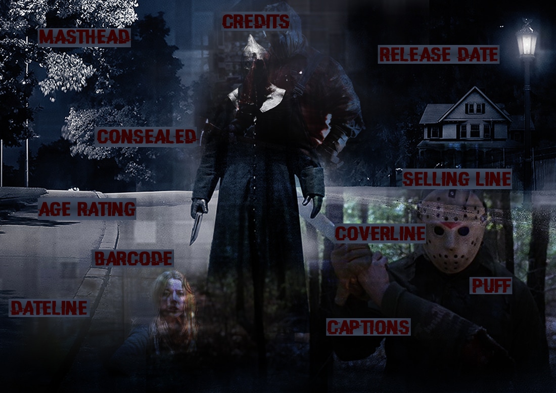
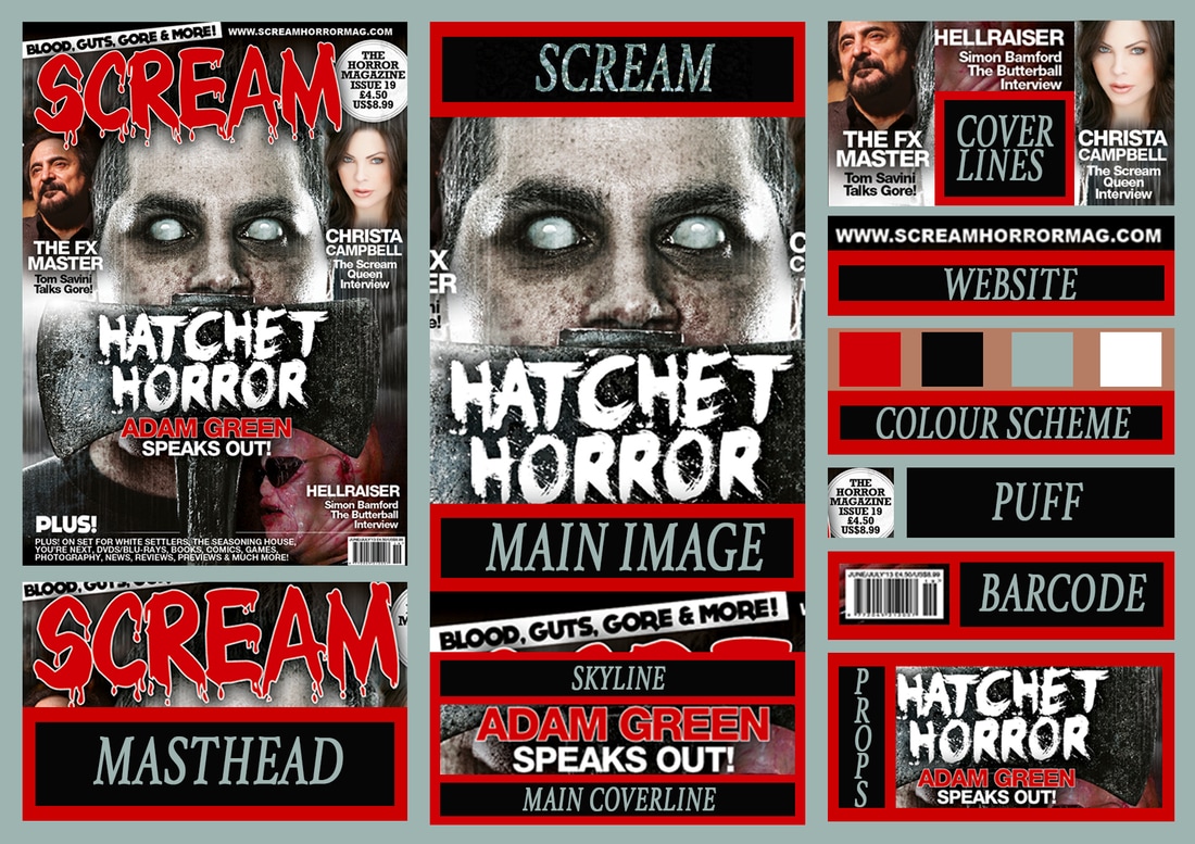
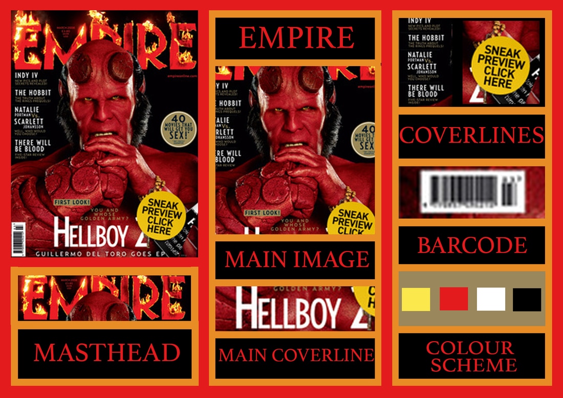
The following diagrams illustrate our research on poster conventions in which we divided into sections by dissecting different parts from existing real media text. From this research we have realised most of them were applied to our own poster, therefore this shows its importance to the viewer. Bellow you will also see our poster where we have made a diagram showing conventions we followed, developed and changed.
|
|
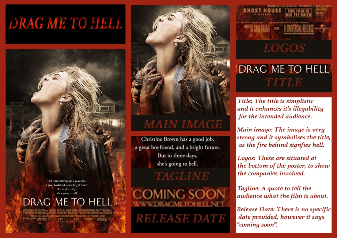
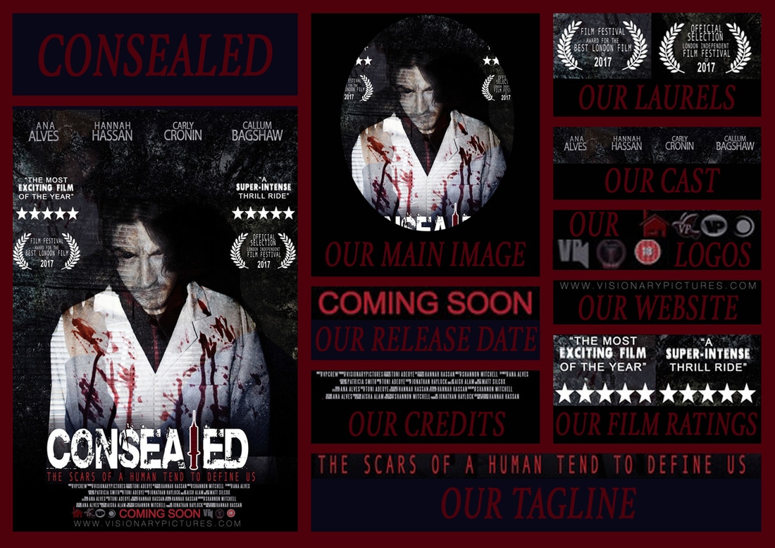
USED
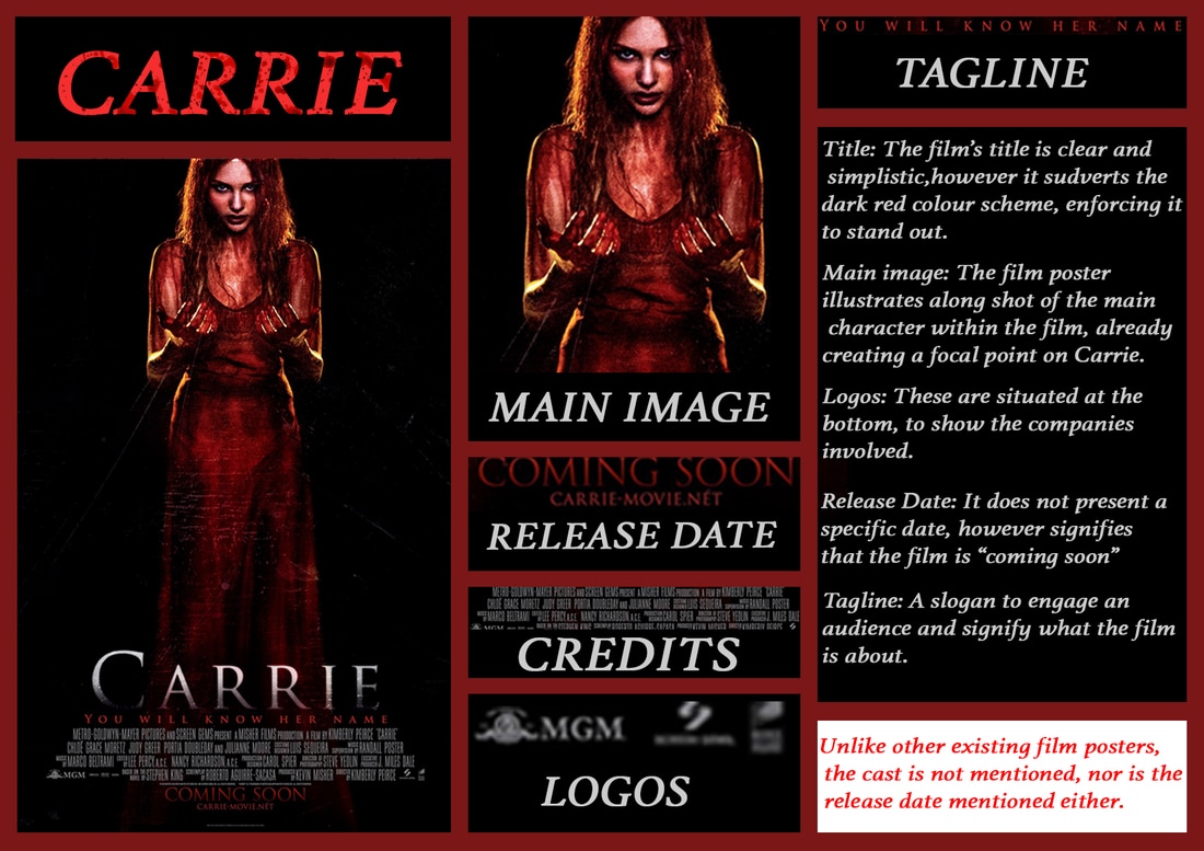
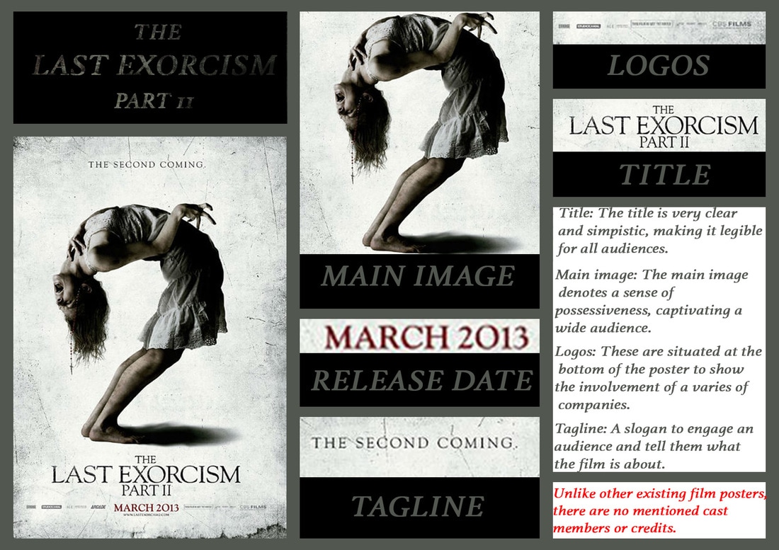
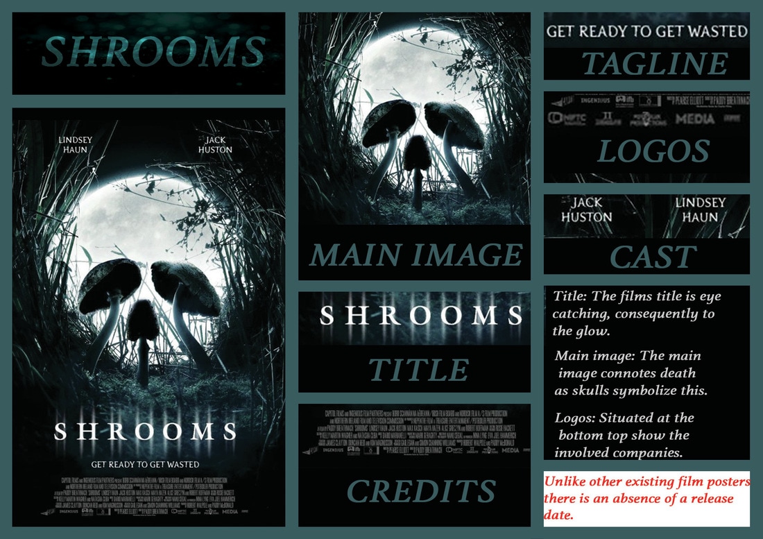
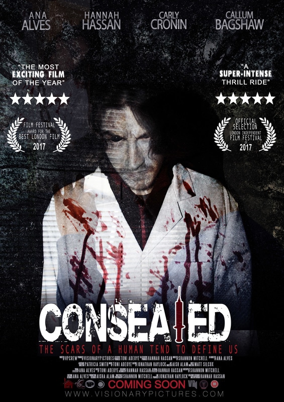
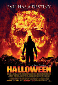
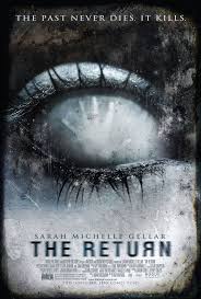
Above shows our movie poster CONSEALED which are divided and cut up into different elements, illustrating the conventions that we used. In similar ways to the real media text we analysed they all feature a Large title across the poster, however we decided to change the generalised location of it situating at the top, but rather being 1/3 down from the bottom of the page. Our group decided on a effective title and colour scheme for presentation purposes as the running colour scheme on our website matches. In similar ways to the 'Halloween'' film poster we preferred the use of red tones, nonetheless we came to a conclusion to use darker ones, hence why our main colour scheme is formalised on the use of burgundy.On the 'Halloween' poster the creator uses an image from the film of the main character and the antagonists' mask floats in the background while smaller images are positioned within the bigger image. We kept the convention of mentioning the cast members as we thought it be a good idea to give credit to the principle cast just like the 'Scream' poster which we both placed under the film title.
DEVELOPED
In regards to development, our grouped developed the following conventions: our title, the main image and website. As a group we thought our title needed the most attention as this is a dominant feature for the targeted audience to being engaged. We thought the more different it looks- compared to the standard simple text and bold letters as we have come to see a lot during our research of existing horror posters for example the 'Halloween' poster - then our audience would be more eager to watch the trailer. Our sub-genre of slasher influenced the ways in which we played around with our title on Photoshop, purely because we deeply aspired for our title to replicate our surgical theme revolves around the plot of our trailer. We recognized that our poster had to have the ability to allow the audience to infer on what our trailer would be about. This is why we manipulated the letter "L" into being portrayed through the syringe, as the syringe is an iconic weapon used within the trailer.
CHALLENGED
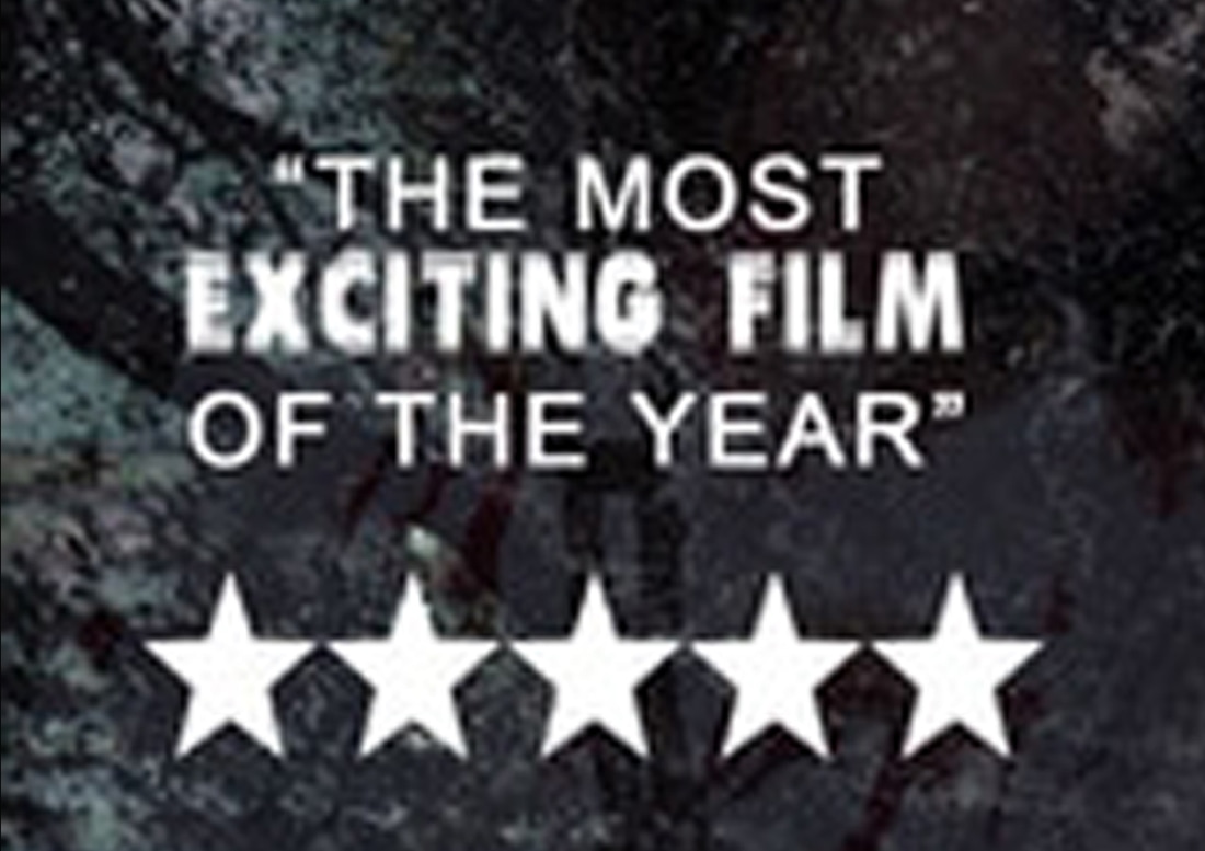
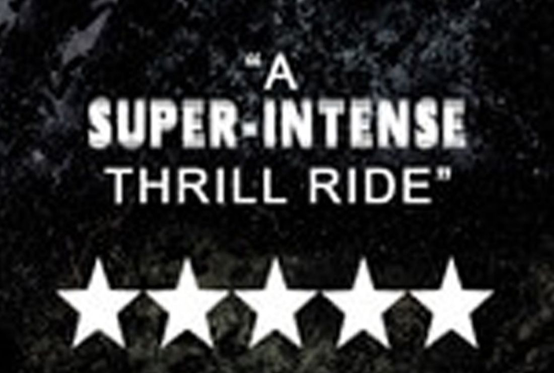
As a group, we felt that we didn't make a lot of alterations to the poster conventions as we had rather keep it simplistic but we decided to add the following: Critics Quotes. This promotes a sense of encouragement for the intended audience to watch our final products.
|
|
|
|
|
|
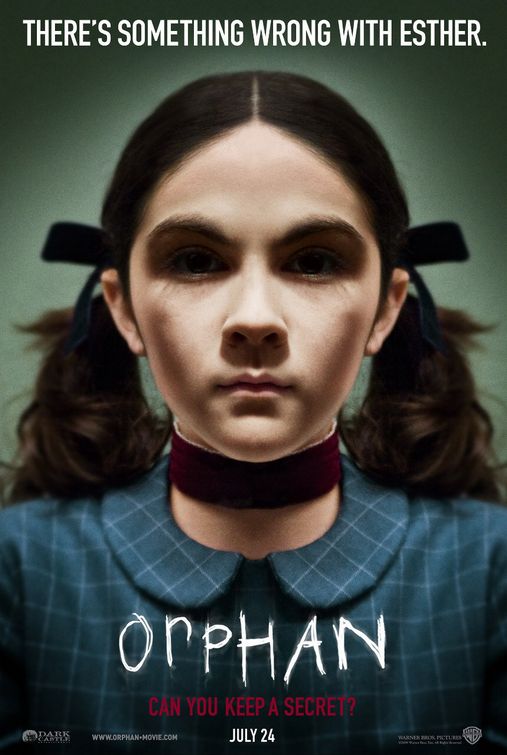
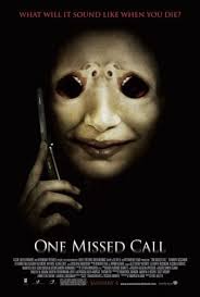
The images incorporated are illustrations of posters that position the title within the centre of the page, however at the bottom. This inspired us to follow the same conventions by keeping our posters title in the centre and positioned at the bottom of the page, in order to signify a realistic and dominant approach. The film "Orphan" influenced our concept the most in the beginning, although this altered a bit, we recognised that the movie poster for Orphan had been placed in the middle, at the bottom of the page. Therefore, we felt courageous to do the same, even though the our influence of the actual film had been altered.
|
|
MAGAZINE CONVENTIONS |
|
|
|
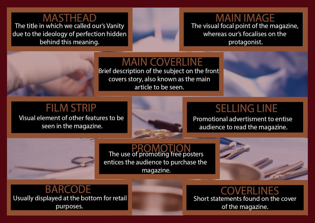
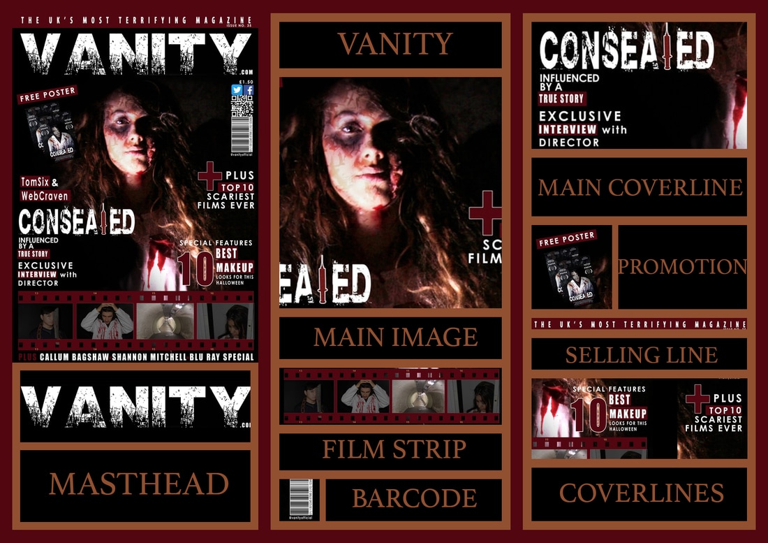
The following diagrams illustrate our research on magazine conventions in which we divided into sections by dissecting different parts from existing real media text. From this research we have realized most of them were applied to our own magazine, therefore this shows its importance to the viewer. Bellow you will also see our magazine where we have made a diagram showing conventions we followed, developed and changed.
|
|
|
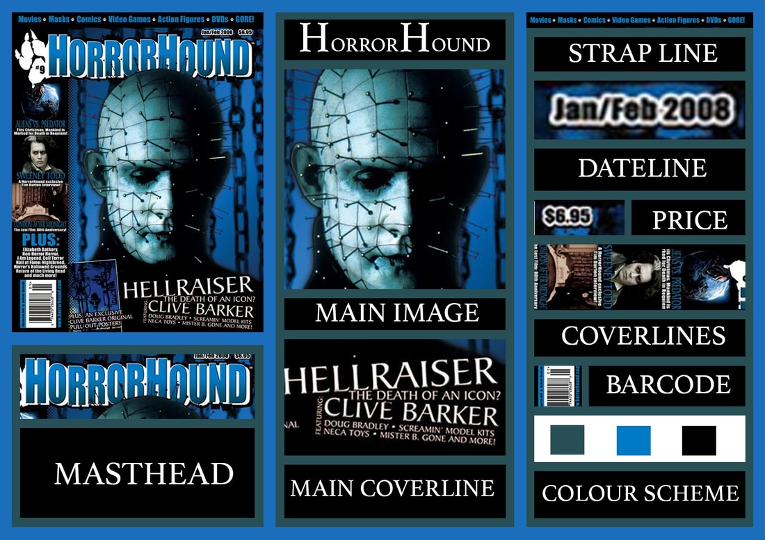
USED
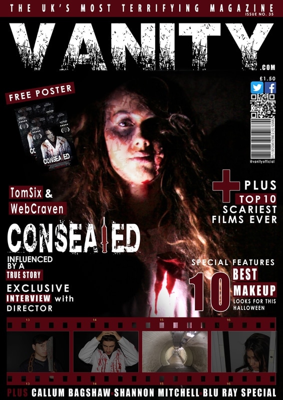
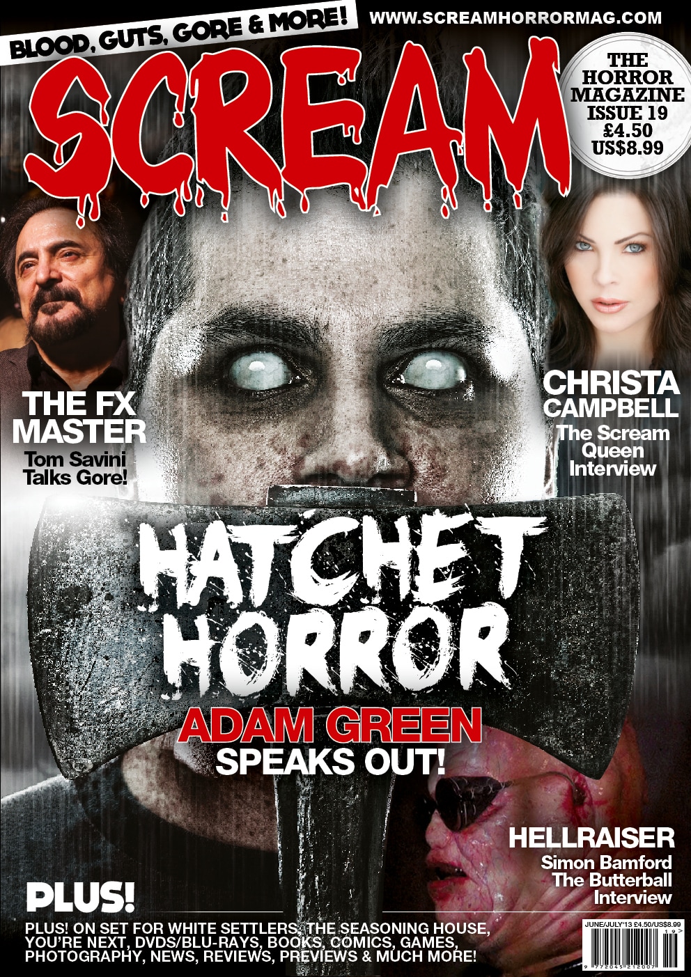
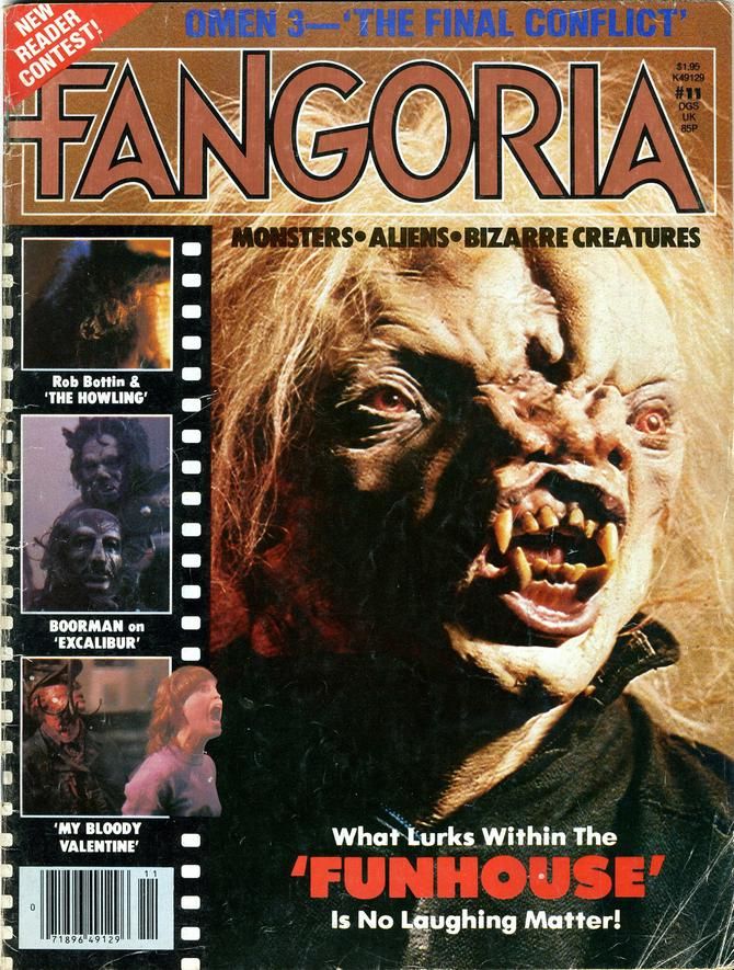
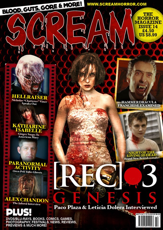
As viewed above, our group researched existing horror magazines which are split into sections to critically analyse the common conventions followed. This was highly significant as it effectively opened our eyes to the similarities that we had been able to retain that are projected on real media texts in which we had used an influence and inspiration. The use of a bold font had reminded us of the "HorrorHound" magazine's masthead as theirs is also bold and simplistic, yet it still portrays horror through their desired colour scheme. With that being said, our title replicates a black and white colour scheme to denote a sense of horror but always retain it's simplicity by not using bright colours. Also, the incorporation of a film strip allowed us to add a visual element to our magazine, as the consistency of writing can become disengaging for an intended audience. Furthermore, we used a selling line to promote our magazine whilst maintaining the audiences engagement where possible.
|
|
|
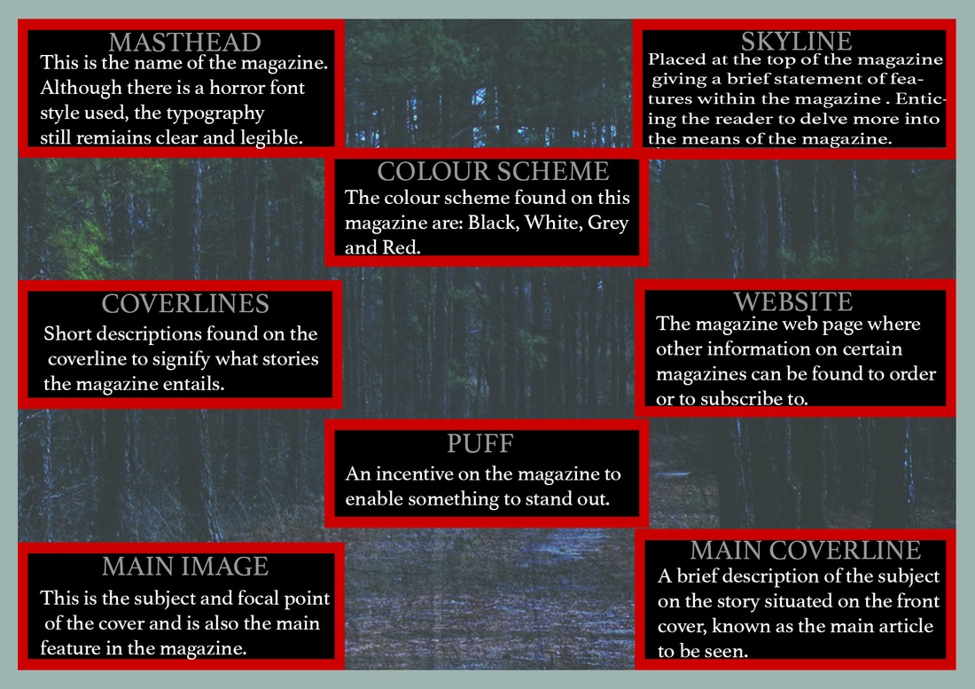
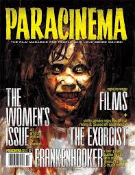
The following images on the illustrate other existing horror magazines where the masthead typography design is unique and remains memorable on the the other issues released. The scream magazine also illustrates how the main cover line is kept more visual rather than having more text which can put viewers off from continuing to read further. For this reason we wanted to keep or magazine front cover engaging as possible. Another similar trait with the magazines is the use of the colour red, yellow, white and black which are bright colours which keeps the the page vibrant on the black background ,while the brightness and contrast are kept at a good level in order for the main image to stand out.
DEVELOPED
|
|
|
As a group, we anatomized the magazine conventions critically, by segregating specific conventions and choosing which ones to incorporate into ours. We felt the need to include a film strip as there weren't many visual elements which provided the reader with information, as we chose not to include visual cover lines. Therefore, the film strip suggests allows the audience to infer into the articles located inside. The reasons why we placed social networking apps is because our generation overly use different social media to communicate with different people therefore for viewers to know that they can talk about the product or find more about on the a social media page, makes it more engaging and allows them to ask questions to the company.
CHANGED
As a group, we felt that we had not made many changes in terms of conventions, but followed them because altering it would potentially confuse our viewers. Nonetheless, we did develop it more in order to distinguish our selves from other existing magazines.
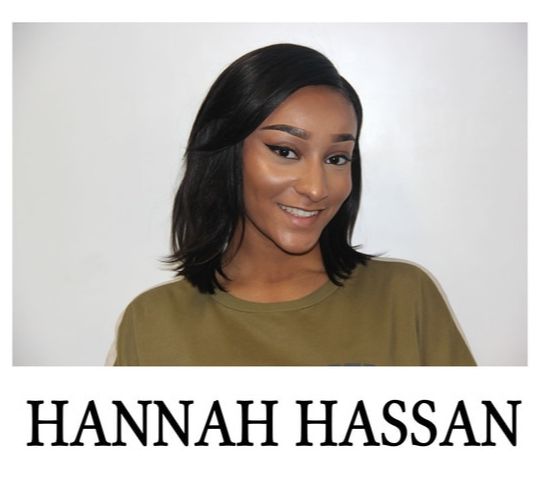
This is a visual aspect of one of our group members Hannah who is analyzing the conventions used for both our poster and magazine.
|
|
TRAILER CONVENTIONS |
|
|
|
|
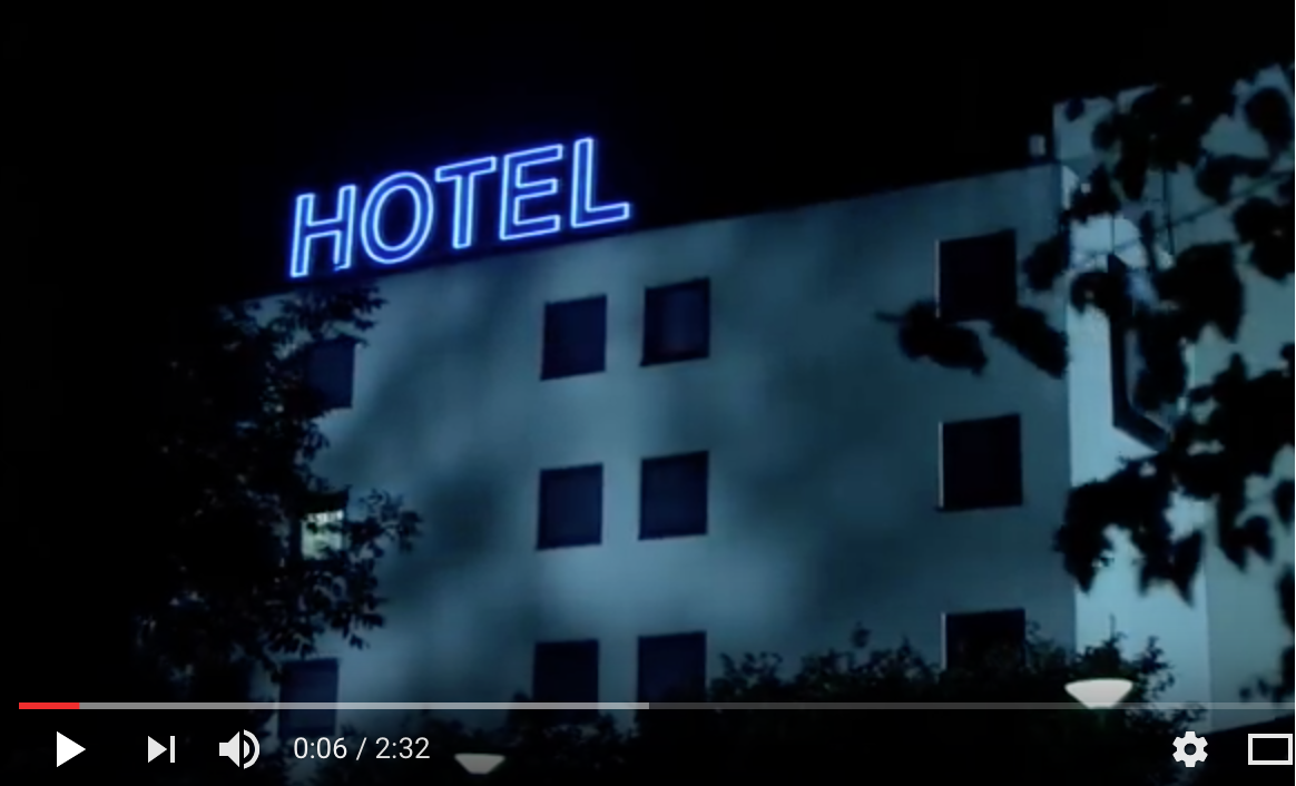
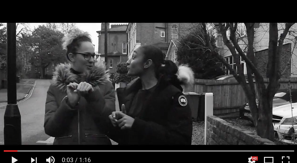
Our trailer comparison is The Human Centipede: As there are similar visual aspects between the two trailers. Therefore we have analysed the following elements that correspond most prominently. Such as the beginning of "The Human Centipede" opening with an establishing shot to give context referring to the surroundings. However, in our trailer we open with the bbfc certificate followed by a mid-shot.
|
THE HUMAN CENTIPEDE - TRAILER

Below are two establishing shots from The Human Centipede.
|
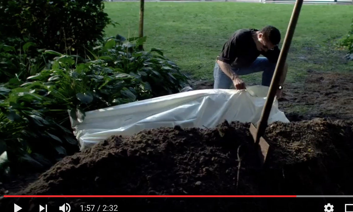
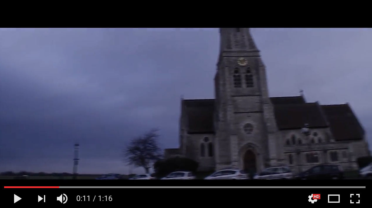
CONSEALED - TRAILER

Below are two establishing shots from Consealed.
|
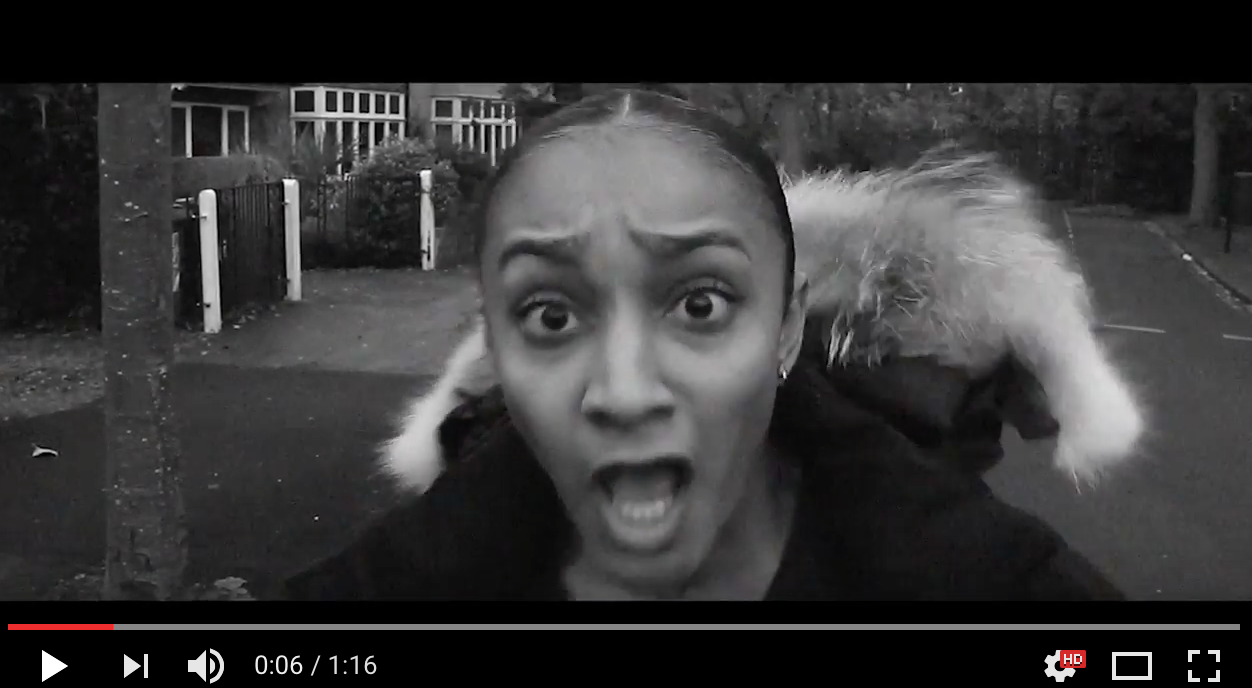
Extreme close ups of faces were used in 'The Human Centipede' trailer and our 'Consealed' trailer. We believe this shot enhances the importance of the most renowned characters within the trailer, and amplifies their use of NVC at specific points. Also, extreme close ups do not always have to focalise on a specific character but it can be of a symbolic object to help add additional information.
|
|
Wide angle shots are significant when creating awareness of the main characters and stock characters for the intended audience.
|
|
Zooming in and out is a key feature to intensify a reaction mainly to impose jump scares upon an audience.
|
|
|
Captions From: The Human Centipede
|
Captions From: Consealed
|
|
|
EDITING
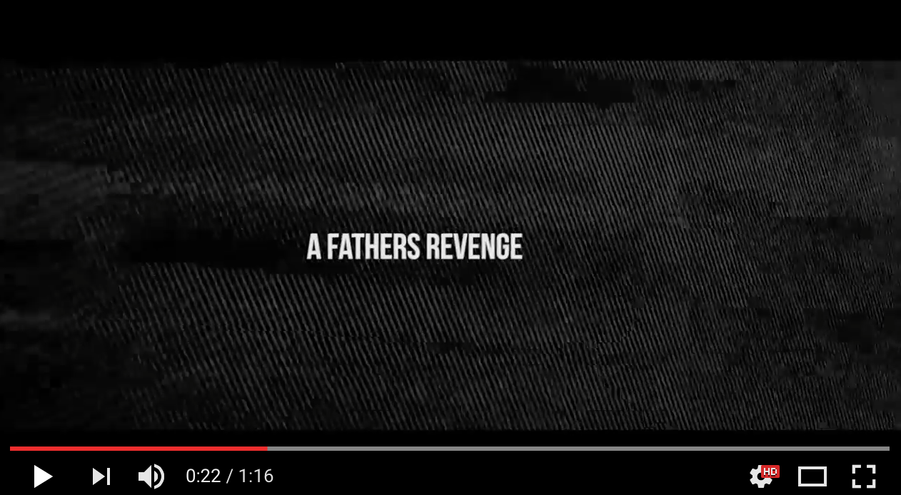
Our film Consealed is edited in a sequence format, where there are a series of shots and scenes that contain a middle, beginning and end. We chose to structure it like this in order for the audience to gain a better comprehension of the concept we wanted to portray, as it is considerably complex. Therefore it begins with two best friends, one dies, therefore the father seeks revenge and captures the opposing best friend for the trafficking industry whilst destroying her physical appearance, the theme of revenge is imposed at (0.43) . Similarly sequence editing is evident in The Human Centipede also, as they're synopsis is a challenging and disturbing one, therefore it may be inferred that this was done to keep the audience aware and engaged. We further see the theme of brutality being imposed at (1:18).
|
|
|
USED
In the beginning we used wide angles and juxtaposed them with close up shots to show a contrast of the protagonists, denoting normality at first and then vulnerability. This led to a varies of establishing shots to denote a theme of death, signifying that one of the protagonists had died. As our concept is quite complicated, the incorporation of nine captions enforced a sense of comprehension and clarity upon the audience at all times. Because of this we felt that it was important to reduce the amount of information given within the captions as we didn't want to give too much away, however we still wanted the audience to comprehend our synopsis.
DEVELOPED
In terms of development, we worked on stylisation the most, such as adding a glitch to our film title at the end, and incorporating a range of vibrant colours to denote danger. Furthermore, we also worked on the background for our captions as they portray a fuzzy image, somewhat like a television that does not have an ariel. This created a horrific and daunting effect of what would follow after each caption, keeping the audience gripped and engaged. Also at the beginning, we incorporated a "fade to white" film transition in order to clarify that the protagonist had been run over.
CHALLENGED
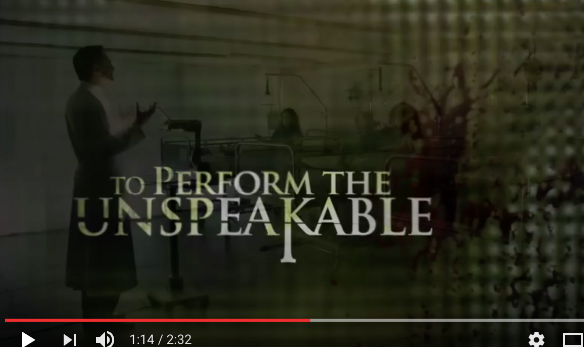
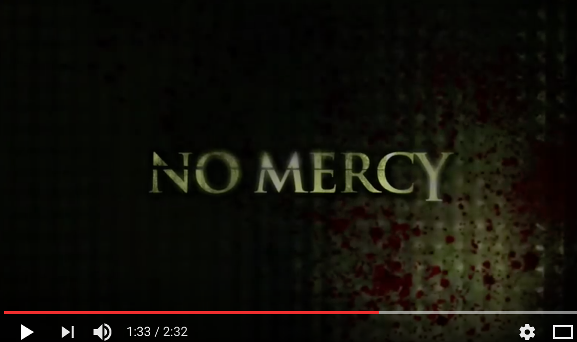
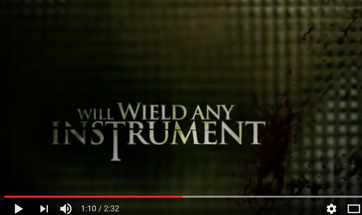
As a group we didn't challenge many trailer conventions, however we used more of others such as captions, recognising we incorporated more than the generic amount seen in existing horror trailers. Also we used more film transitions in order to tell the story, not just to promote the fluidity of the trailer.
|
|
SUB-GENRE CONVENTIONS |
|
OUR CHOSEN SUB-GENRE WAS SLASHER
COSTUME
In order for our cast to look like replicate our sub-genre, we had to research costumes that a vulnerable victim of trafficking would wear which we then applied when we creating our own costumes. We looked on the search engine google and found a range of images, as well as watching well known Slasher films.
|
|
|
|
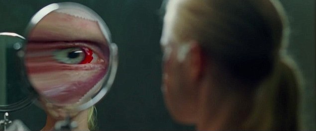
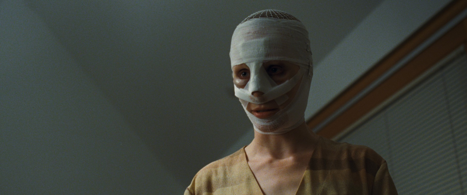
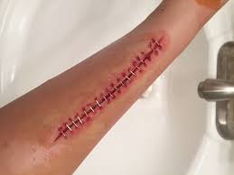
In terms of inspiration the film "Goodnight Mommy" (2014) correlated to our synopsis quite well, as it reflects surgical assistance going wrong and imposes a religious aspect upon it in order to taint the satanic spirit inside of her. Therefore we used the same concept of surgical destruction and religious connotations, however we wanted the protagonists to portray a sense of naivety, therefore we wanted them to appear more naked to inflict a sense on endangerment upon our intended audience. Which was further implied through the use of blood and sfx wounds created. Exposing more of a destructive outcome of surgery, as the mother in "Goodnight Mommy" uses red bloodstained eyes to portray this as everything else is bandaged and unseen.
|
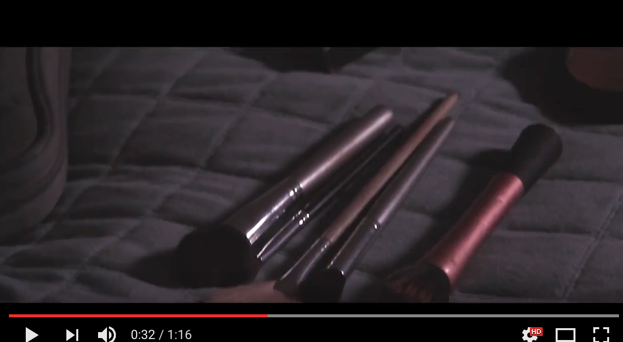
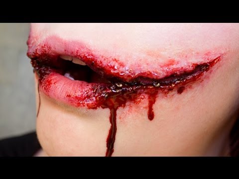
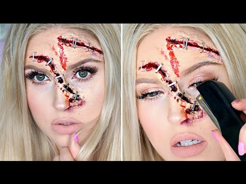
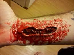
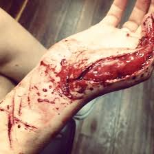
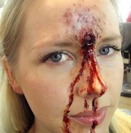
MAKEUP
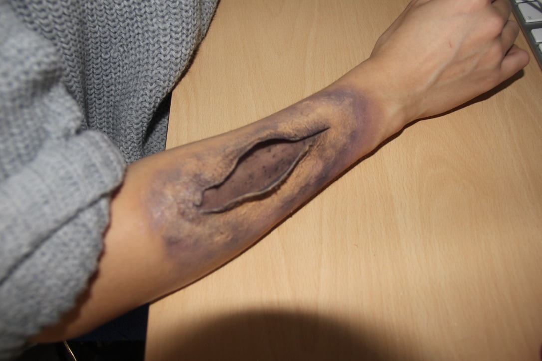
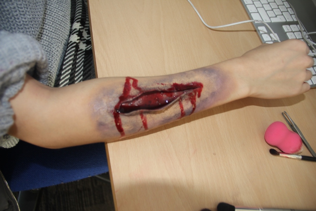
In terms of make-up our research was mainly using YouTube watching make-up tutorials which our group practiced before shooting. We also used the search engine Google to get basic pictures of how bad surgical procedures look in existing shows and films:
|
|
|
The following images and video (our own tutorial) are of the SFX wounds being demonstrated.
|
|
|
PROPS
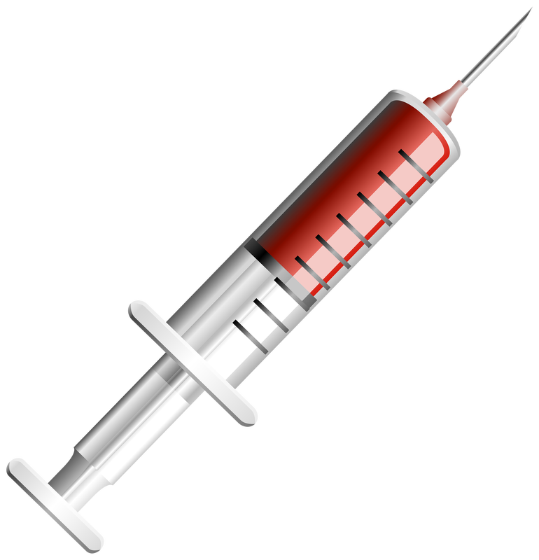
From looking at existing real media linking to our sub-genre, not many props were used unless it was a weapon used by the antagonist to victimise the protagonist. In our trailer we employed the usage of a syringe tool to drug the antagonists.
|
|
CHARACTERS
In most slasher films the victims are always being chased through the heights of escapism. However, in regards to the specification of their movements, they generally crawl, walk slow, walk rapidly or run wildly. In our trailer the protagonist captures the antagonist to denote the points of when he victimises the protagonist.
|
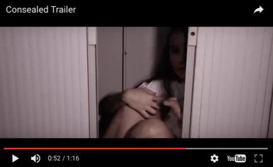
Starting from the time of 0.43-0.44 the audience can see the antagonist capturing the protagonist.
Snapshot of a a stock character to denote the antagonists previous victims.
|
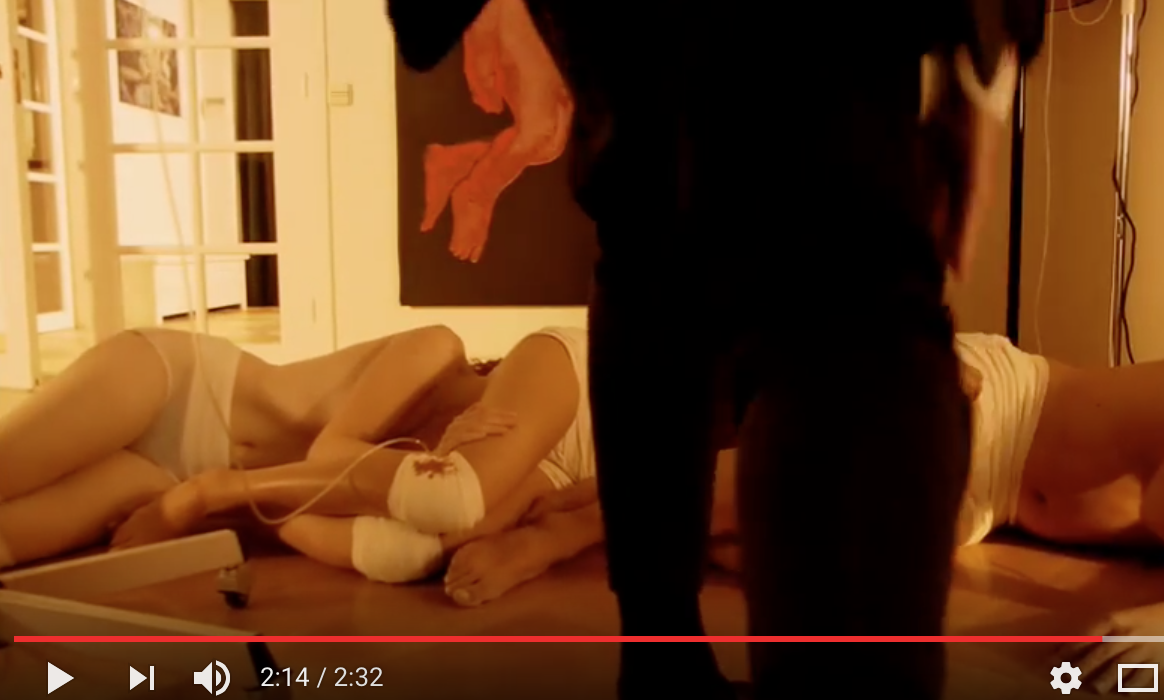
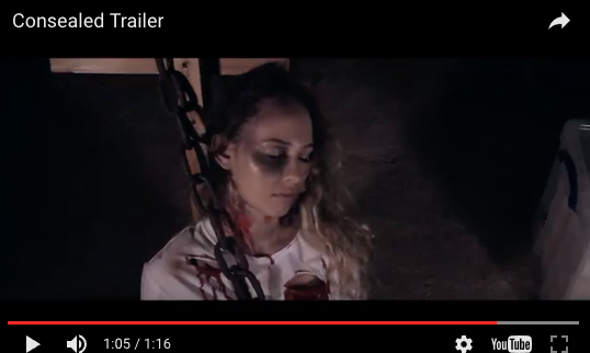
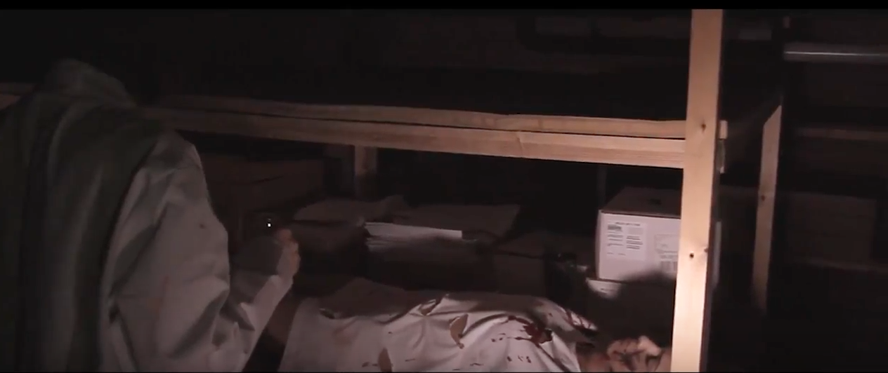
Starting from the time of 1:05 the audience is able to view the protagonist captured and chained up.
Snapshot of the protagonist to highlight the destruction already imposed upon her.
|
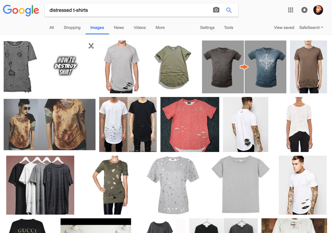
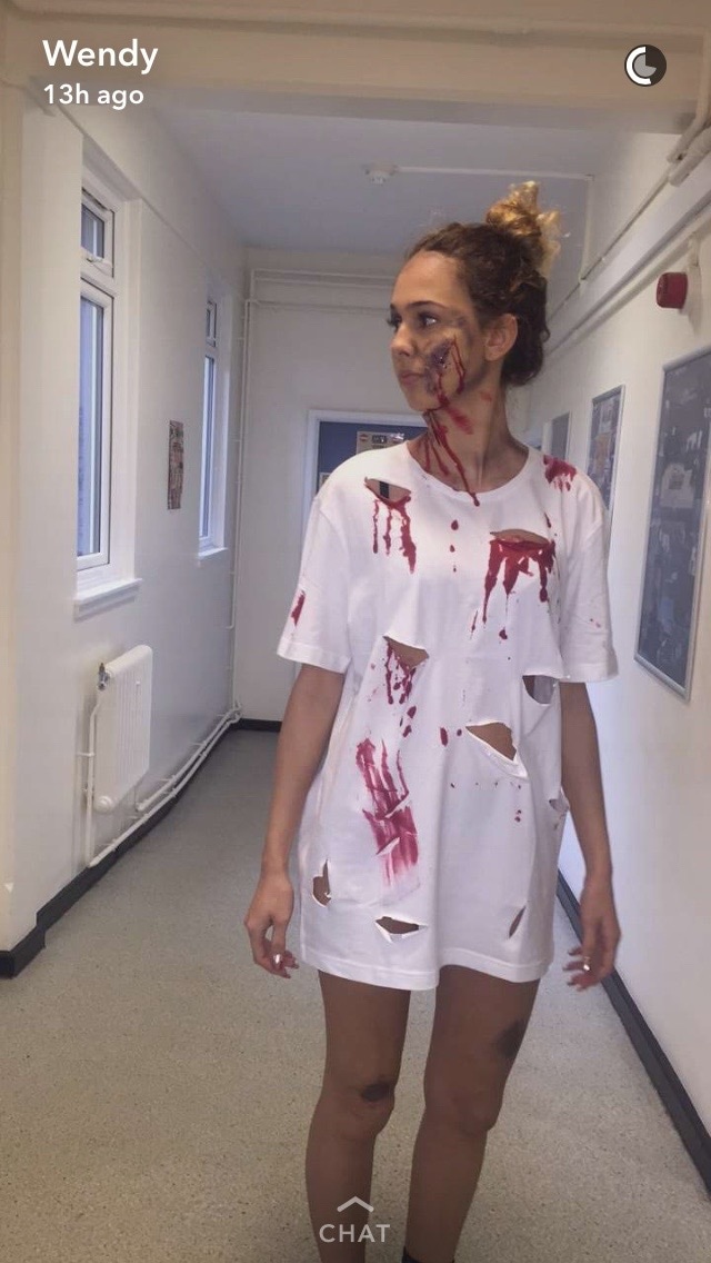
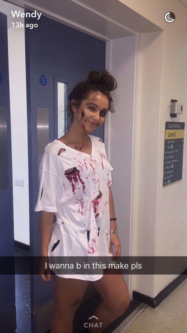
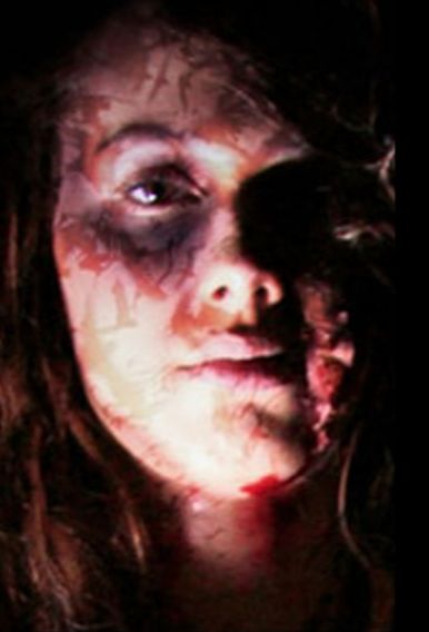
In terms of character appearances, the followed common convention were dirty, distressed t-shirts saturated in blood to signify a sense of destruction within their attempt of surgery to create perfection.
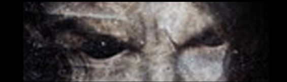
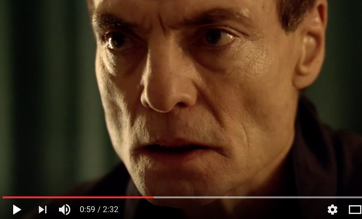
Snapshot#1: Dr. Schwarzkopf's eyes were blurred to make them appear dark as if he has no pupil, portraying a demonic appearance.
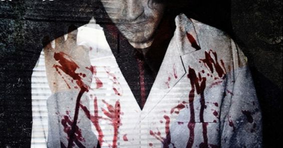
Snapshot#3: Dr. Schwarzkopf's lab coat is saturated in blood to denote his savage and diabolical doings, also denoting the normality of his surgeries going wrong.
|
Snapshot#2: Jessie's eyes are shown unlike the antagonist's to show her vulnerability, whilst her face is covered in bats.
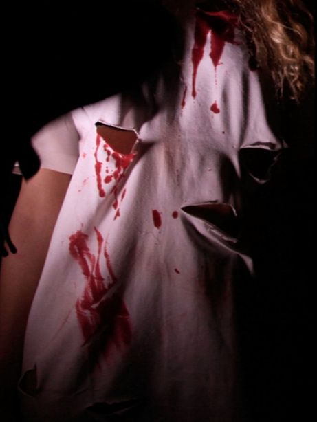
Snapshot#4: Jessie's t-shirt is distressed and saturated in blood to denote a sense of the surgical procedure not being successful.
|
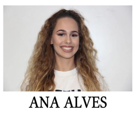
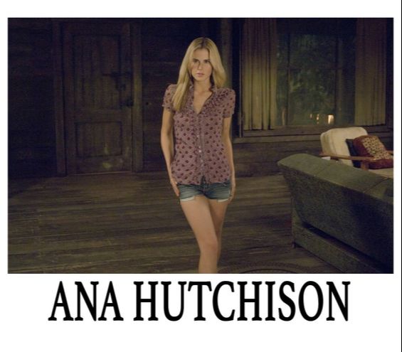
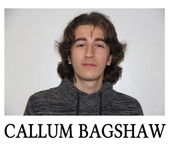
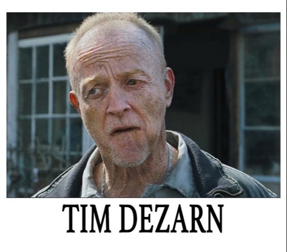
Principal characters/protagonists/antagonist from
'Consealed' & 'Cabin in The Woods'
'Consealed' & 'Cabin in The Woods'
|
|
|
|
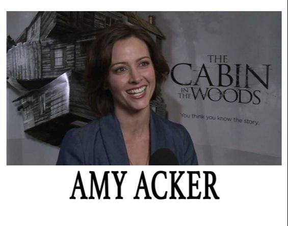
In the film Cabin in The Woods they used the common concept of Tim DeZarn evil upon the teenagers in the enablement of portraying a sense of youthfulness and naivety. We followed this same ideology as Dr. Schwarzkopf shows his power over the girls (protagonists), maintaining this original concept of men being more dominating and powerful than women in horror films. Below will illustrate snapshots from out trailer that we have reckoned to be important.
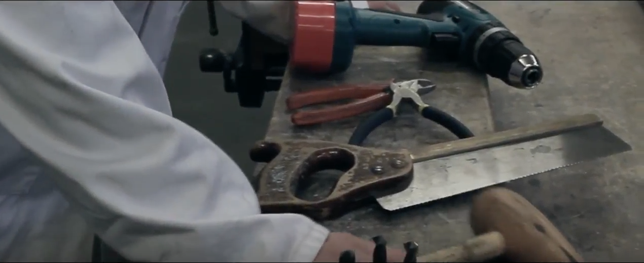
The use of props reflects the illegitimate surgery as these props are not used within this industry, defining a theme of endangerment.
|
The wide angle portrays the setting of a torturous basement, highlighting the antagonist to dominate the protagonist in a vulnerable manor and dangerous manor.
|

The following image highlights that the antagonist has captured vulnerable girls prior to his latest affair, exploring a consistent theme of vulnerability and horrific hierarchy over them.
|
|
|
|
The following trailers above involve male antagonists inflicting pain and suffering upon the protagonists to denote that they are vulnerable and youthful.
LENGTH
During this process we were researching existing horror films within different sub-genres, our group had realised that the length of the majority of them were a minute and 30 seconds or just under. Therefore we decided to follow this because it was a good length to place all our shots which gives our viewers more to watch and understand what our synopsis is and try to find what we haven't let viewers know as we didn't want to give to much away.
|
|
SOUND
The following trailers bellow features some of the following sounds we used: Drones, Glitches, Crashes, Glass, Heart Beats, Swishes, Thuds and Medical alarms.
|
|
|
|
Bellow are examples of sounds that we used in our trailer, which we spent time editing to make sure each sound flowed well with each scene as well as all together.
|
| ||||
|
This was the final stage whereby we edited the ongoing beat in the background ensuring it entices the photoboard animatic. We increased the level of sound where necessary, but never fully muted the beat in background as we thought it was important to be consistent when running during the trailer, however when necessary we decreased the level of volume so it almost cannot be heard. This helps maintain a flow.
| ||||
|
The software we used was Adobe Premiere Pro. We have chosen to use this software as a pose to Garage Band because Adobe Premiere Pro allows us to create and add audio but also edit in sync with our animatic file in the background. For this soundscape I will be using the storyboard animatic that we made, it contains all of our shots that we plan to shoot for the trailer with the specific times of when each shot will appear or how long it will last for.
|
EVALUATION
To conclude, as a group we feel that we have understood the importance of conventions of real media text, which is portrayed through the completion of our poster, magazine and teaser trailer. Further to this, we have received successful feedback from our targeted audience.
Developing these existing conventions meant we were able to demonstrate difference and originality but also ensuring our audience is engaged. Also by challenging these conventions we were able to adjust certain features to our concept and synopsis, such as the syringe being manipulated to replace the letter "L" in our film title seen on our poster. Therefore it signified a surgical aspect seen within our trailer, and connotes imaginativeness.
