
"HOW EFFECTIVE IS THE COMBINATION OF YOUR MAIN PRODUCT AND ANCILLARY TEXTS"
INTRODUCTION
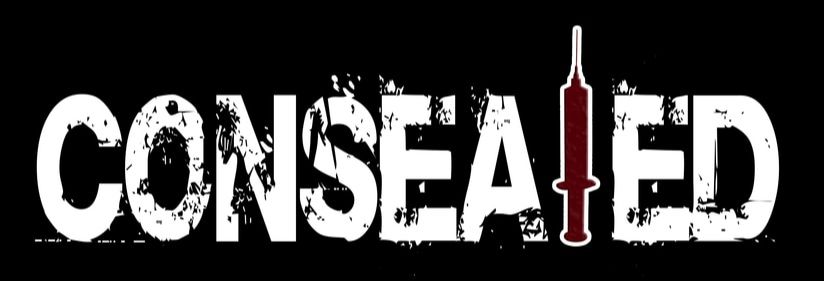
This is the Question 2 evaluation section. The question will be discussing our film "Consealed". It will be presented in various forms of media, this will enable me to demonstrate the combination of the main product and ancillary texts. We will be looking closely at the SYNERGY, CONTINUITY, BRAND IDENTITY AND CROSS MEDIA CONVERGENCE (CMC) in all 3 of our products (trailer, poster and magazine). MEDIA CONVERGENCE is "the merging of previously distinct media technologies and media forms resulting from digitization and computer networking". This is the merging of mass communication outlets – print, television, radio, the Internet along with portable and interactive technologies through various digital media platforms e.g DVDs , video games, mobile apps, game consoles and so on.
Having a strong BRAND IDENTITY is essential when creating any franchise as it enables the product to be recognisable for the audience. We will also be discussing how "Consealed" has built its own strong brand identity and compare it to other real media texts to see whether it is strong enough to form sequels of the film. Iconic weapons, costume, typography and logos are one of the many features that make a horror franchise recognisable for an audience.
Having a strong BRAND IDENTITY is essential when creating any franchise as it enables the product to be recognisable for the audience. We will also be discussing how "Consealed" has built its own strong brand identity and compare it to other real media texts to see whether it is strong enough to form sequels of the film. Iconic weapons, costume, typography and logos are one of the many features that make a horror franchise recognisable for an audience.
EXAMPLES I WILL BE USING:
|
|
WHAT IS SYNERGY/CROSS MEDIA CONVERGENCE/BRAND IDENTITY?
Film companies depend on a lot more than just the production and marketing of that film. Big media conglomerate companies such as Walt Disney Studios and 20th Century Fox spend huge amounts on making their films. This is so that they are able to widely promote a film through various media platforms so that the product is can be easily recognised, which intern generates money for ticket sales. The definitions are listed below followed by some examples:
SYNERGY: meaning the combination of 2 products, in the media industry meaning the simultaneous release of 2 or more products to booth sales in both. This means 2 or more media companies collaboration to create products or a final product. This technique is often used by big media conglomerate companies to promote to the success of a film through linked products across different media platforms.
CMC: A very similar to synergy in 2 or more media platforms working together. The forms of media this can include are TV, internet, social media, radios etc. Cross media convergence may occur at one of the following stages of the film process: production, distribution or exhibition. An example of cmc could be the promotion of a website or book on a television show.
BRAND IDENTITY: A company's brand identity is how they wish to be perceived by their audience. The components of the brand will include: logo, name, tone, tagline and typography. They reflect the value the company is attempting to put forward to its audience and reveal the market appeal.
EXAMPLES OF BRAND IDENTITY:
(FILM MARKETING CAMPAIGNS)
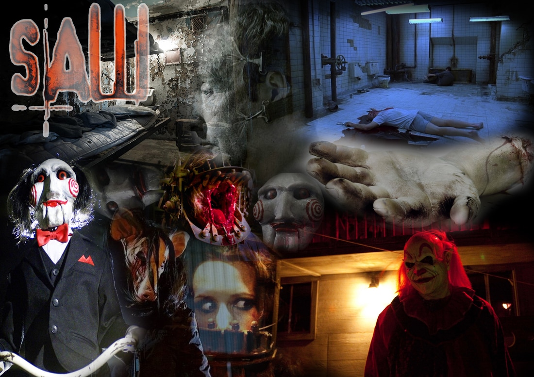
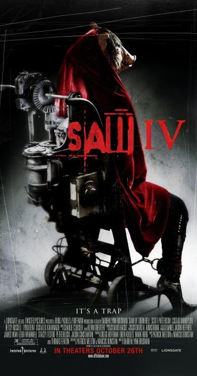
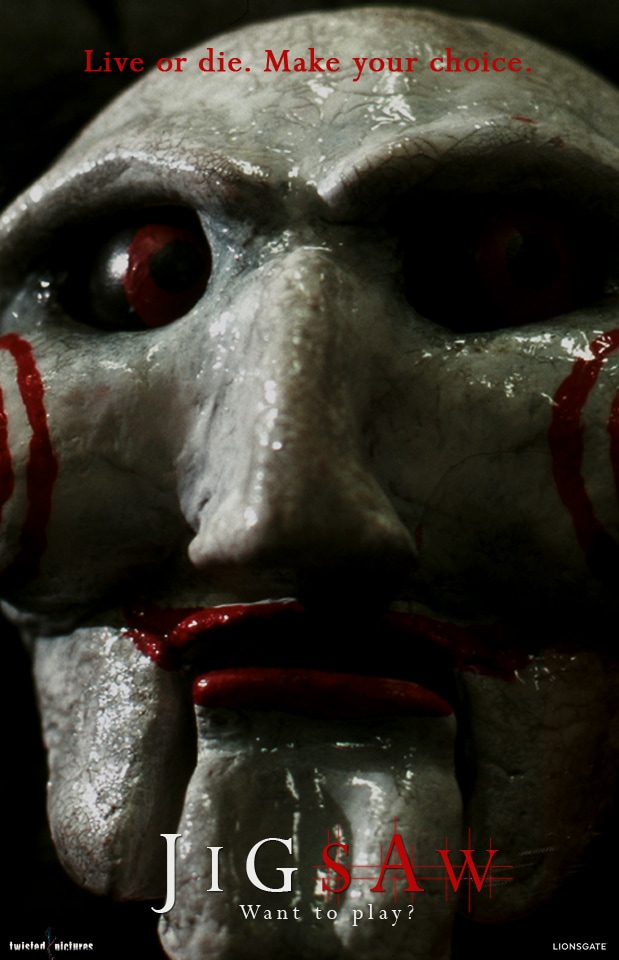
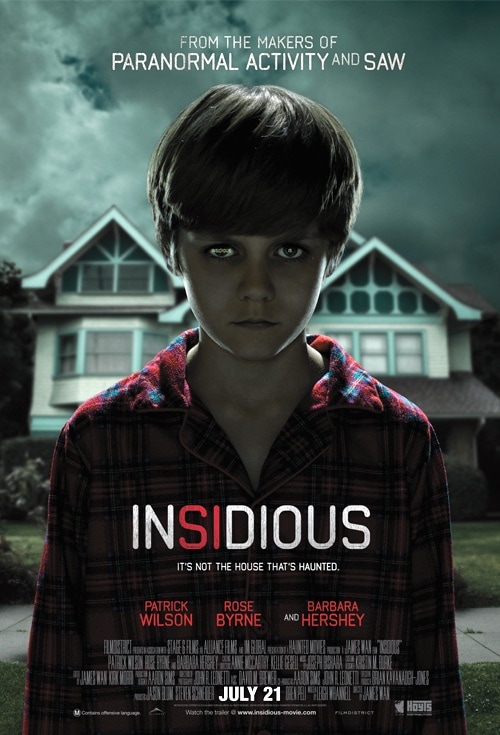
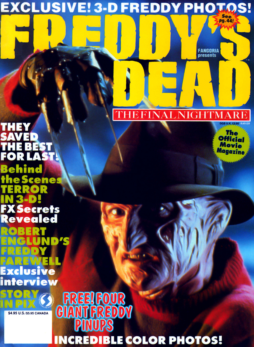
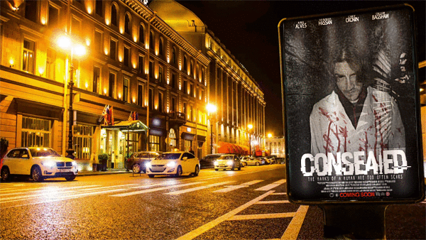
The Saw film sequel is an example from the horror genre, sub genre somewhat similar to our film, gore it also contains elements of the slasher sub genre. We chose this films as it a successful example for the marketing campaign and CMC. Saw is a 7 part franchise media product distributed by Lionsgate films in 2004 and produced by Twisted Pictures, Evolution Entertainment, Saw Productions Inc. This film was initially directed by James Wan, the following sequels were directed by Darren Lynn Bousman. Leigh Whannell wrote the films. The films collectively grossed over $873 million altogether in the worldwide box office. In the first week of DVD release for Saw 2- Feb 2014, it sold 3.9 million units, topping the charts, it was Lionsgate's fastest selling theatrical DVD at the time.
CHARACTER POSTERS
|
|
TRAILERS FOR THE WHOLE SEQUEL: (FILMS 1-7)
|
|
|
|
|
|
|
|
BILLBOARD

|
This is the film billboard's advertising the last series of the film sequel in 3D. It is evident that the film uses a particular house style which is carried out through all the posters as well as the billboard. The colour scheme is very dull, with dark red typography. The typography of the film title also makes it very distinguishable to an audience. A common characteristic used to promote the films are the images, they are often of iconic weapons, or parts of the body / character to heighten the theme of torture and gore within the sequels. These elements are part of a trademark to the Saw franchise, therefore representing brand identity and continuity.
|
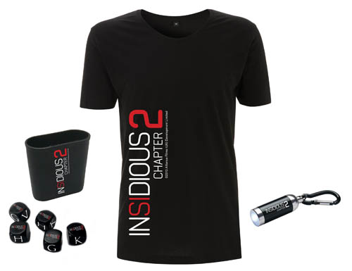
MERCHANDISE
|
Saw also created merchandise products in order to further promote the film. These would be particularly aimed at a fan of the films. This action figure/toy displays continuity through the logo, typography and colour scheme. This would be a must have for a fan. Synergy and CMC promote the release of the new film it is advertising, "POP!Movies" produced the merchandise. The Saw films are well known to the scary masks the antagonists have to project the mystery of the killer, this is reflected in the figure of the mask, Jigsaw, this mask is a unique selling point for the film.
|

|
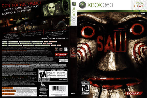
VIDEO GAME
|
Video games are a promotion to franchise and a common element to synergy. Saw being a film that is rich in blood and gore it is expected that a video game would become released due to the increasingly high rate of violence and graphic images appearing in video games for young adults these days. It was released in October 2009. The game includes the antagonists such as Jigsaw, an iconic character within the franchise, included in the trailers, posters and merchandise. The horror influenced logo is also included on the video game cover, trailers, movie posters and character posters. This displays brand identity in allowing the audience to easily distinguish the film through brand recognition.
|
|
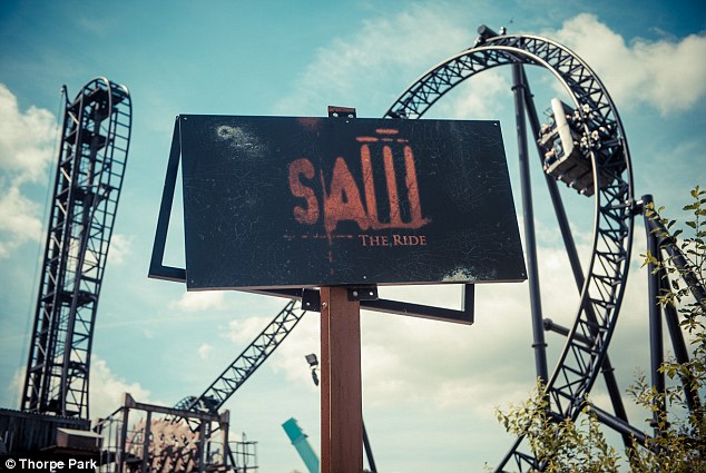
AMUSEMENT PARKS
|
Another way in which the film sequel was promoted was through the famous amusement park- Thorpe Park. They created a ride inspired by the film which is now one of the most popular and most visited rides in the park. In addition to this every year for the fright night period of Halloween they also have an inspired maze by which actors are dressed up as the characters and are paid to scare the people, making them feel as if they are inside the film. This was achieved using continuity of the logo on the sign, the same red, scratched typography makes it recognisable for the audience. Word of mouth about the adrenaline pumping ride means that people that hear of the ride will then go onto watching the film that inspired it.
|
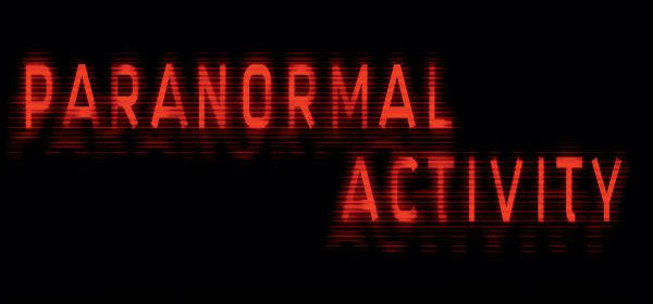
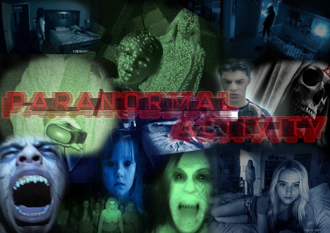
Paranormal Activity is another film that utilises synergy and is clearly brand identifiable. Paranormal is an American psychological horror film which differs from our horror genre but we still felt it reflected film marketing and CMC perfectly. Director Oren Peli was inspired by the film due to the noises he was hearing in his sub urban home in San Diego with his wife. He bought a camera for $3,000 and auditioned to naturalistic actors. Distributed by Paramount Pictures 2009 and produced by Solana Films, the sequel includes 6 films which were all equally as successful with additional merchandise. Written by Oren Peli originally, the second sequel was written by Michael R. Perry. The franchise grossed over $398 million at the box office worldwide and sold 374,560 DVDs in the first week of their release and 106,005 Blu-Ray sales.
TRAILERS FOR THE WHOLE FRANCHISE: (FILMS 1-6)
|
|
|
|
CHARACTER POSTERS
|
|
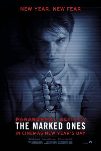
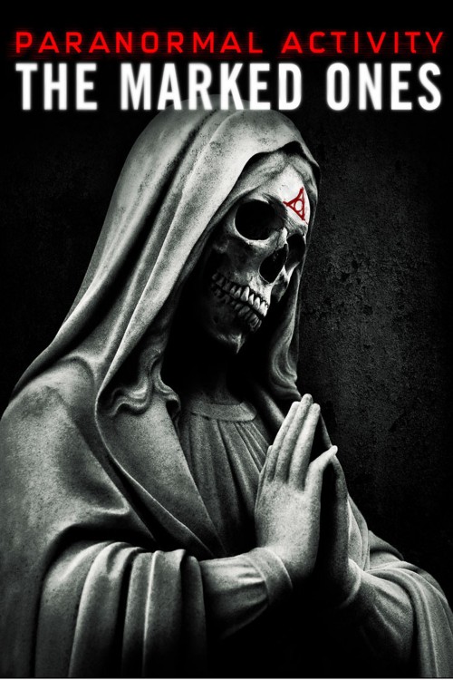
BILLBOARD
|
This is one of the forms they used to market the film. The billboard shows a consistent house-style, utilising the same characteristics of the franchise, such as colour scheme and typography which promote the film in a way which it can be recognised by the audience. Furthermore it advertises the common convention for which the film is widely known for; the date and time in the bottom right hand corner, implying the film has been personally recorded by the protagonist. This also promotes the distinguishing of the film.
|

|
MERCHANDISE

|
Paranormal Activity has official merchandising which the audience and fans can purchase. The t shirt means that members of the public seeing someone wearing it might think the film is worth viewing, therefore will go and watch the film in cinemas or purchase a DVD copy when later released. Paranormal Activity developed this merchandise to help promote the film, such as t shirts, mugs, a phone case and replica version of the recording device used. The title of the film is on all of the products for consistency, using the same colour scheme and typography from the posters, dark red. The sequel is known for it's personal touch to it through hand held shots and the antagonist recording the whole film, therefore the replicated recording device promotes the way in which the film is created.
|
BLU-RAY DVD
|
This is a blu-ray cover for the 2nd Paranormal Activity film, the DVD cover enforces the brand continuity and identity within the colour scheme, sharing the same colour scheme as all the posters, a night vision inspired blue, red and black. This form of continuity progresses the brand identity for the audience. The cover of the case is a POV shot from the camera reflecting the way in which the whole film is shot.
|

|
CONTINUITY
TYPOGRAPHY

|
|
|
|
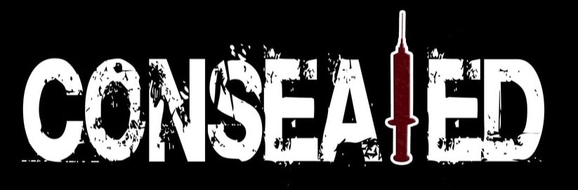
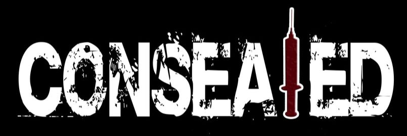
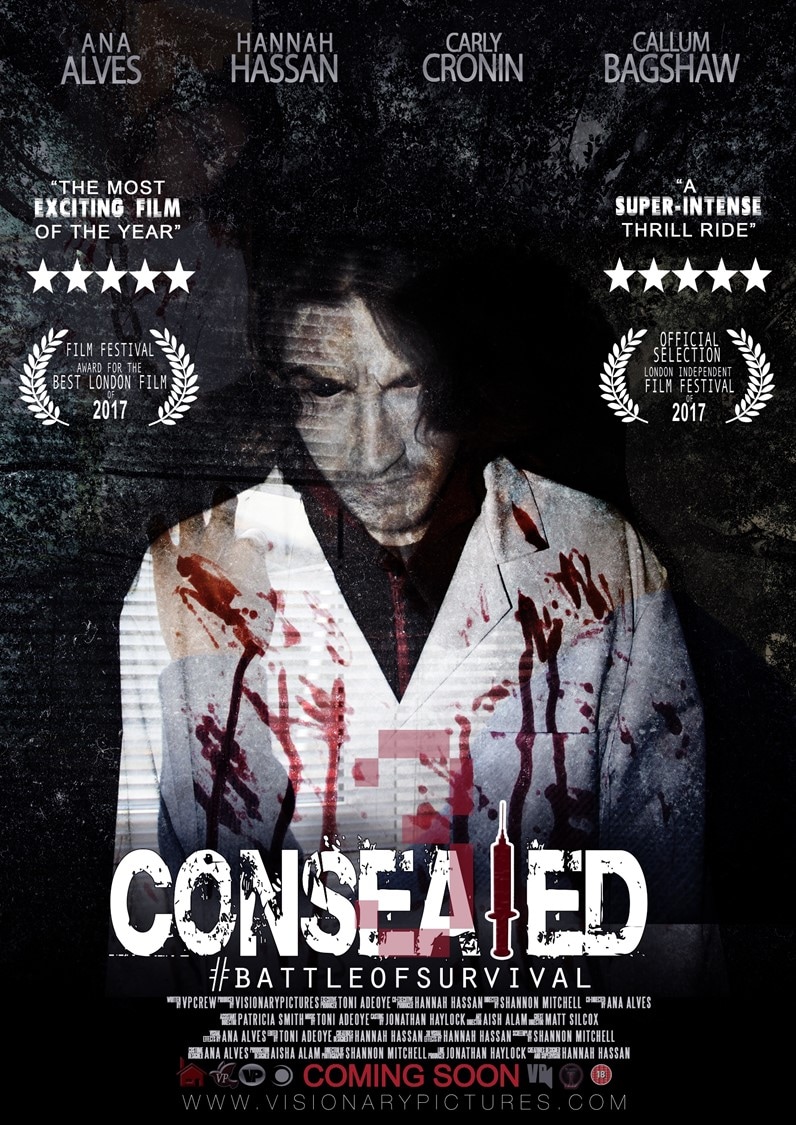
Each of these products display continuity through the same typeface in each title. The name of this typography Consolas. Continuity and brand identity is connoted in the main products and ancillary texts used within the promotional package, making it far more effective when advertising the film's release date. This makes the brand easily identified for an audience seeing the logo displayed on different promotional platforms representing the film e.g. billboards, bus posters, merchandise.
|
|
|
|
The typography used on all our products is "", we used the same font for all of our products to display continuity. All the products use the same font as it allows the audience to make an effective link between all the products. These elements allow the audience to identify the brand being promoted. Collectively working together to make a promotional package will be successful with continuity. We continued the font on the trailer as well to create this link between the products.
PROTAGONIST/ANTAGONIST

|
|
|
|
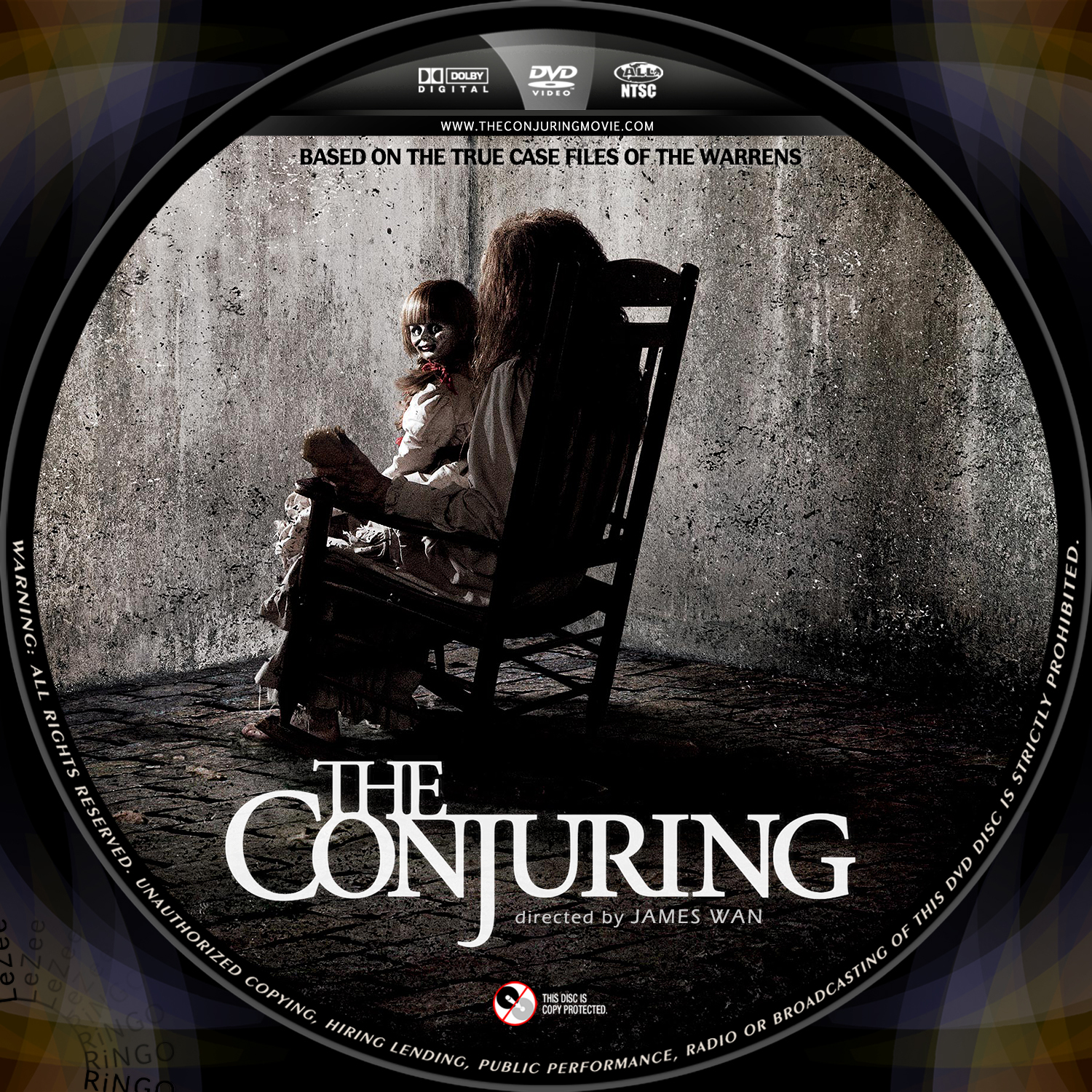
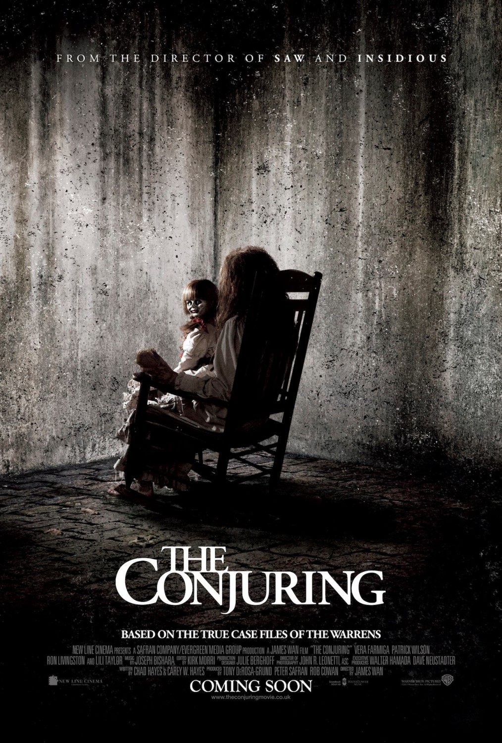
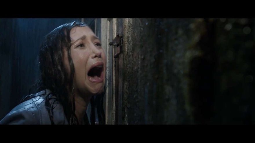
The conjuring franchise has developed their products using both the protagonist and antagonist, this represents brand identity and continuity. The doll is presented on the film poster and dvd cover whereas the protagonists: demonologists Ed and Lorraine Warren appear on the magazine and film trailer. This establishes a link between the products for the audience, making the audiences familiar with the antagonist, so that they will automatically link the doll with the Conjuring film.
|
|
|

|
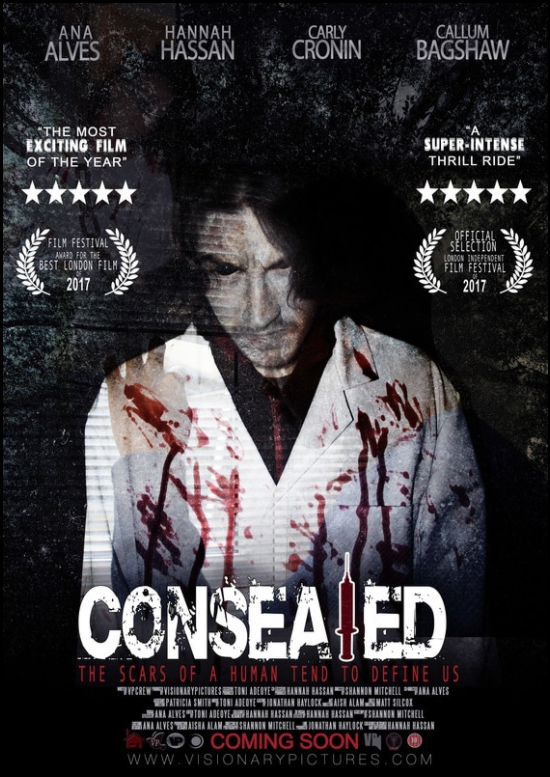
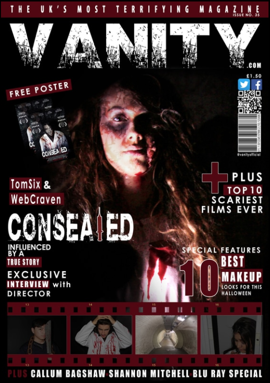
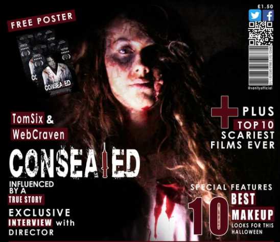
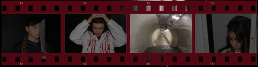
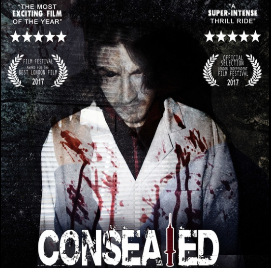
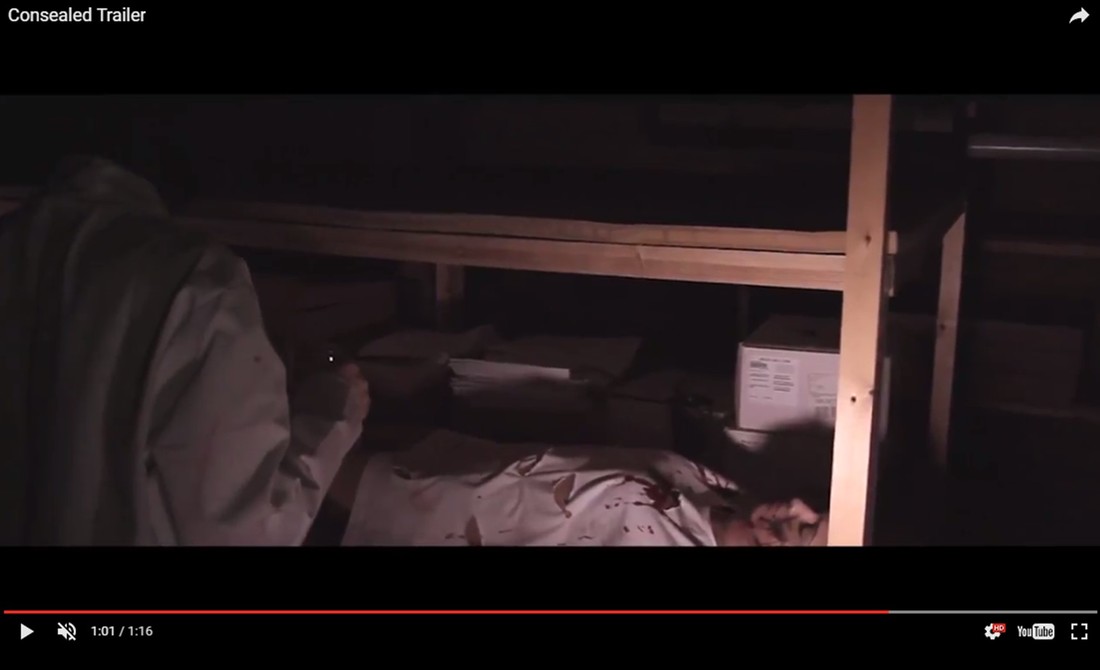
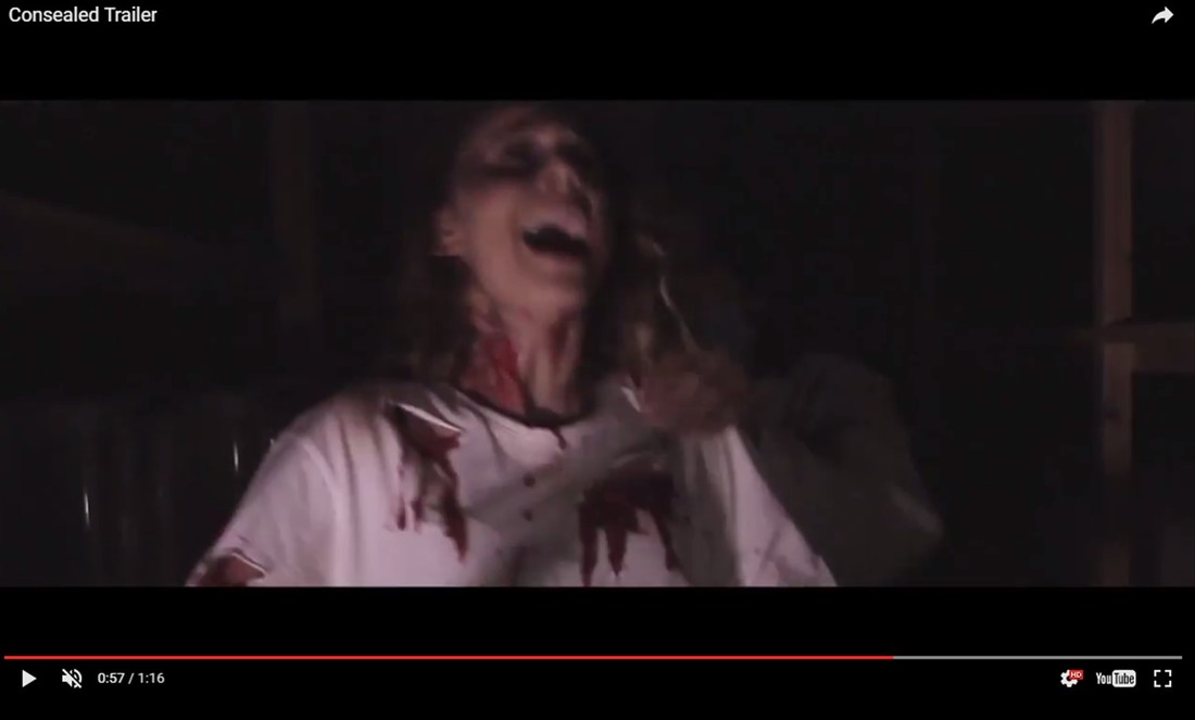
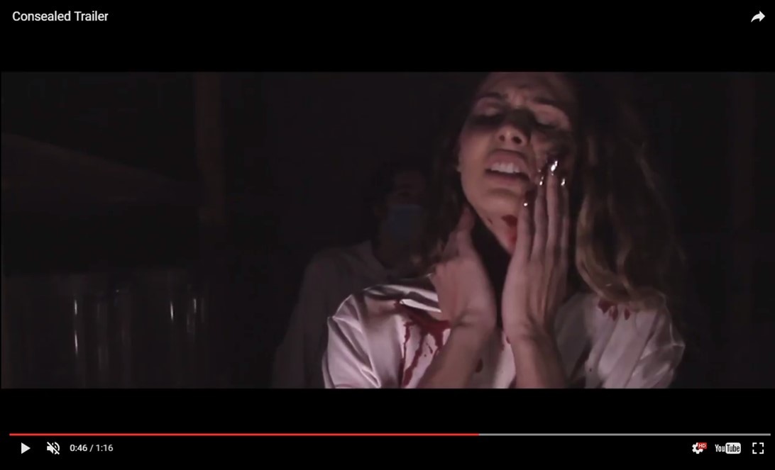
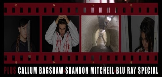
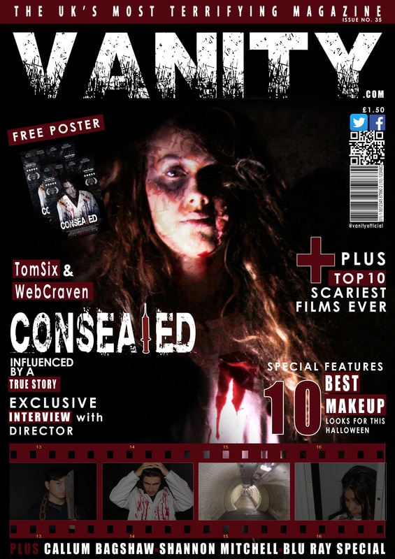
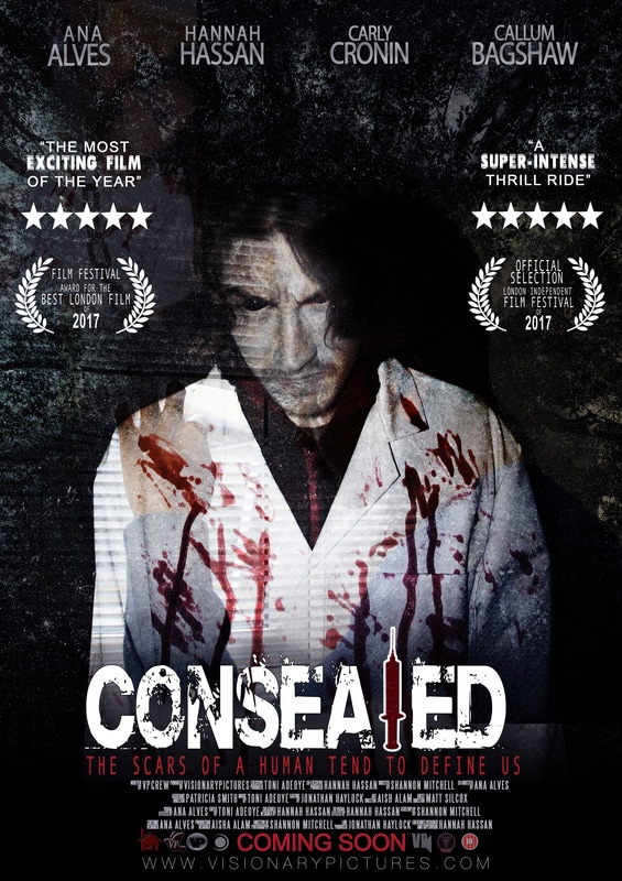
We used shots of both our protagonist and antagonist in our products to establish a clear link whilst also connoting continuity. The poster and magazine link to our trailer as they contain shots from our trailer e.g. the film strip at the bottom of our magazine contains some footage shots from our trailer (picture 2 and 4). The front cover main image is an image we shots whilst on set as is the poster front cover. Using a different character on each product allows the audience to understand the difference between the two characters and that they are a part of the "Consealed" brand. We edited these shots for continuity with the theme of our products, we overlaid the images we grungy textures and dark colours, the main overlay colour influencing our products was a dark red. These shots all link to the trailer so that the audience can recognise these main characters when watching it.
COLOUR SCHEME

|
|
|
|
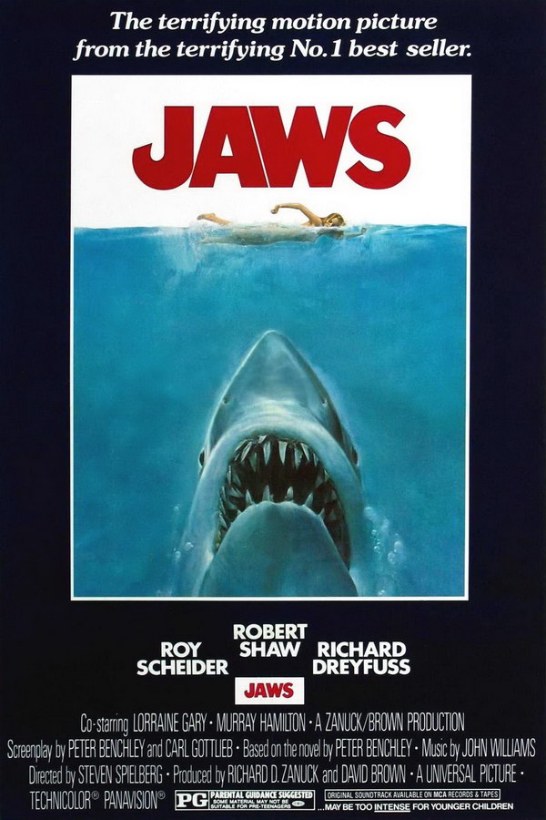
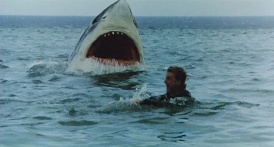
The Jaws franchise consists of blue shades. They produced their products to contain the same colour scheme to display continuity and allow the audience to understand all the products belong to the same film franchise. This is an effective tool for marketing as other promotional products they produce will all use this colour scheme. The dark blue colours entice the sense of mystery and suspense within the film, giving the ocean deep connotations.

|

|

|
|
We believe displaying continuity through colour scheme is essential in our franchise as it enables the audience to make a link between all 3 products whilst distinguishing the difference in them all. We chose the colour scheme red, white, blue and black. The tonalities of all these colours are grungy and dull, supporting the dark theme in the horror genre we aim to portray. The trailer is mainly black and red, the red connotes the blood and gore and the darkness connotes the fear as well danger. We continued this colour scheme in the poster but added some dark blue overlay to portray mystery. In addition to this the poster and magazine both included white on typography to contrast it against the dark background, making it easily legible for our audience.
PROPS

|
|
|
|
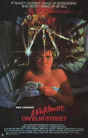
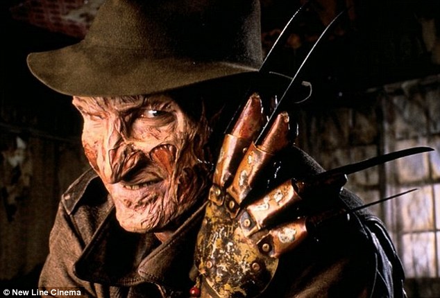
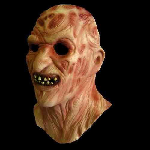
In the Nightmare on Elm Street film the props used are the knifed gloves in weapon form and the mask the antagonist wears to reveal his destructed face. The mask is a typical convention of a horror film as it hides the killers true identity, enticing the mystery of the film. We often see the glove or the mask on their products, not just for continuity but for recognition, so that we can understand the film it related to by associating that specific iconic weapon with that particular killer.
|
|

|
|
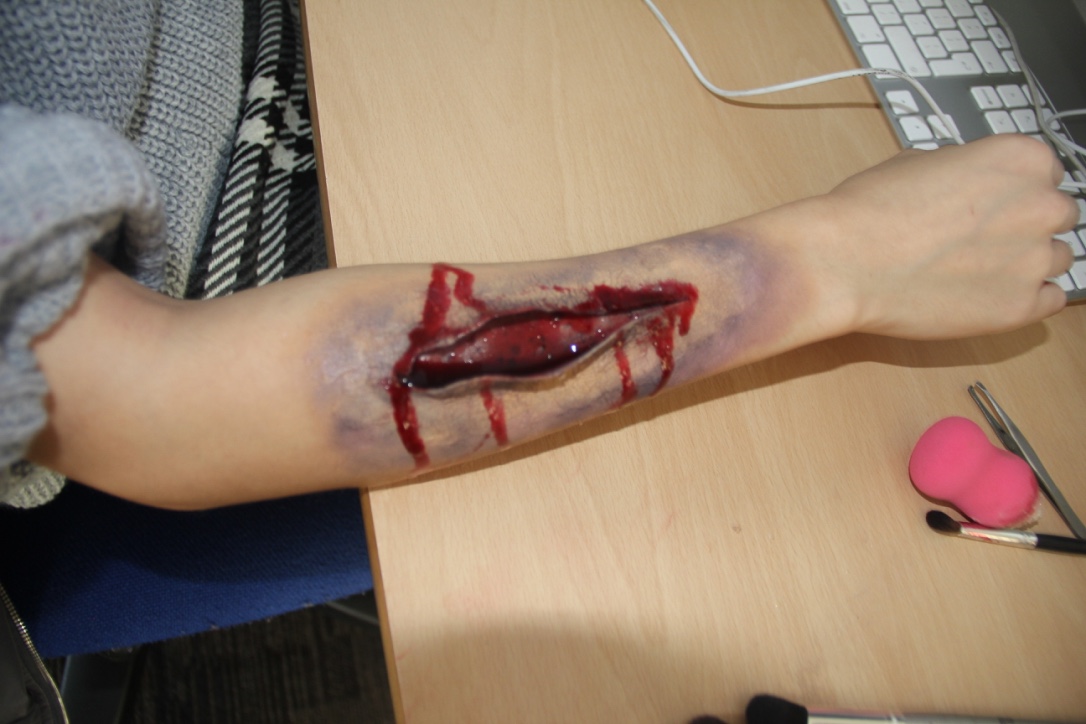
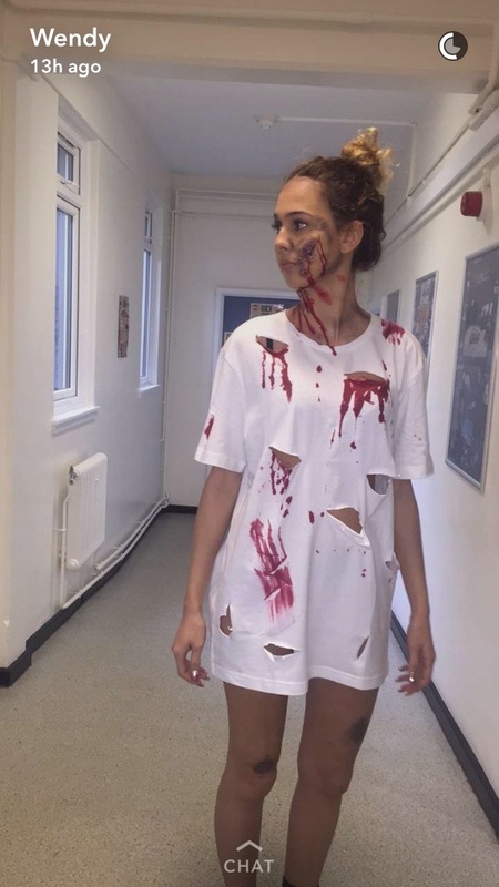
Our unique selling point was the cuts and scars which promote the theme of destruction in the cosmetic surgery industry. We used latex as our prop to create this look, another prop we used were the ripped t shirts with blood on them. Not only does this connote the horror theme but it supports the colour scheme of the products with the deep red, allowing audiences to establish the link.
LIGHTING
|
|
|
|
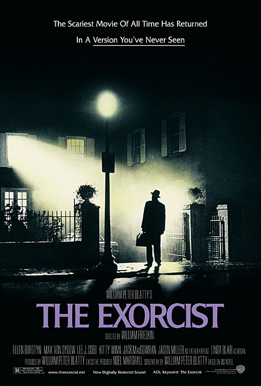
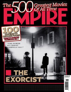
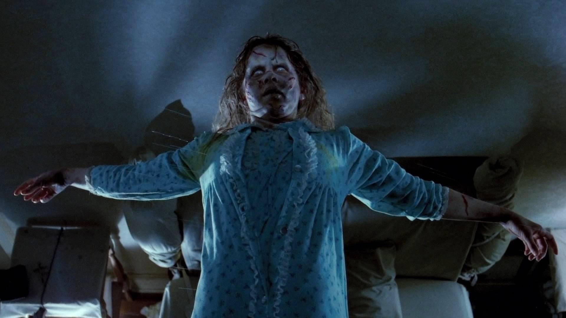
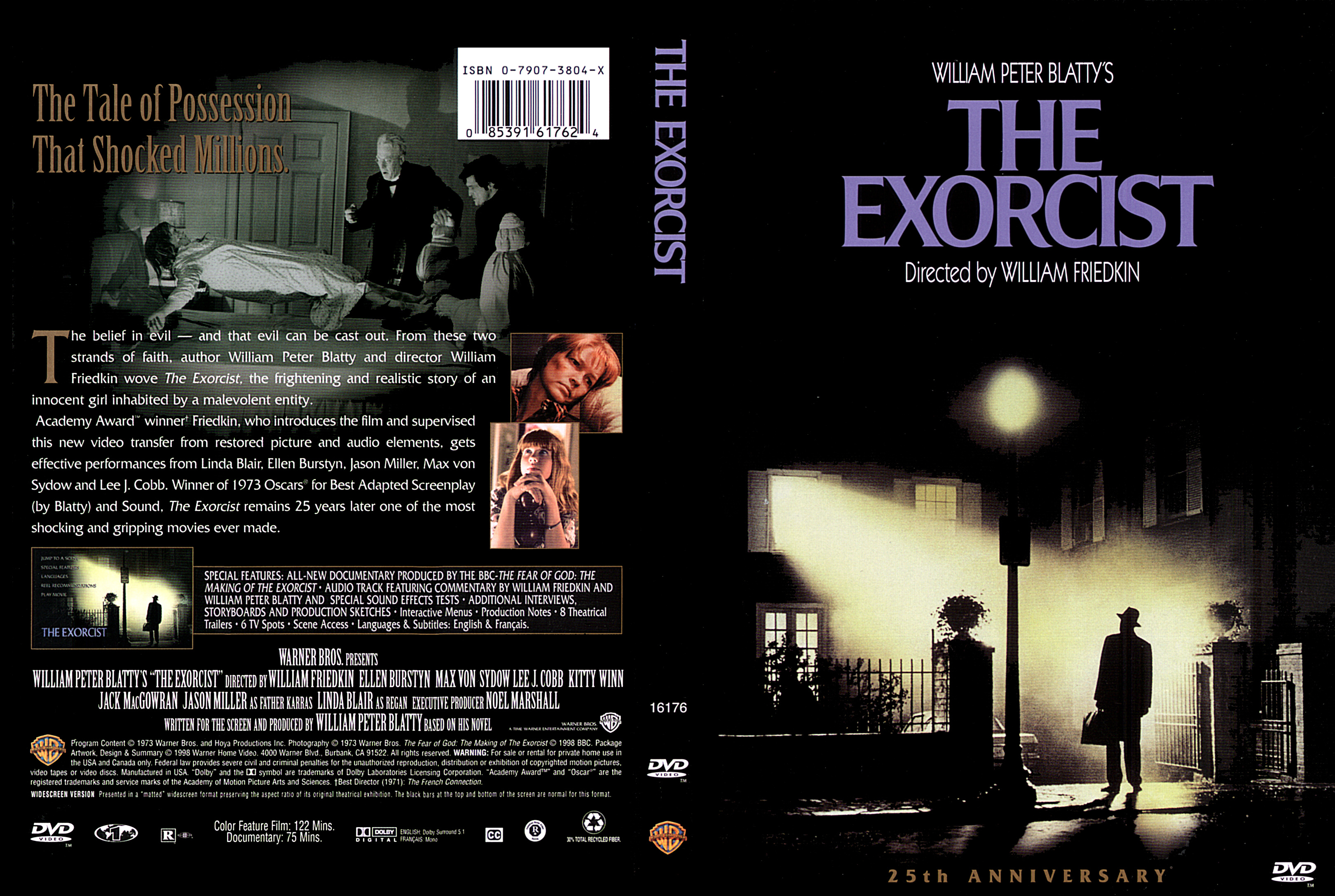
The lighting in the Exorcist film franchise is very dark. Generally most horror films utilise dark lighting as it is a reflection of the horror genre and evil killers. The lighting is dark on the antagonist to project mystery as shown in the magazine cover and film poster, but bright light is also used when revealing the face of the antagonist or showing the facial expressions of the victims.

|
|

|
|
In our film franchise we adopted the key horror convention of utilising dark light. We did this throughout all 3 of our products to display continuity but also because we felt in the trailer especially the use of dark light would help connote the deep emotions felt by the father in the revenge he is set out to complete. In our magazine and poster we used lighting in our colour scheme, dark colours however bright light was used over the main image to focus and allow the protagonist/antagonist to be seen.
SHOTS/FRAMING
|
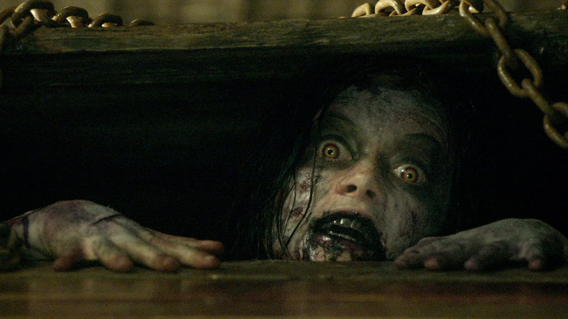
|
|
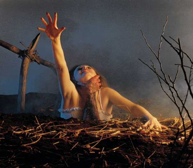
|
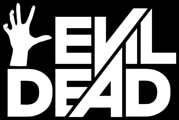
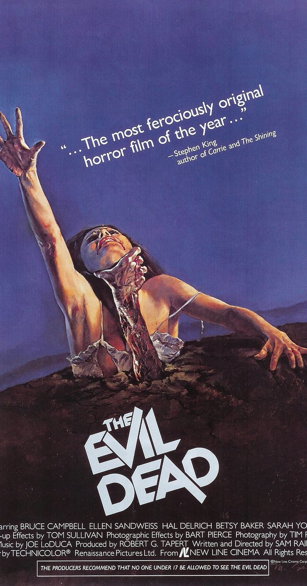
All 3 of The Evil Dead products use the same shot, the victim low angle shot and the aggressors close up shot of the face, audiences can now easily recognise the subject being presented through the iconic movie scene shots. The aesthetics of the makeup on the aggressor and the shot of the arm which is also utilised in the film logo, works as a promotional package for the film's franchise.
|
|
|
|
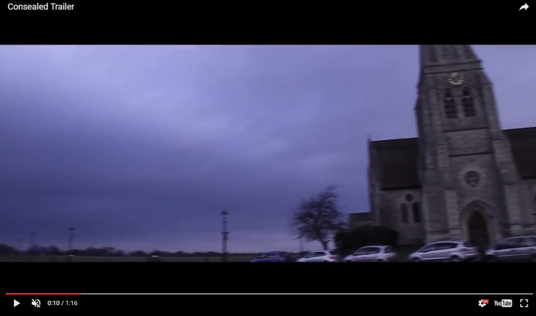
We developed continuity in our products through the use of establishing shots and mid shots. We used establishing shots of the film (still shots) and placed them on the film strip of the magazine and the trailer uses an establishing shot for the church setting, meaning the audience are able to recognise the products as part of the Consealed brand. For our magazine and poster we used mid shots of the victim and aggressor so the main characters are distinguishable when appearing on billboards, bus ads and merchandise.
OVERALL SUMMARY: CONTINUITY
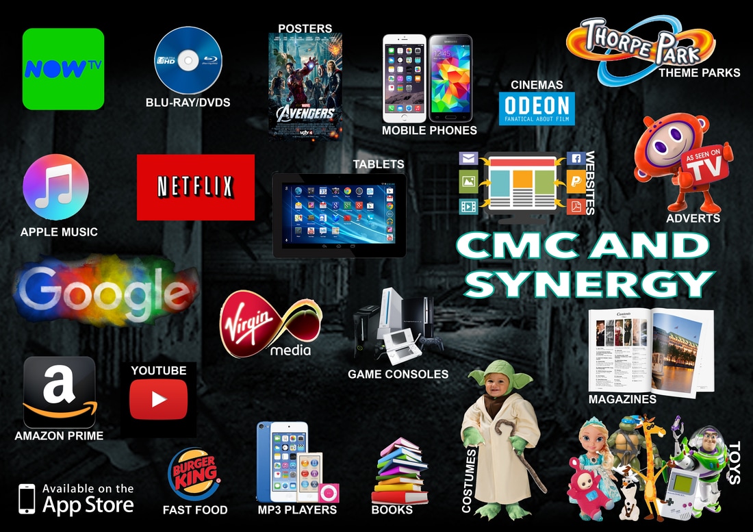
CMC: CONSEALED PRODUCTS
ELECTRONICS: GAMES CONSOLE
|
|
|
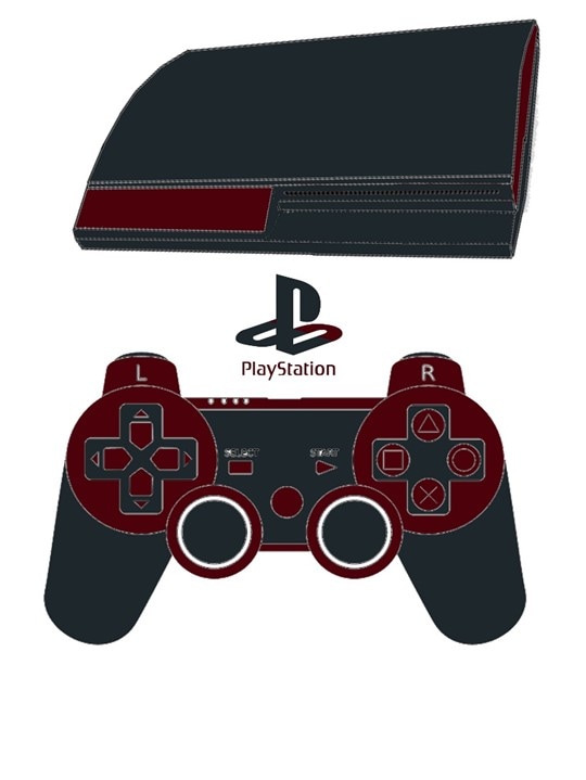
Playstations are the best selling game console of 2015 and yet continue to dominate the gaming and entertainment industry. Many people opt to purchase a Playstation over a TV subscription due to the variety of medias which can be accessed on the console. We developed a partnership with Sony to develop 200,000 Playstations with the Consealed colour scheme, we did this in order to allow advertising in a modern means as a pose to the traditional public advertising. We believe this is an effective way to promote our film, grow our brand and expand/reach our audience further. A lot of our audience will be owners of this game console, even so gaming nerds might want to purchase this exclusive coloured set.
|
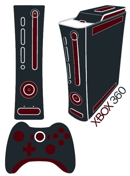
With 84 million units sold, the Xbox 360 is highly popular amongst young people and constantly dominating the entertainment industry. Many people are choosing to purchase Xbox's over a TV subscription due to the variety of medias which can be utilised on the console. Visionary Pictures has developed a partnership with Microsoft to develop over 50,000 copies of these exclusive Consealed colour themed consoles. This is another form of advertising rather than using conventional advertising such as the classic billboards and TV advertising. We believe this an effective way of promoting our film via our specific target audience, as most of them will be Xbox 360 consumers.
|
PORTABLE ELECTRONICS
|
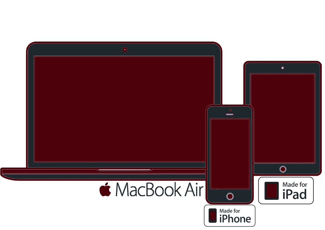
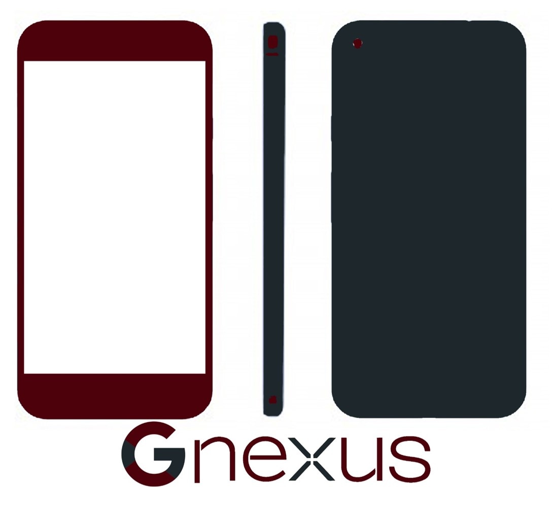
Visionary Pictures have developed a partnership with Apple. Apple have produced products using the Consealed colour scheme for an exclusive period of time. We believe the exclusivity of the products will encourage customers to purchase the products, not just film fans but also Apple product fanatics as they are only kept for a limited amount of time. People may also decide to re sell these products at a higher price. Audiences will pre-chase products showcasing our colour scheme. This is effective for marketing as Apple is one of the most popular mobile phones in the market. People will recognise the Consealed brand when purchasing these products.
|
|
|
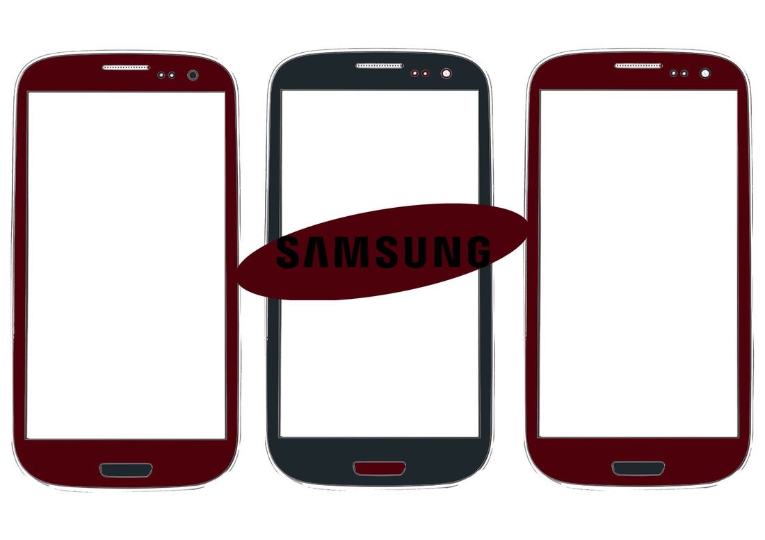
Samsung has produced products using the Consealed colour scheme as a result of the films current success. They have produced a current concept of creating phones which reflect the colour scheme of the Consealed brand. This is relatively effective in developing our brand identity as well as being an effective way of promoting the film, through spreading the brand to the public eye with the recognition of colour scheme. Incorporating the colour scheme on their best selling product strategically allows them to promote our film much more effectively in the light of the public as more people will be exposed to the developed product, understanding that it is a part of the Consealed brand.
|
|
Google is a big company that also create electronics, they have developed a partnership with our brand to advertise their best selling phones using the Consealed brand colour scheme. Effectively, being a different form of advertising as our company will be promoted via mobile phones and Google, giving the film a greater success rate chance. The use of CMC and Synergy is successful for developing a greater target audience and promotion in a larger area of the media industry.
|
|
YOUTUBE CHANNEL
|
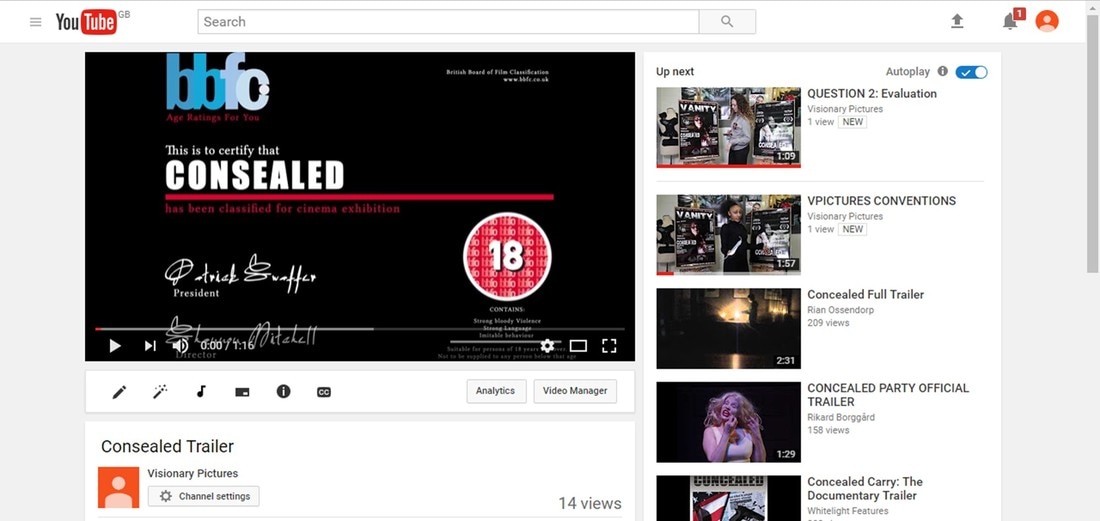
The success on Youtube has allowed for our brand to grow massively. Youtube is an effective way to promote the film as its a free service that can advertise the Consealed brand worldwide, more over it allows our fans to engage with upcoming teaser trailers for sequels, interviews, behind the scenes footage and events.
|
|
SOUNDTRACK
|
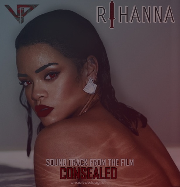
Visionary Pictures have partnered with Rihanna to create a soundtrack which will also feature on her upcoming album work. The track has currently hit number 1 in the charts for 2 weeks running and number 10 in the US top 40 charts, selling over 1 billion records. This allows people to engage with our brand through other means such as music, which is a highly consumed activity, especially among young people daily. The name of the soundtrack will give the audience a link between the song and our other products e.g. our trailer.
|
|
SCARY MAZE
|
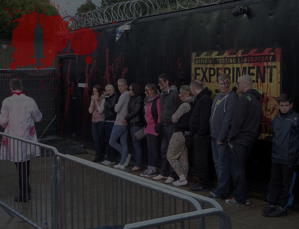
This is the Consealed horror maze that has been opened this year for Halloween for fright night at Thorpe Park, the aim of it is to recreate the victims experience in the movie for the members of the public. It is restricted to 18 years and above due to the graphic images. This effectively develops our brand.
|
|
TRANSPORT FOR LONDON
|
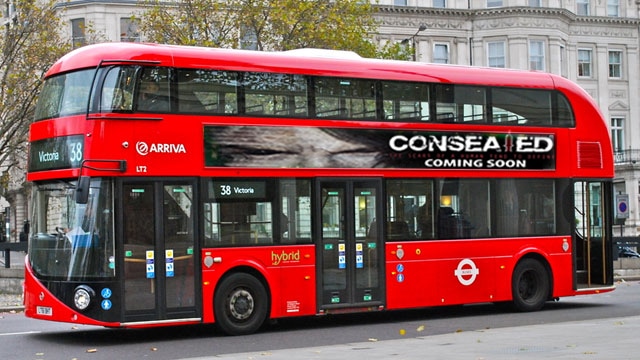
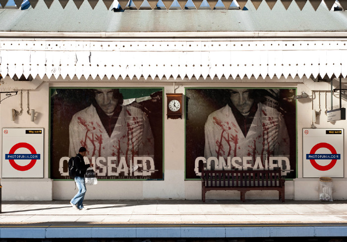
|
The Consealed poster has been placed in the London underground train stations as well as on London buses. This allows us to promote our brand across London. Over a million people use public transport daily in London, therefore promoting on the means of public transport can be beneficial in allowing more people to see our products, which means our Consealed brand can successfully develop. This will attract a lot of attention from the public eye in such a largely populated city.
MEDIA STREAMING PLATFORMS
|
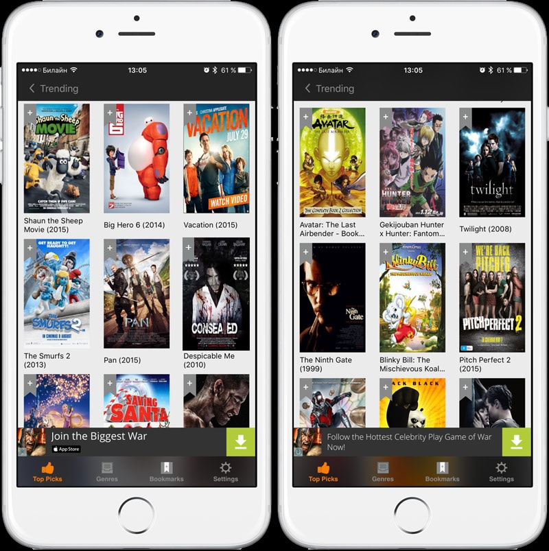
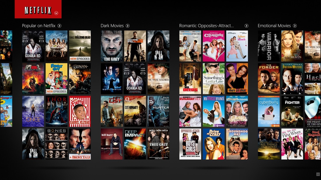
|
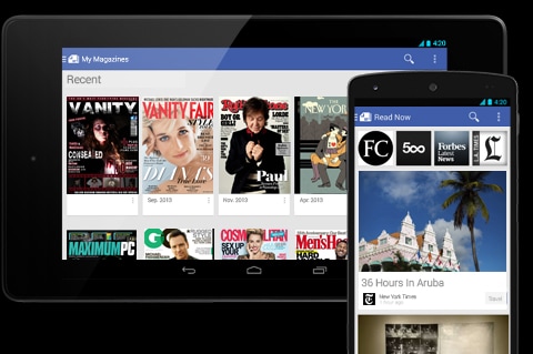
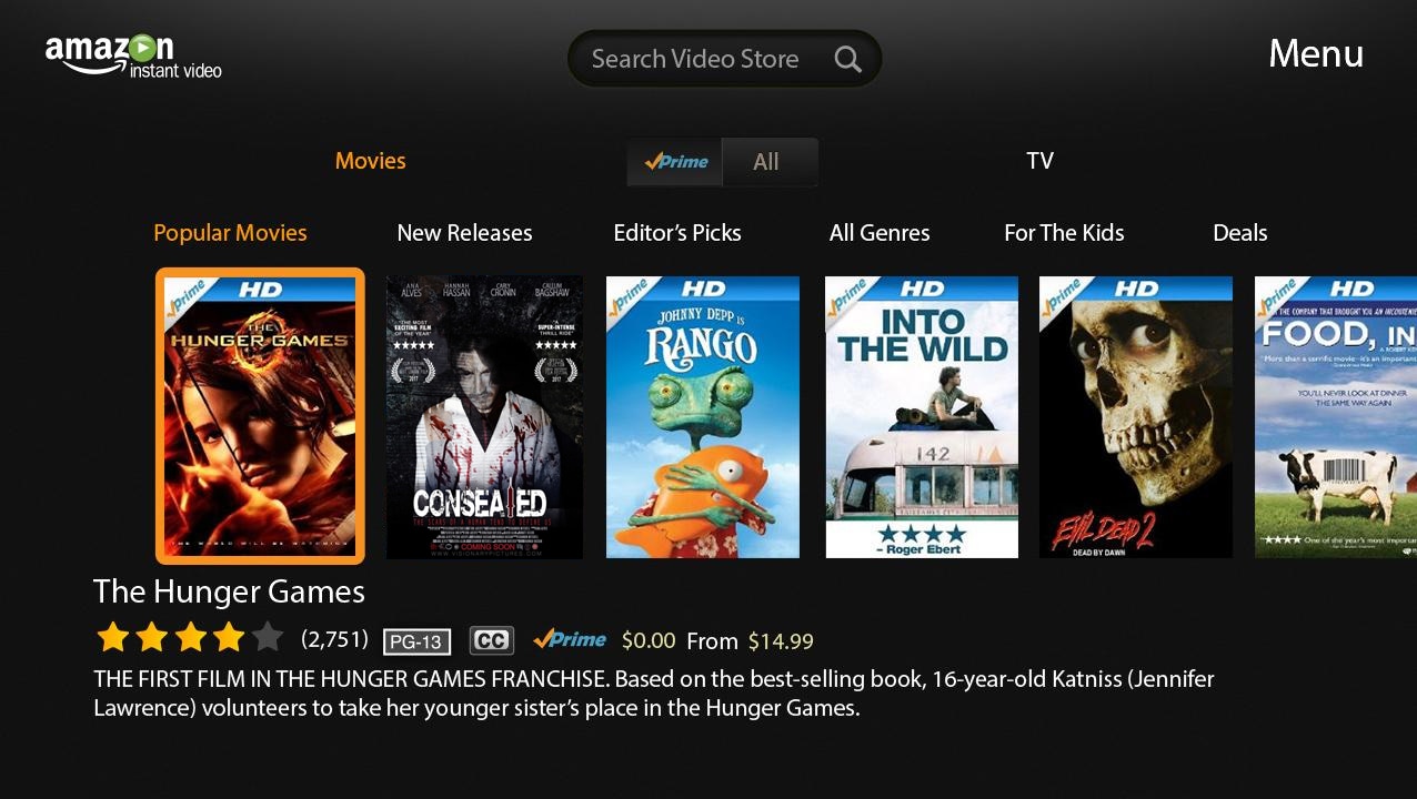
The magazine and poster have been released on Google play service, Apple app store, Netflix and Amazon instant video. This is effective as it allows for the Consealed brand to grow as the audience will be able to purchase the product through a variety of media streaming platforms and consume the product in the comfort of their own home. This can lead to sequels in the film of the product if the product is successful.
GOOGLE PLAY AND APPLE STORE APPS
|
We also created an app for the film due to the high success rate. The app is available on the Google Play and Apple Store to consume, mainly by fans of the film. The app is free to download as of now, however as it becomes more developed with other film sequels a small cost will be added.
|
|
PUBLIC ADVERTISING: BILLBOARDS
|
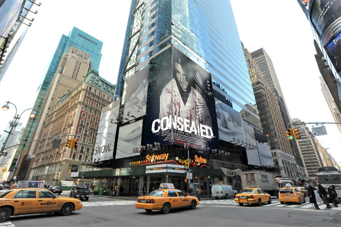
|
We have promoted the Consealed brand using the conventional way of public advertising this includes billboards and bus stops. This is effective as it allows for our company to grow through the placement of the adverts in public hot spots where we are positive people will take notice of them.
FILM SEQUELS

|
|
Consealed was a very successful film grossing over 520 million in the box office. Due to its success we have decided to develop some sequels to mantain and promote the success of the Consealed brand.
CONCLUSION
In conclusion as a group we feel that we have produced our brand identity and continuity effectively using cross media convergence within the products. We created our products with an element of recognition in regards to continuity which means our audience can easily establish a link between all the products as well as that they are part of the Consealed brand. In addition to this, we used continuity and CMC to advertise the company film, the use of continuity in the magazine, poster and trailer form an identifiable package whenever promoting the brand to an audience. More over, we feel that the use of billboards, bus stops and the internet to promote the main products is effective as it allows for the brand to grown. All in all, we believe that we have successfully produced a strong brand through advertising, continuity and CMC to develop our main products and brand identity.
