
HORROR POSTERS (4)
At this stage, we looked at horror posters, horror magazines and horror trailers for the purpose of identifying and analysing critical features and what they contain, such as their mise-en-scene, lighting, typography and so on.. This is imperative in gaining a sufficient understanding of what is expected in our own creation.
|
|
|
|
|
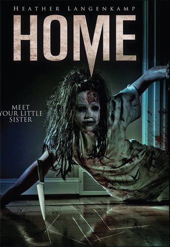
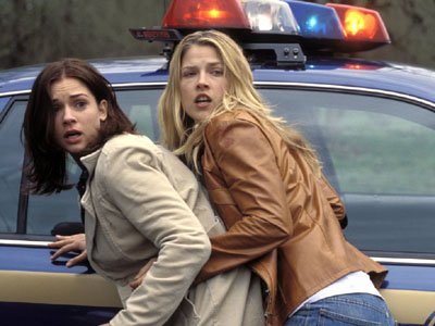
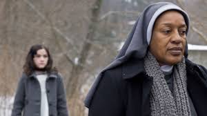
Film title: Home
Director: Frank Lin Release Date: Sub- Genre: Slasher Production / Financing Company: Principle cast: Synopsis: Carrie is a religious fundamentalist. But her mother decided to come out-of-the-closet and marry another woman, which they have a daughter together with. Now, she is forced to move into a new house with people she cannot accept. The story takes place over the first two days at the strange house, as Carrie's new parents leave for a business trip and she must now take care of her stepsister. As creepy occurrences lead to full-blown terror, Carrie must learn to overcome her own fears and beliefs to save her little sister. |
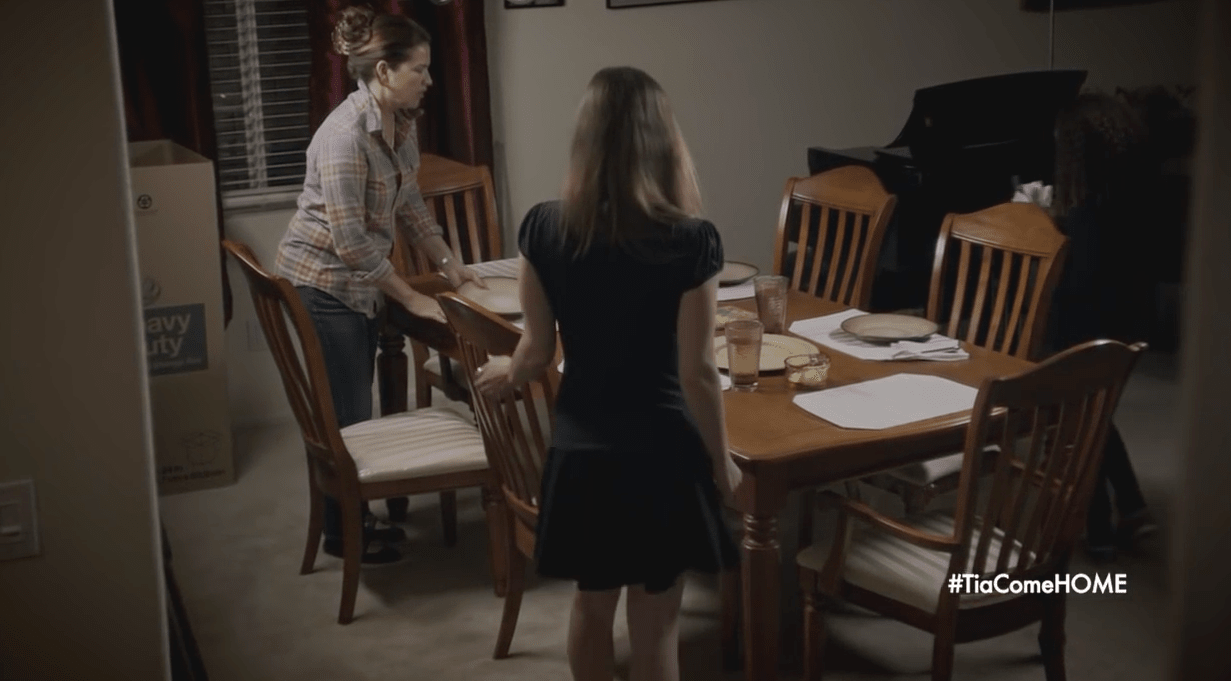
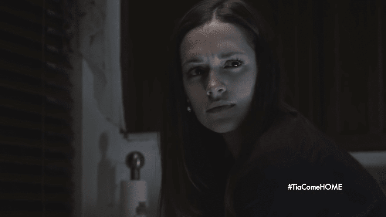
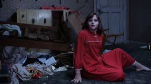
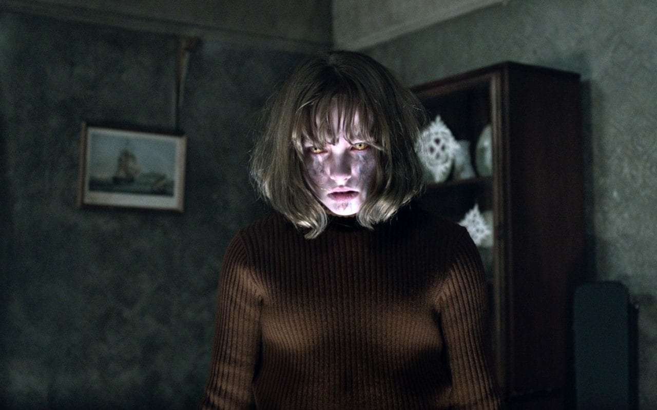
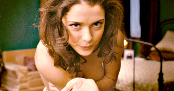
Denotation: The title “Home” emerges so distinctly, and catches the audience eye -sight, due to the differentiation of the colour scheme, enforcing it to stand out against the low key lighting of the background. Further to this, the imagery of perhaps a possessed young girl is incongruent to the title, as it does not depict the normality of something or someone homelike. Signifying that the main image creates connotations of crazed, consumed, demonic and other similar ideologies. This is identified consequently through the main images discolouration of clothing, displaying a saturation of blood, dirt upon her top and her face. Moreover, a significant a noticeable element is the inability to see the main images eyes, as they appear to be larger than the average and anthropomorphic size, and also much darker.
Mise-en-Scene: The setting of the poster portrays a situation within a hall way, this is conveyed to the audience, as skirting boards are visible, and possibly the ventilator opposed next to it. Also suggesting that this hall-way may be located next to a room, as the poster reveals the frame work of a door, displaying the main images body almost being pulled into the bedroom, hence the unseen visionary of her legs. The usage of the knife conveys connotations of danger, which is developed further as the knife has appeared to have written the word “KILL”. Exploring a prominent theme of death. Then again, there are other elements that high point this theme, such as the incorporation of blood filling the scenery, and by being presented on clothing too. Evidently, displaying bloody being splattered upon the frame of the door.
Typography: The continuation of the exploration of death is furthered through the symbolism of the typography appearing from the title. The letter “M” protrudes the most as it has been elongated to convey imagery of a knife which is already presented as a prop within the poster. Likewise, the positioning also follows this same theme of death, as the part which has been stretched is sat upon the demonic main images head, which may be interpreted as a sense of stabbing and killing. Nonetheless, the typography of the title is written in bold which expresses key significations of danger and also simplicity, as the font style is plain and unadorned.
Target audience: As a consequence of the sub-genre being Slasher, my initial thoughts are that the intended audience would be aged form at least 16 years and older, as there are an incorporation weapons therefore highlighting an act of violence and possibly abuse.
|
|
|
|
|
Title: The Babadook
Release date: 17th of January 2014 Director: Jennifer Kent Info: Jennifer Kent directorial debut which has since gained a cult following. Based on 2005 film-Monster Production /Finance company: Causeway Films Principle Cast: Essie Davis, Noah Wiseman, Hayley McElhinney and Daniel Henshall Sub-Genre: Psychological Thriller Synopsis: A widowed mother lives with her 6 year old son who is troubled with an imaginary friend from a popup book, he displays erratic behaviour. However mother beings to be taunted by the monster (babadook) and must figure a way to destroy it. |
Mise-En-Scene: A mid shot surrounded by a fade black image shaped as a house is shown with a mother and son looking out of a window. This may connote them being trapped and the black background may connote fear of the unknown and darkness. The lighting is very shadowy and sketchy this again connotes the fear of the unknown which is wisely done as the babadook is mysterious. The NVC of the characters faces look disturbed and distressed however the mother looks more possessed this could refer to the fact that in the movie the mother’s body is actually possessed by the babadook. The background of the house Is shaped into the monster this can also imply how the Babadook has full control over the house but it may have deeper contexts of the deceased father watching over the house through the babadook.
Typography and Anchorage: The text on the poster is written in red this naturally connotes danger and death, yet the writing around it is placed in a faded white which can connote innocence of the boy which is ironic as he does not display innocent behaviour. The writing written in white highlights reviews, production and cast information but the man title is in red to make it more significant. The typography is written with ‘storybook’ like font this is relevant as it directly relates to the Babadook which origins from a story book.
Mood and Styling :The mood is quite sombre with a dull atmosphere. The image is quite unhazy and rough making it look like a chalkboard illustration involving it to the fact that it’s based on a children’s book.
Credits
Traditional horror movie credits are placed at the bottom to give a sense of familiarity. With cast, production and general movie information
Colour
Common dark colours of red and black are used as they match the horror connotations of death and danger, where as white is added to contrast with this yet add a ghostly feel which the Babadook presents
|
|
|
|
|
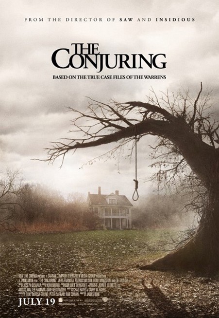
RELEASE DATE: August 2nd 2013
DIRECTOR: James Wan SUB GENRE: Supernatural PRODUCTION/FINANCING COMPANY: New Line Cinema and The Safran Company PRINCIPLE CAST: Vera Farmiga, Patrick Wilson, Lili Taylor and Ron Livingston FILM INFO: Based on a true story, Grossed $318 million in the box office from its $20 million budget- making it one of the highest grossing horror films of all time. SYNOPSIS: Paranormal investigators and demonologists are summoned to the home of Carolyn and Roger Perron. The Perrons have recently moved into a secluded farm house whereby a supernatural presence has made itself known. The events soon escalate badly as soon after the Warrens discover the house’s history. |
DENOTATION: The Conjuring poster uses an establishing shot designed to show the audience where about the action is taking place. It is taken at a wide angle to represent isolation. The establishing shot ‘establishes’ the location and in this case reveals the history of the setting as cut off from civilisation- creating suspense. The title has been placed top centre where it allows more focus as it is empty. There is also a shadow in the right hand corner which reveals the body of a girl in a dress, however we are not able to identify her as her face is not included which supports the mystery prevalent in the film- creating suspense and curiosity for the viewer.
MIS-EN-SCENE: The lighting of the poster is dark, dull and foggy. This creates the effect of an isolated atmosphere, which supports the dark theme of horror films and the mysterious events which are likely to occur. The fog suggests mystery and danger as the house is almost disappearing in the fog. The prop of the rope in the right hand side suggests death and the tree suggests natural decay which also implies death.
TYPOGRAPHY: The title of the movie is in written in archaic font, with “The” placed directly above “conjuring”. The style of this font has been done to represent the time frame in which it is set in, supported by the mis-en-scene, putting the film into a historical context. The title has been placed above the main image and the credits below the image on the left corner so that the shadow is still visible but also so that the white text can contrast properly against the dark background. This juxtaposes the background and forms an unsettling contrast of pure and evil. The “based on the true case files of the warrens” has been used to entice the sense of horror, it is very direct to its audience.
TARGET AUDIENCE: The target audience would be 15-25 year olds due to the concept of the film being based around real life events, this would have a more terrifying impact on the younger generation as they are naïve to this tag line.
|
|
|
|
|
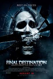
Film title: The Final Destination
Release date: Auqust 28, 2009 Director: David R. Eliss Film info: Franchise Production/Financing company: Zide/Perry Productions Principle cast: Bobby Campo, Shantel VanSanten, Mykelti Williamson Subgenre: Supernatural |
Synopsis: In a car race in McKinley Speedway, twenty-something Nick has a premonition of a deadly car crash with many casualties in the audience and convinces his girlfriend Lori and his friends Hunt and Janet to leave the place. They are followed by the security guard; a racist guy; a mother with her children and a mechanic, that are saved from death. When the racist guy and the mother die in mysterious and creepy incidents, Nick and Lori research and find many similar cases in Internet. They try to lure The Ripper to break the chain of deadly events and survive, but destiny does not help them.
Denotation: This is a poster for the horror film, The Final destination with a close up of a mask in a shattered mirror. This poster has minimal text, which allows the audience to focus on the image and what it means.
Mis-en-Scene:
Costume: As this poster is a close up there is not much to take from the costume only the fact that it’s a mask not a persons face. This could depict that there is a lot of hidden identities within this film / horror genre.
Props: The use of a mask could be seen as the prop as its not a realistic figure and it hides the persons real face. The use of a shattered mirror connotes false reflections of perhaps the characters within the movie. It could also portray the 7 years of mad luck as within the movie its said that the characters have Bad luck and that’s why all the mad things are happening to them. Other than that the use of a close up shot represents direct address with the audience.
NVC: The facial expression of the mask reveals that this poster is from the genre of horror, the reasons for this is because the within genre of horror masks are used as a symbolic code. This connotes hidden past and could make the audience have fear of the unknown
Setting: The use of a dark colour scheme connotes that this is a horror film.
Typography: The typography of this poster is kept to a minimal, this could represent that there is a lot of action in the movie and not much dialog. The font used on the poster is quite bold and plain so that it doesn’t take much attention away from the audience. It could also be because the words itself are power stand alone words that don’t need a fancy font to help it stand out to the audience.
Target Audience: The target audience of this film is 18+, although the poster looks as if it was made for 15+ as it doesn’t have anything too gruesome
HORROR MAGAZINES (4)

|
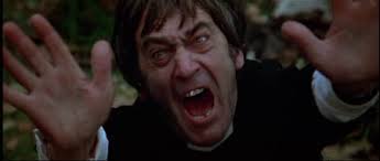
Film title: The Exorcist
Year of release: March 16th, 1974 Director: William Friedkin Production/Financing Company: Hoya productions Principle Cast: Ellen Burstyn, Max von Sydow, Lee, J. Cobb, Kitty Winn, Jack MacGowran, JaMiller, Linda & Blair, Mercedes McCambridge Films origin/info: The movie “The Exorcist” was based on a true story from 1949. A boy was diagnosed as being possessed by the devil, and the Roman Catholic Church believed this enough to assign multiple exorcists to this case. Synopsis: Mother and daughter have a good relationship but after a time Regan begins to act strangely. She undergoes various neurological tests but doctors can find nothing to explain her behavior. Sub-genre: Supernatural horror |
Mise-en-scene: The mid-shot reveals high key lighting to make the antagonist the focal point, which highlights the abnormality of her facial expressions. Recognizing that the antogonist is smiling, which conducts a sense of fear unto the protagonist. Also the largeness of her eyes depicts a theme of danger. Not forgetting blood smothered across her teeth, which intensifies this persistent theme of danger as it signifies the antagonists reasoning for smiling, as its evidently to display and project the blood being on her teeth, as the colour red connotes intensity and pain.
Typography: The font is big and bold and the yellow typography tends to connote sunshine and happiness. This could also suggest that it revolves around children, as children do not comprehend nor notice the negative aspect of things, and tend to have no worries to be upset about suggest that children are key in the. Developing the importance of children, the fact the cover photo is like a painting advocates the clear ideology of a child-like drawing; therefore the stereotype of children is portrayed throughout successfully.
Mood and styling: The variation of colours depicts a range of arousing yet spectral moods. This creates a lot of pressure ion the atmosphere and you’re never guaranteed of what is going to happen yet, therefore it enforces the audience to be engaged at all times.
|
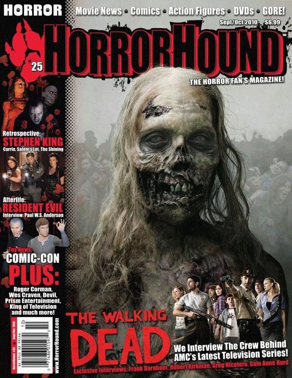
Title: The walking dead Release date: 31st October 2010 Director: Frank Darabont Info: It was based on a comic book series by Robert Kirkman Production/financing company: AMC Studios Principal cast: Andrew Lincoln, Jon Bernthal and Sarah Wayne Callies Sub-genre: Zombie/ splatter/serial drama Synopsis: People try to escape a zombie apocalypse which has overrun the world |
Mise- En -Scene: A mid shot of a distorted looking zombie is surrounded by a pale establishing shot of zombies reaching out by doing this it really highlights not just the zombies face but also the body decomposing to emphasises on the gore of the zombie. There is also a group of non-infected people placed at the bottom of the magazine this may connote their vulnerability and them being inferior to the zombies. The NVC of the zombie looks lifeless like a living corpse which is what you would expect of a zombie however the NVC of the people placed at the bottom look serious and stern which may infer that they are ready for a fight and are determined. The background of the magazine has an excessive amount of zombies contrasting with the small amount of people this may show how overpowering the zombies are showing how much of attack the humans are. Most of the lighting is placed on the zombie to highlight its features and show the horror of it. There are props of a gun in the lower image this is held by a human so It shows that they are more advance than the zombies showing more life in them. The gun may also show the need for the humans to protect themselves from the danger they are encountering.
Typography : The text is written in very sharp and bold writing to make it stand out and clear but also done too fancy to take away focus from the main image.
Colour: Colours of red and black are the dominant colours on this magazine this is dominant for a horror magazine as they connote death blood and danger, which is deeply related to horror. Other colours such as a dull green and faded grey is used for the images this emphasises on the subtext of the zombie horror.
Masthead: The masthead is placed at the top of the magazine so that it doesn’t block the focus of the main image. It includes colours of red and black which again connote death danger and blood therefore making it relevant to include in the magazine as those are significant colours to horror. There is black outlying of the masthead this can relate to splatter and gore which is appropriate for zombie horror.
Selling Line : The selling line of ‘The Horror Fans Magazine’ gives a sense of familiarity for the horror fans as it makes it seem like it’s personally catered for them. It is placed next to the masthead giving it a sense of continuity of following horror conventions
Cover lines: The cover line of ‘The Walking Dead’ is written in sharp red writing which may deeply connote to blood giving an indication to the readers that the series will include a lot of gore and blood. The cover line is placed at the bottom to not disturb the main image but is also placed directly next to the image of the cast of walking dead to create a sense of connection.
|
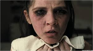
RELEASE DATE: March 16th 1974
DIRECTOR: William Friedkin SUB GENRE: Psychological PRINCIPLE CAST: Linda Blair, Ellen Burstyn, Jason Miller and Max von Sydow PRODUCTION/FINANCING COMPANY: Warner Bros FILM INFO: Has been banned 3 times as seen controversial due to religious reasons, one of the most profitable horror films of all time, based loosely on actual events. SYNOPSIS: When young Regan starts acting odd- levitating and speaking in tongues- her worried mother seeks medical help, only to hit a dead end. A local priest, however, thinks the girl may be seized by the devil. The priest makes a request form to perform an exorcism and the church sends in an expert to help with the difficult job. |
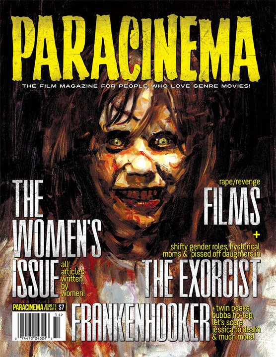
DENOTATION: A mid shot has been used for the aggressor “Reagon MacNeil” from “The Excorcist” as the main image. The aggressor is making direct eye contact with the reader which not only attracts the reader’s attention but alludes to a sense of possession in which the victim experiences during the film. Surrounding the main image are cover lines for the “Paracinema” magazine.
MIS-EN-SCENE: The costume and setting are not visible in this mid shot of the aggressor, an props are not involved. However, the lighting in this magazine cover is purposely made brighter on the aggressor to illuminate their face which connotes the dominance of her possession by mysterious antagonist. It has also been done to highlight the sinister effect of her appearance and her facial NVC where she is grinning. This shows the influence of the spirits on her characterisation with her bewildered eyes for an intimidating look- showing the innocence has been taken away from her after possession.
TYPOGRAPHY: The front cover uses a variety of fonts which is to attract the reader’s attention to the various stories/ articles appearing in the magazine. The main cover lines are bold and white- juxtaposing the dark, sinister background with bold writing which is made more visible with the colour contrast, the white could also suggest the girl’s innocence before possession. The masthead is located at the top of the magazine in big, bright yellow font. The font is archaic sans serif. The yellow suggests mystery and is also a big colour contrast with the white and dark colours which enables the font to pop against the background and made easily read.
TARGET AUDIENCE: The target audience for this magazine are those who are interested in horror movies and especially the sub genre or psychological horror films.
|
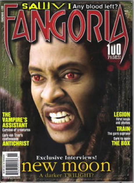
FILM TITLE: The Twilight Saga: New moon
RELEASE DATE: November 20th 2009 DIRECTOR: Chris Weitz (2) FILM INFO: Sequel PRODUCTION/FINACING COMPANY: Temple Hill Entertainment (1–5) Imprint Entertainment (1–3) Sunswept Entertainment (2–5) PRINCIPLE CAST: Kristen Stewart, Robert Pattinson, Taylor Lautner SUBGENRE: Vampire |
Synopsis: This saga is about a normal human being falling in love with a vampire. She also has a werewolf as a best friend who she is unaware is a werewolf in the beginning of the first movie. Throughout the sagas the love triangle have many enemies that they have to defeat in order to survive being in love with a human girl.
Denotation: This magazine cover is of a black make with red eyes perceived to be a vampire. The masthead is placed in front of the main images head, with short but snappy cover lines on both sides of the magazine.
Mis-en-Scene: The NVC of this main image connotes that this character is aggressive as the facial expression reveals hatred and pain. As this is a close up shot the audience is unable to identify any costume/ props and what it may depict. The lighting of the picture is focused upon the antagonist face whilst the camera blurs the outside of the main subject to show that he is the focus and also the new character within the saga.
Typography: The typography of this magazine covers main cover line is done is lower cases, this may be so that it doesn’t draw any attention away from the masthead and the main image. The selling states ‘A darker TWILIGHT?’ This connotes that the saga is a horror in which any may find scary. It is quick and catchy to the human eye and may lead to an increased fan base. The barcode is placed within the bottom left corner which cannot be missed as the sizing is noticeable.
Colour: The colours within this magazine cover are dark and deadly which connotes the horror genre and also a lot a red aspects are used with depicts blood. Blood is one of the symbolic codes within the horror genre and is included in nearly every horror movie so this allows the audience to see that this is a magazine about horror.
Target audience: The target audience for this magazine could be 16+ only because the selling line connotes that this movie will be scarier than the first and minors may not be able to handle the content of the movie.
HORROR TRAILERS (4)
|
|
|

|
|
|
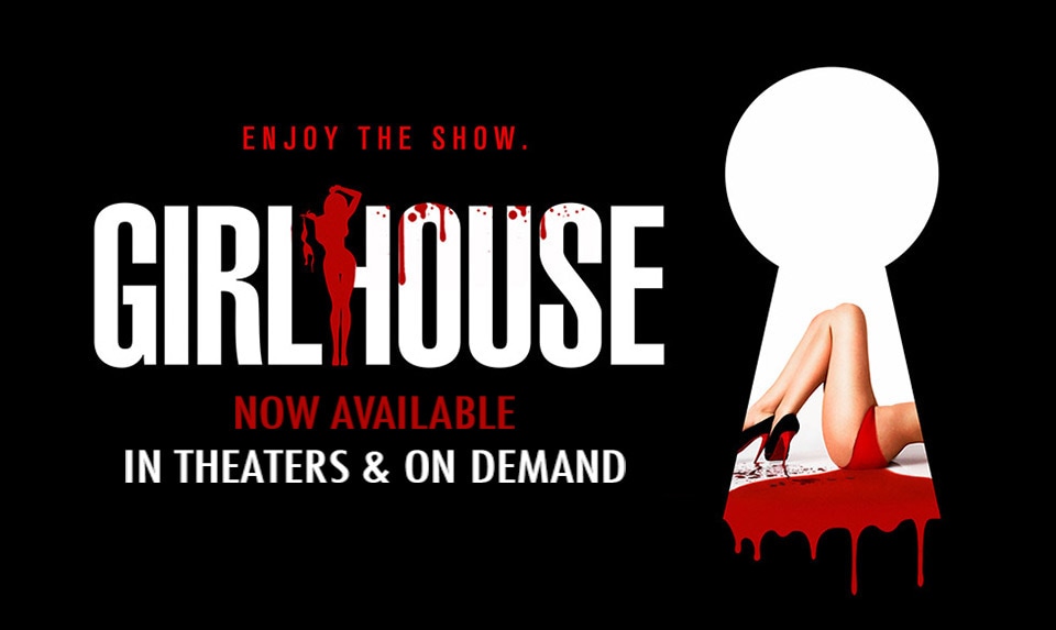
Title: Girls house
Release date: October 16, 2014 Director: Trevor Matthews, Jon Knautz Production/Financing Company: Brookstreet pictures Principle Cast: Ali Cobrin, Adam DiMarco & Slaine Film origin/info: Synopsis: A beautiful young college student moves into a house that streams video to an X-rated website. After a deranged fan hacks the site and finds out where she lives, she spends the night fighting for her life. Sub-genre: Slasher |
Mise-en-scene: The trailer commences through the wide angle, revealing the group of girls to be situated within a circle. The scene expands through the use of mid-shots and close up angles of one of the girls exposing themselves. The use of low key and high key lighting is highly significant in regards to what they represent. Recognising that the high key lighting is persistently used when the girls are going garmentless online, however the men that are watching online are portrayed through the usage of low key lighting, which may signify the idealogy of pleasure and desire juxtoposing with danger.
Camera and Editing: The use of the POV (point of view) shot enforces full engagement within the audience, as they are seeing the same visuals as the antagaonist are, therefore mainitaining the atmosphere of suspense here is at a high. Furthermore, the cut away shots intensify each stage that gets closer to knowing what will happen next, ackonwledging that these shots are very consistent in the middle of the trailer.
Typography: The typography used is plain and simple, which may be interpreted to symbolise the girls’s simplistic thoughts on creating live ponorography, as the are naïve to the consequences.
Mood and Styling: The mood of the trailer is gripping and enthralling. The modification of the selected camera and editing techniques has played a huge role within the style of the trailer, regarding the audience being captivated at all times.
Sound: The use of dialogue informs the audience at the very beginning when discussing the theme of time and cronology. Moreover, the significant use of sound bridges emphasizes this aspect of being online as it reveals the sound of a keyboard typing, which is what is done when one is watching them on the internet. Also followed by an eerie non-diegetic sound to intensify the dangers of doing so.
Location: The trailer is located in a house.
Narrative: The incorporation of typography manages the audiences comprehension by enforcing them to read about what is happening and what is possibly to happen next.

|
|
|
|
|
|
The omen
Release date: June 6th 2006 Director: John Moore Info: Remake of 1976 film the omen. The release date was done to reflect number of the beast. Production and Financing Company: 20th Century Fox Principle Cast: Julia Stiles, Liev Schreiber, Mia Farrow, David Thewlis ,Pete Postlethwaite Sub-Genre: Supernatural |
Synopsis: A successful husband and wife have a child unknowingly to the wife the child dies during childbirth therefore the father adopts a child from a priest advice. Everything is all good as it seems however mysterious event start to happen such as the nanny suicide at the young boy’s birthday party, attack from the son to the mother and a zoo chaos. With continuity of these disturbing events taking place surrounding the young boy the father is approached by a priest who explains the son is born from a jackal mother meaning the son is an antichrist. So the parents are left with a serious ultimatum with more disturbing events and an evil nanny introduced , the mother being seriously harmed they are left fearing for their lives with the choice to kill their beloved child or live with the omen ….
Mise En Scene: The spooky and faded lighting throughout the trailer emphasises the sombre atmosphere. The constant grey tones with random red lighting really highlights the supernatural element of the trailer. There is not a high level of positive NVC attributed in the trailer therefore indicating the fear in the movie. However it is ironic that the nanny smiles but just after that she commits suicide as this is not an expected reaction. Many religious symbols such as a Christ sign is used throughout the trailer climaxing the fact that the film is based on the anti-Christ therefore these props are relevant
Setting : The film is set in various locations such as the hospital the church and the graveyard this are traditional setting for horror movies so it was wise to use it as things such as death gore and supernatural events happen here . However setting such as a children’s party a congress roman the zoo are not credited as a setting where supernatural or scary events take place however it is ironic how the boy shows much more withdrawal and displays strange behaviours happen in these places .
Narrative: The narrative of the story is about a family who is under attack from their evil son who is possessed. They are faced with life changing decisions on what do with their ‘beloved’ son. The theme of religion and family is played on throughout. The ongoing narrative is told with drastic events upon drastic event throughout. Using a child to be the antagonist of the film is a common convention of horror movie as it plays on the child’s innocence and purity which is what we expect children to be like this subverts the expectation of what children are supposed to be like (children aren’t supposed to be scary)
Editing: There is a lot of slow pace movement this has impact as it creates suspense and chill but also gives a lot of time to focus on the NVC of the characters and show the true fear they have of the Omen.Towords the end a lot of fast cuts are used this creates confusion and uncertainty leaving the audience in mystery.
Camera Shots: The trailer starts with an establishing shot to show the location and surroundings. It then includes a lot of reaction shots to show the characters reactions and NVC of the certain things that happen. The zoom is used a lot on certain elements that are seen as codes for the movie e.g. the Christ symbol, the photographs and the beast sign.
|
|
|
|
|
|
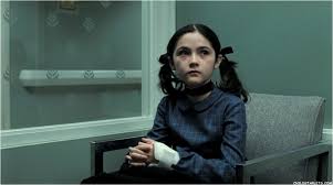
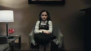
FILM TITLE: Orphan
YEAR OF RELEASE: 2009 DIRECTOR: Jaume- Collet Serra PRODUCTION/FINANCING COMPANY: Dark Castle Entertainment and Appian Way Productions PRINCIPLE CAST: Vera Farmiga, Peter Sarsgaard and Isabelle Fuhrman FILMS INFO: 78.3million USD at box office, original SYNOPSIS: Devastated by the loss of their unborn baby, Kate and John decide to adopt a child. At the orphanage, both feel drawn to a little girl named Esther, and soon the couple take their new daughter home. But when a dangerous series of events unfolds, Kate begins to suspect that there is something evil lurking behind the child's angelic exterior. |
NARRATIVE: The narrative of this horror trailer is about a mother who has suffered the loss of an unborn child, mother of two now decides to adopt an older child at the orphanage not knowing where she came from and what her past is. The trailer escalates with a happy beginning and then goes into a dark, violent series of events which are shown in quick cuts for effectiveness to make the viewer want to watch the full film and see what actually happens.
MIS-EN-SCENE: The lighting to begin with is bright, connoting positivity in the location of the orphanage as this is the equilibrium of the trailer. Then the lighting slowly darkens with the introduction of negative events and a sinister soundtrack. This is presenting the disequilibrium of the trailer which is set inside the home of Kate and John. The antagonist is shot with props such as a screwdriver, a rock and matches which all connote danger, aggression and pain, they are also symbolic weapons in horror films for the attacker. The majority of the time the antagonist seems to be wearing dark gowns which depict a gothic theme. To begin with the antagonist was wearing pure colours such as white gowns suggesting an angelic persona. She wears black colour chockers throughout the whole trailer to entice the mystery of her character, we want to know what she is covering up. The setting was often secluded areas such as Kate and John’s home or places where victims where vulnerable e.g. the hospital. Areas like this make it easy for torture and murder to occur in horror films.
CAMERA: The trailer begins with an establishing shot of the orphanage. It cuts to an over the shoulder shot of the orphans playing which allows the viewer to understand that there is someone else other than the children playing. Which is then shown through eye line match when they find the aggressor isolated in a room which already allows the viewer to understand there is something different about her. As soon as the trailer reaches its disequilibrium there is a range of close up shots and eye line matches to show the aggressors point of view and her facial NVC which forms tension and reveals each possible death scene in the trailer. High angle shots are also used to reinforce the power of the aggressor and its dominance during possible death shots. This also enforces how powerless the victim is, there is nothing they can do other than attempt to save themselves, this is a common convention used in horror films- the battle of survival.
SOUND: To begin with the trailer uses voice over to introduce the story line, the voice over then turns into softly played piano music for the trailer’s equilibrium this then changes as the soundtrack ends. It is then interrupted by diagetic sound and Foley sounds such as the school bell which could be a symbol for an alarm- the trailer’s disequilibrium begins from this point. The banging against walls and screaming then connotes danger for the characters accompanied by the harsh sound of a violin.
EDITING: The transition from equilibrium to disequilibrium used black panned fades to connote the danger due to occur. Quick cuts are used throughout the trailer during disequilibrium to increase the pace for effect and leave many possible death scenes untold for the viewer to be curious about. The quick cuts are an effective method for advertising as they change the mood to more drama.
TYPOGRAPHY: Typography throughout is very horror influenced as the font alludes to dripping blood. The name of the film is placed at the end of the trailer in archaic serif font for dramatic effect to leave an impact on the viewer.
TARGET AUDIENCE: The target audience is young people/ young adults who are interested in the sub genre of thrillers in horror films.
|
|
|
|
|
|
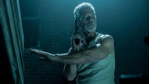
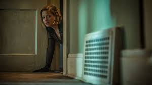
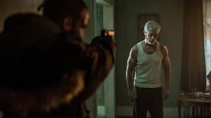
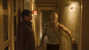
Title: Don’t Breathe Release date: August 26th 2016 Director: Fede Alvarez Production/Financing Company: Ghost house pictures Principle Cast: Jane Levy, Dylan Minnette, Daniel Zovatto, Stephen Lang Sub-genre: Slasher |
Synopsis: Three Detroit delinquents who make a living out of the breaking into homes and selling the items they take. They discover a blind man’s household and decide to break into his house one night not knowing that the blind man has high senses other than just sight. The blind man has his daughter killer held in hostage as he sets his revenge upon her. As the remaining three try to find their escape after one of them was killer the old man turns off all the electrics and makes them live like him with no sight as he continues to torment them as he seeks to kill. Upon their escape only one member was able to set free and return home to move away from her alcoholic mother with her abusive boyfriend to set the world with her younger sister.
Narrative: The narrative of this film is presented in a sequencial order but with an untold story within it which gives it a sense of fragmention. The reason behind my thought process is that the protagonist believe that they are going to rob the house and get away with it but in doing this one loses their life and the remaining two meet the house owner’s daughters murder who in which he is keeping hostage. I believe this trailer is made to live the audience thinking of what is going to happen the the three being held hostage as the trailer gives quiet a lot of information about the movie inside of it.
Mise-en-scene: The setting of this trailer is in a detached house. The NVC of the protagonist characters are seen to be confident with the way they talk and walk and there facial features with certain situations. The main female lead connotes that within every horror there is always a blonde girl who tends to be the first victim of the antagonist but this movie subverts this view as she is the only one to survive. Within the trailer there are many props used but one of the main props that I found significant was the use of the gun although the antagonist was blind. The gun also signified power because whenever the gun was at used, the protagonist character reacted in fright. A symbolic code within the horror genre is the use of keys and padlocks which is involved when the characters are held hostage within the home as this shows that their freedom has been stolen and is in the hands of a blind man. The lighting throughout the duration of the trailer was dime which connotes that the blind man can’t see anything. It also insinuates that the emotions going through the characters in their personal lives and when they are in isolation are dull and lifeless. It shows the characters inner feeling of not having anything to partially survive for. One thing that I recognised is that when the camera was on the main female role is that the lighting was brighter than it was for the other scenes which signify that she has hope that she will survive or that she has aspiration to achieve something in life which the other may not have as they could have lost their hope and faith of surviving.
Camera: In this trailer, I found that there was quite a lot of establishing shots of the different settings. This allowed me as a audience member to gather thoughts that the reason why the antagonist may act so psychotic is of because the isolated environment that surrounds him. Close up shots are frequently used to show emotions of the characters, props and costumes, this signifies that the intensity between the characters is high as sometimes they may be near each other but they are unaware of it because of the darkness. Many two shots are used to create this trailer which may signify that within this movie characters are never alone whether that is a bad thing or not, they have no choice to personal space. The movement of the Steadicam is quite slow which allows the trailer to create suspense within the characters and the audience as they are unaware of what may happen next, this allows the trailer to have the feeling of the horror genre as it is always full of surprises.
Editing: The use of frequent quick cuts allows the trailer to adapt its individuality as many film trailers have a balance between the different editing cuts. I believe that this connotes that the movies story line moves at a quick pace and doesn’t drag and prolong until the ending with in some cases will attract more people to watch it as in today's society individuals have a short attention spam. Although there is a lot a quick cutting this doesn’t make the story line confusing for the audience as in spite of the content given there is a even balance with the sound and the camera in my opinion.
Sound: This trailer consisted of mainly diegetic sound with certain aspects of non diegect sound effects. Although there was voice overs at certain points the voice over always went to the scene in which they are actually stating those lines. The sound effects used as background music was very low and taunting. It created a sense of mystery throughout the trailer and became load when something dramatic happened.
Typography: The bold typography with dashes through the letters reflect the sense of wild life isolation as the dashes not only could connote splatters of blood but also grass shedding. Throughout this trailer there is no typography until the ending which connotes that there may not be much dialog throughout the duration of the movie and it is mainly action.
Target audience: In relation to the context of this trailer I would believe that it is aimed to 18+. My reason behind this is because I believe that under 17/18 year old's may not have the mindset to read in between the lines to get the meaning behind the movie and the antagonist’s action. Younger people tend to want everything spelt out for them word for word instead of thinking of it themselves. Also another reason why it is probably aimed as the older teens is because adverting robbery to young minds is dangerous as they may take it as an inspiration instead of a lesson as to way they shouldn’t rob nor break into peoples households as you never know what are behind closed doors.
